A Young Couple Redefines Their Living Space With 'Rustic Simplicity'
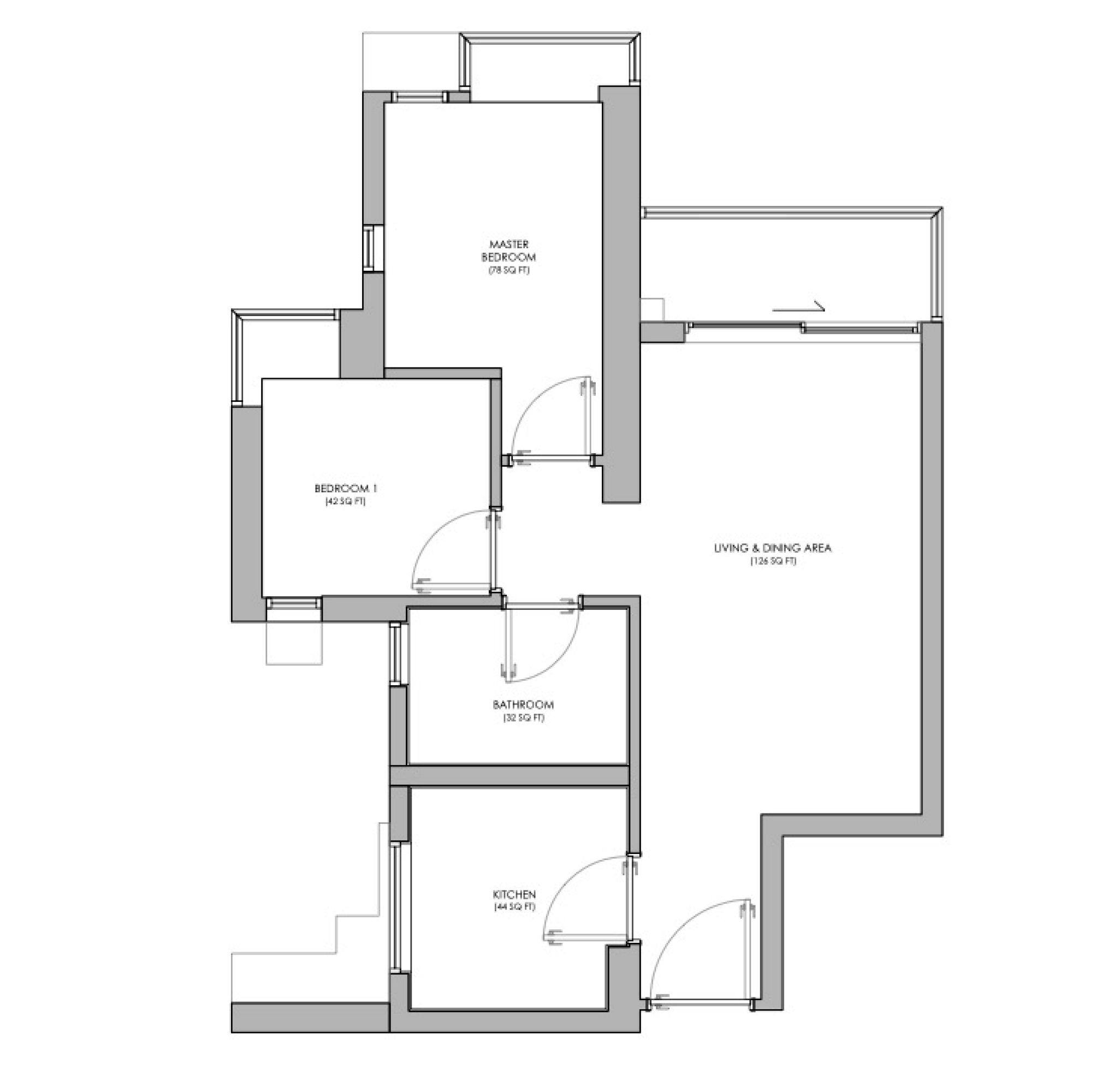
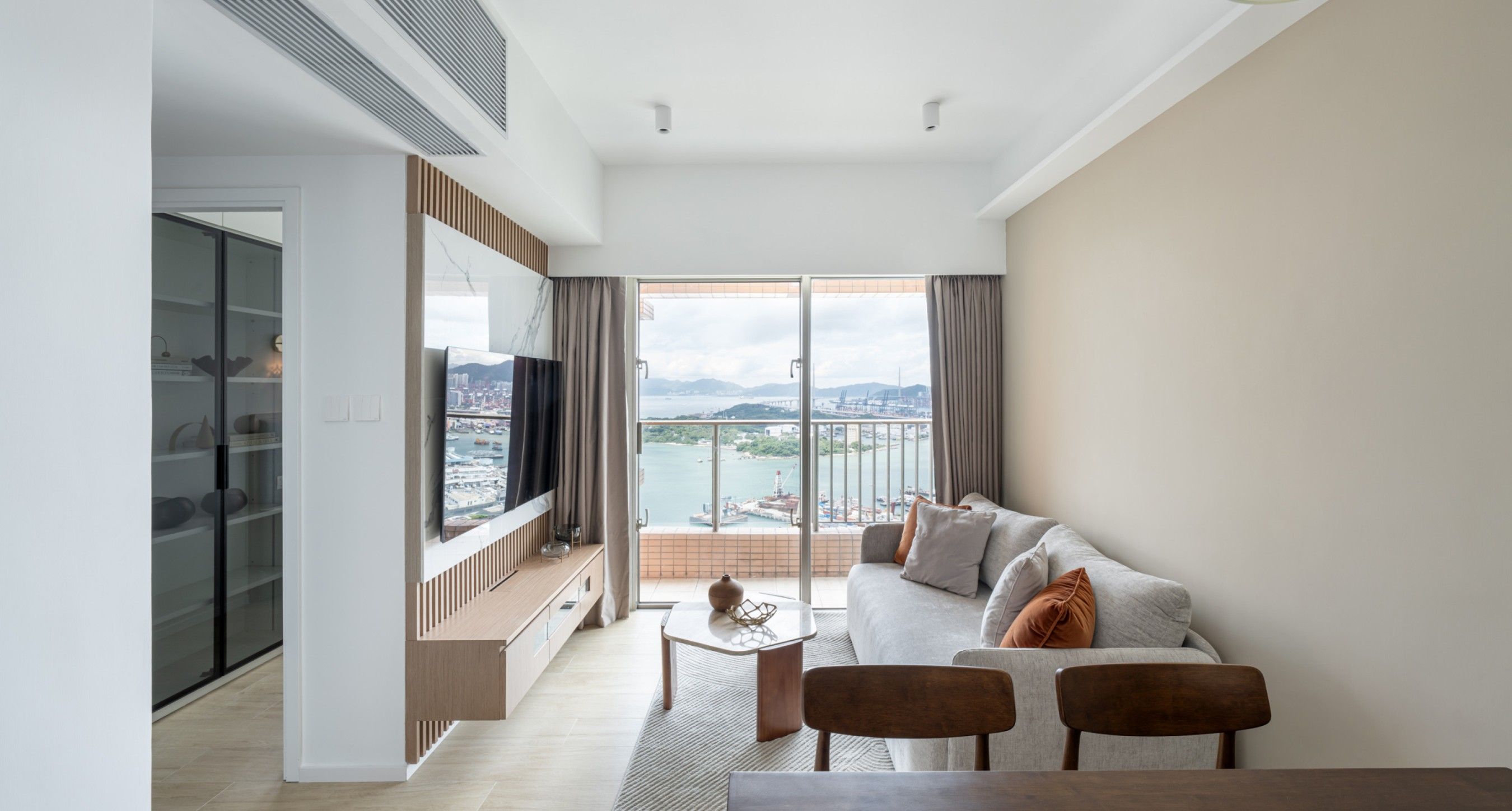
Our designer once again undertook a renovation for a compact unit, this time for a residence of a young couple located near Olympic Station, with a usable area of nearly 400 square feet. Within this limited space, the homeowners wanted to reflect their taste while maintaining daily life's flow. The small dwelling was transformed through interior design into a space that better suits their lifestyle, with our designer skillfully employing a 'Simplicity' and 'Rusticity' aesthetic to define their ideal haven.
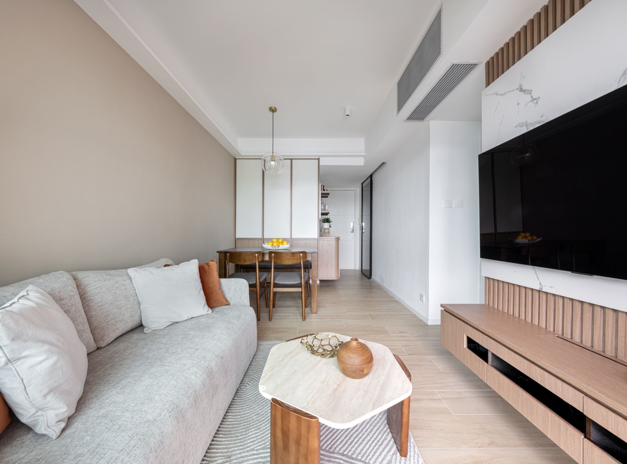
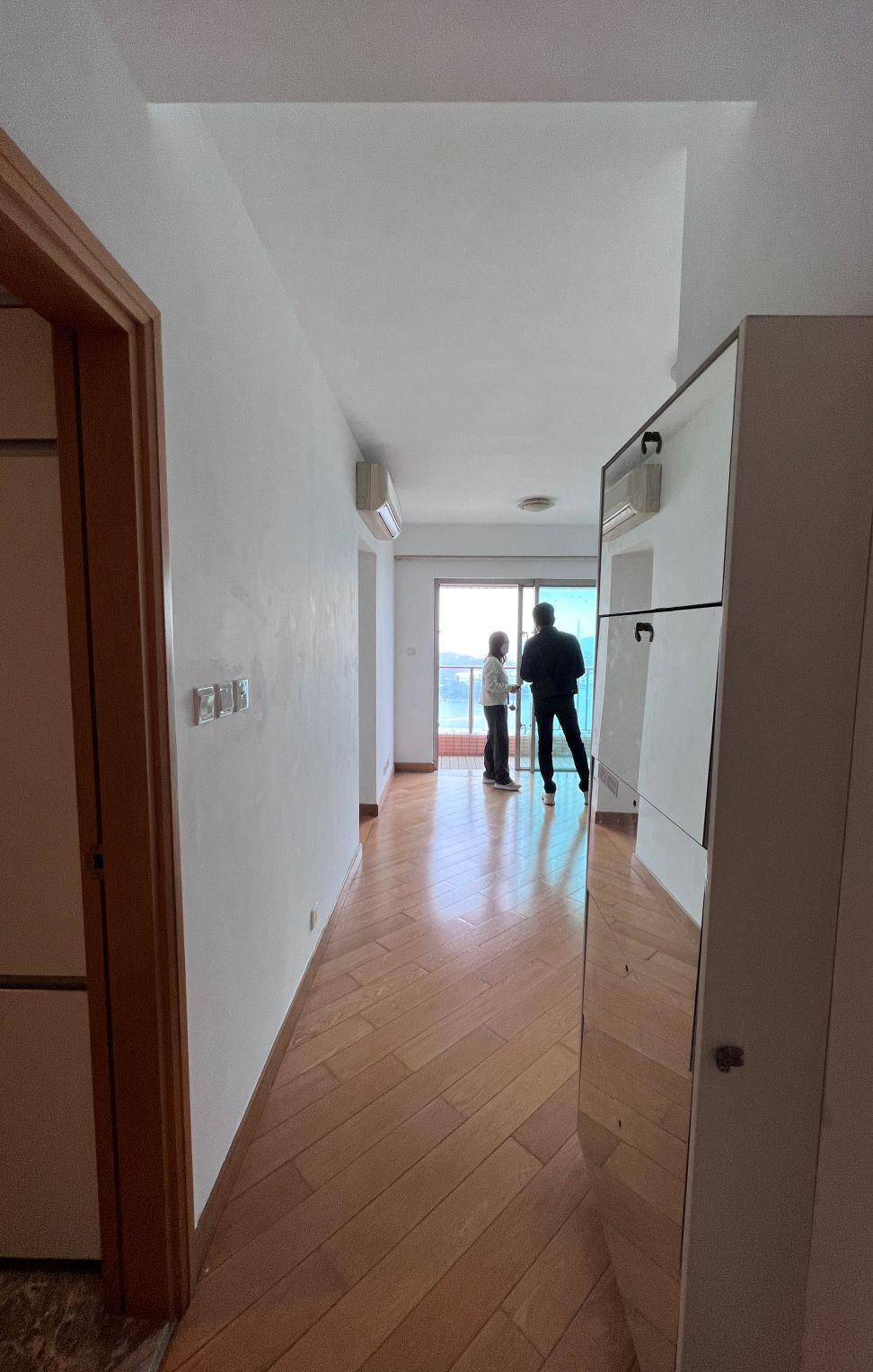
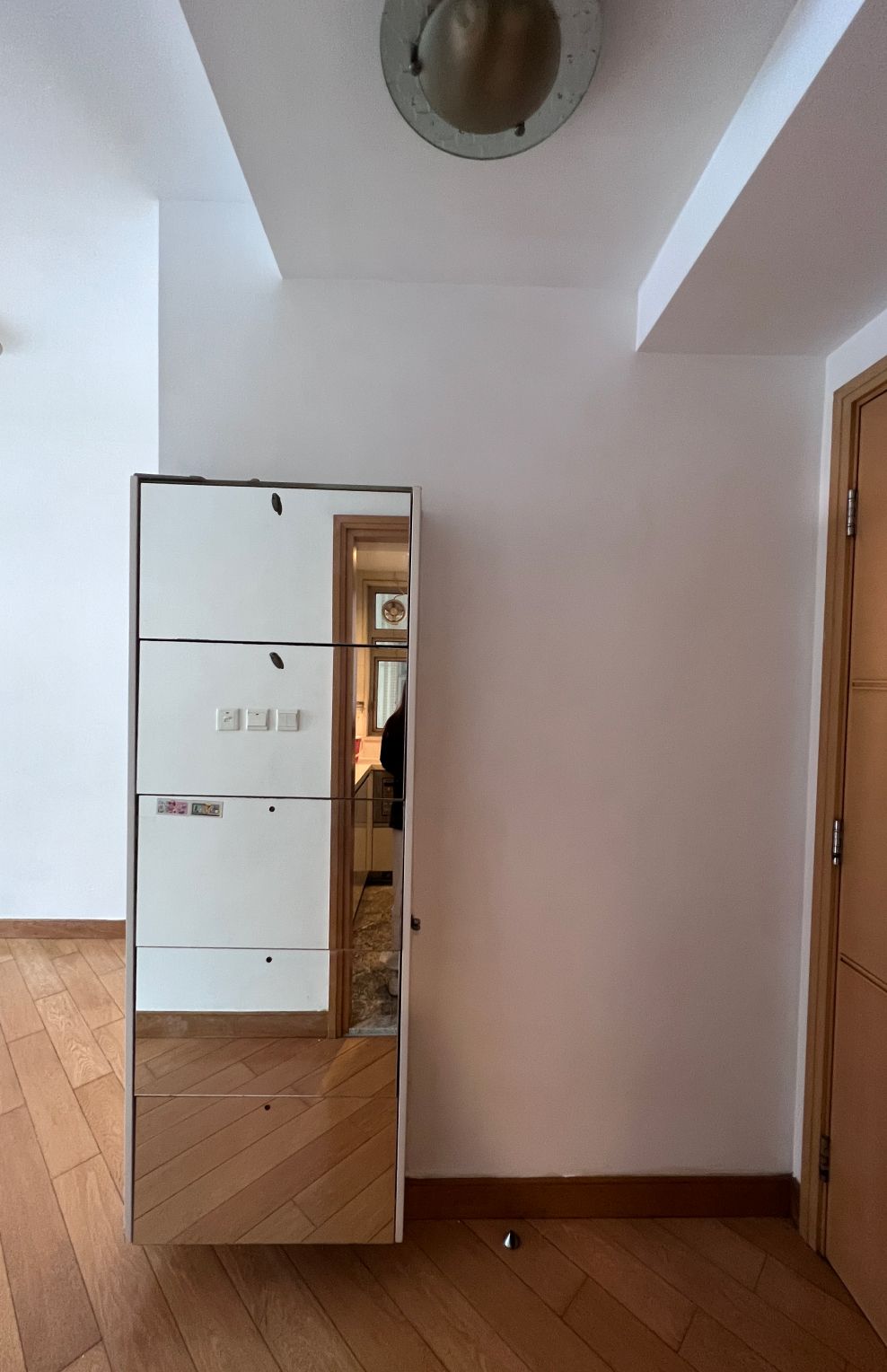
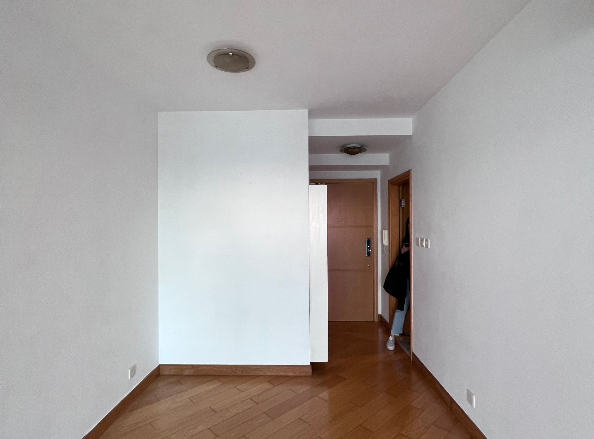
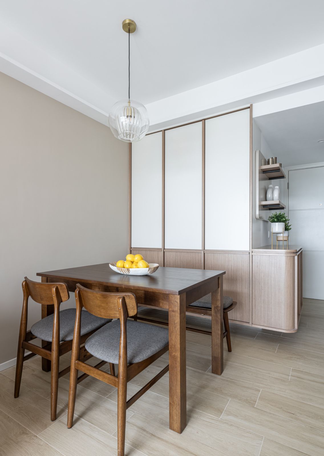
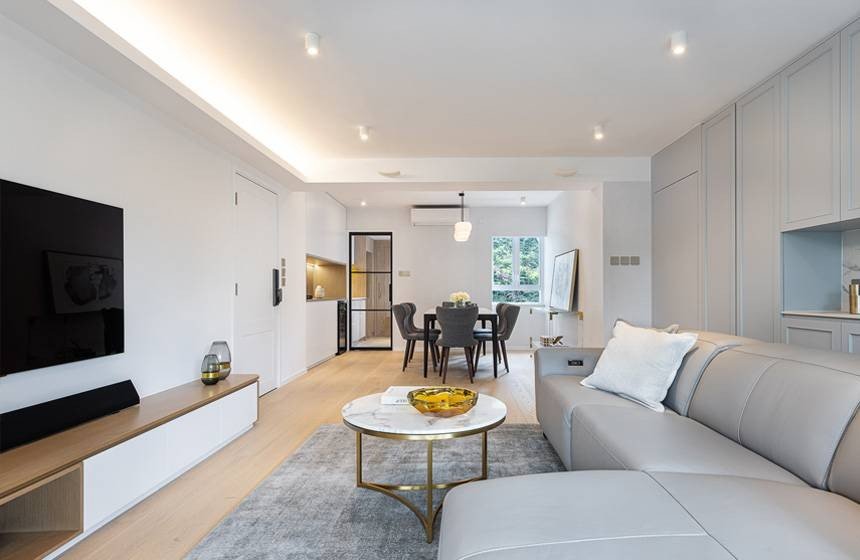
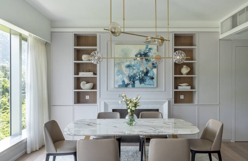
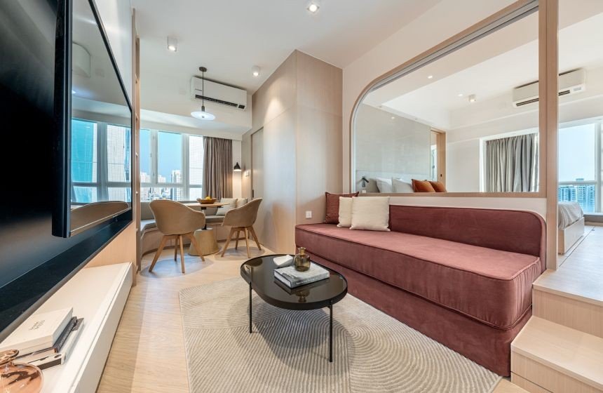
To enhance the sense of space in the compact area, the living and dining rooms feature a simple and soft colour palette throughout. The design infuses numerous elements, with textures like wooden slats added to accentuate the furniture, aiming to reduce the sense of confinement created by the limited space. The original entrance lacked any layout design, which wasted this area.
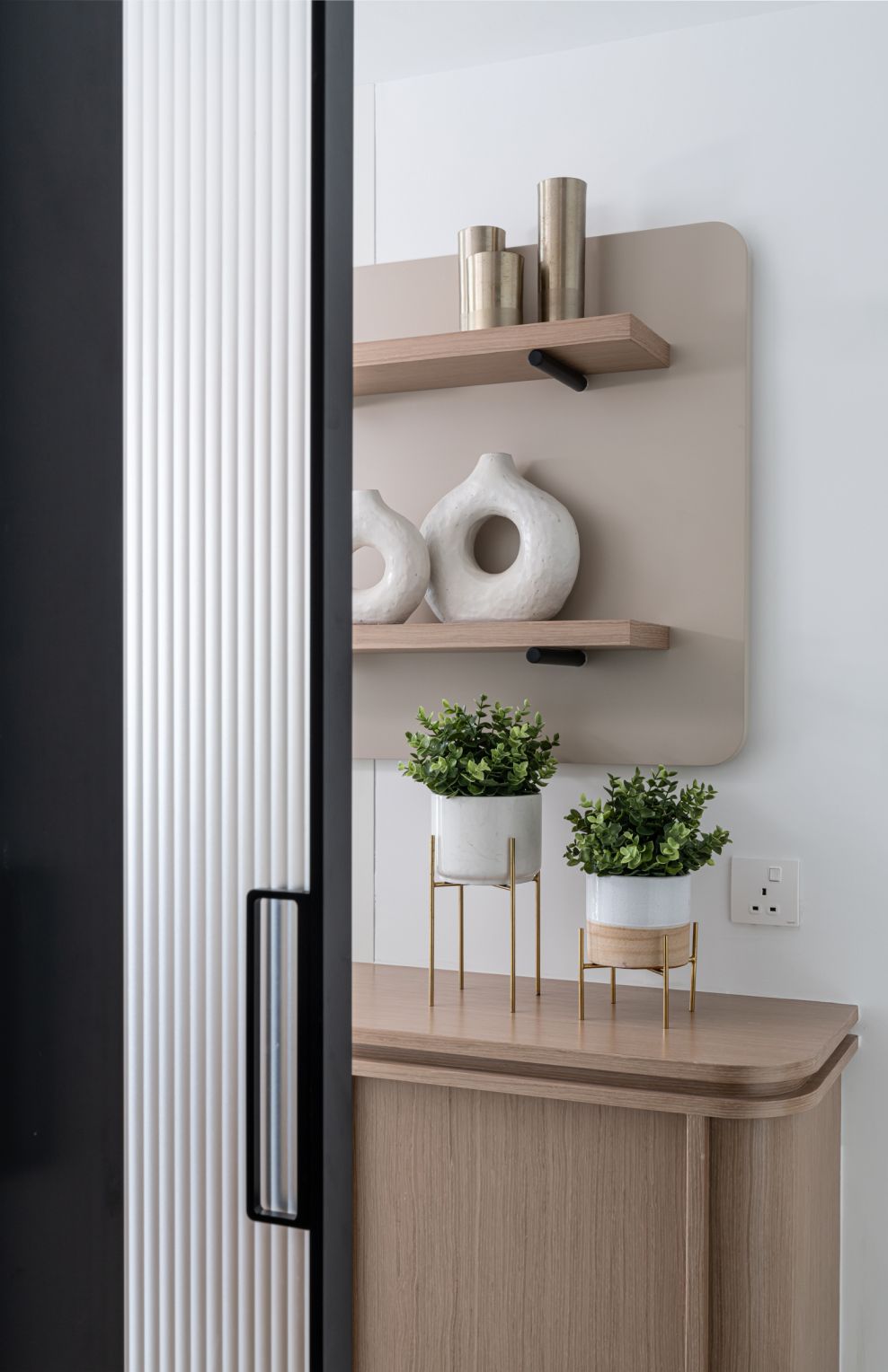
We added a wooden shoe cabinet at the entrance, a screen effect to separate the living and dining areas, which is not only practical for storing shoes but also serves as a place for the homeowners to keep their items for easy access.
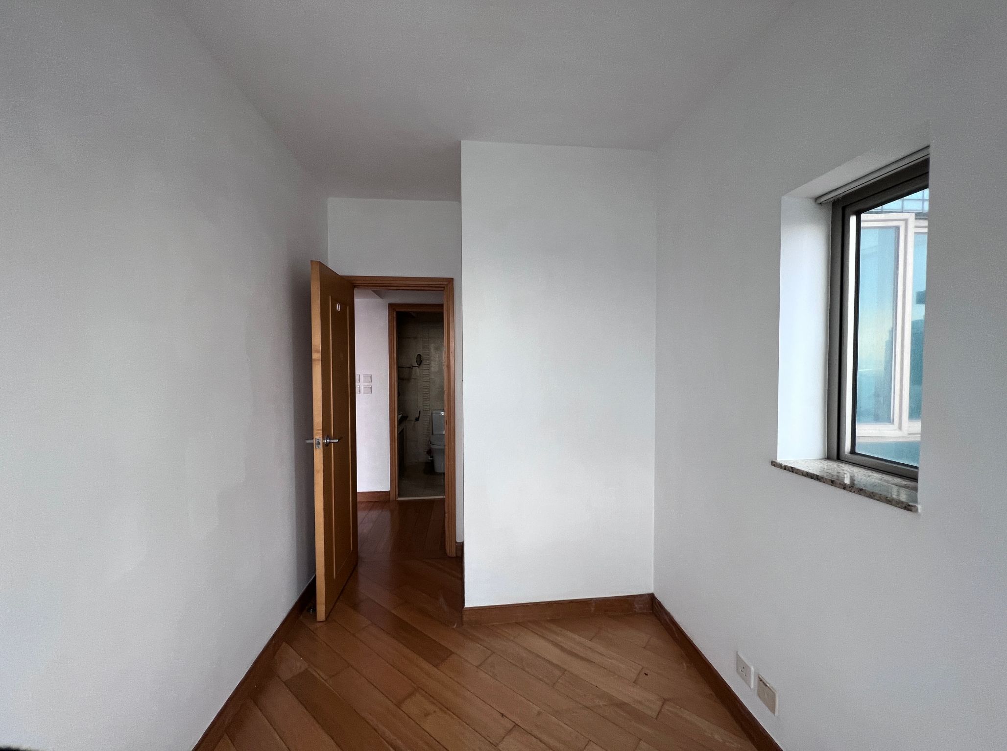
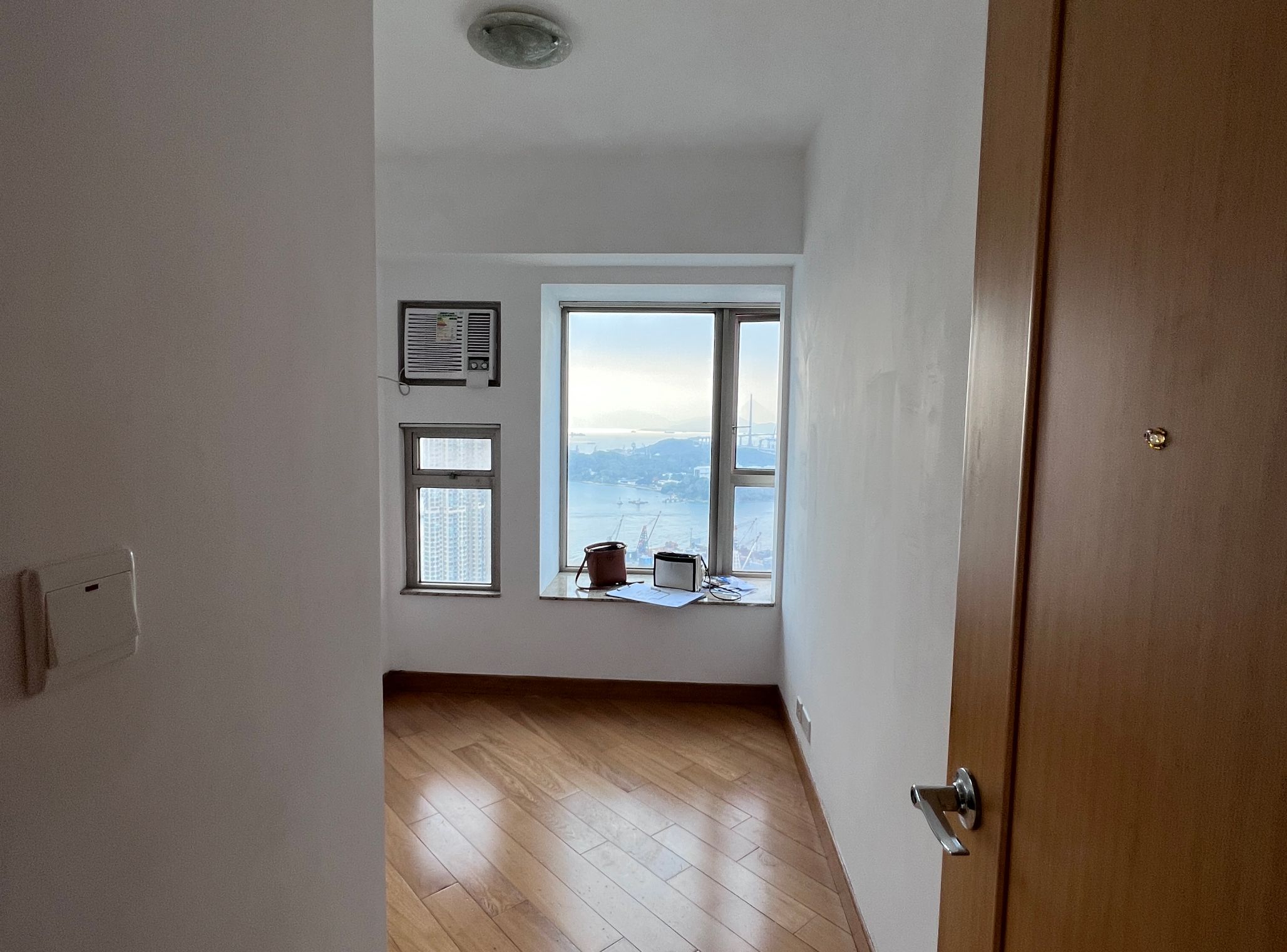
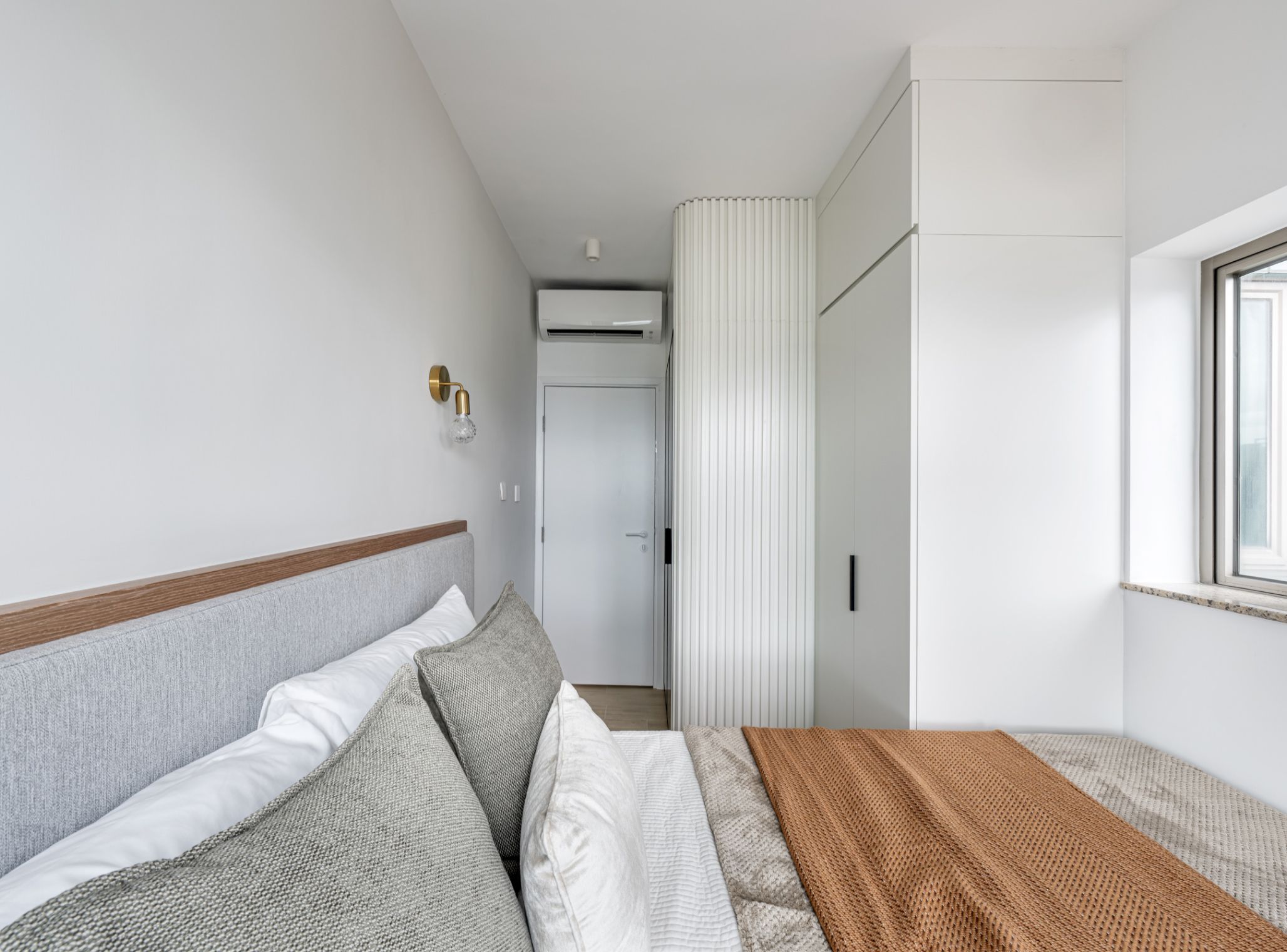
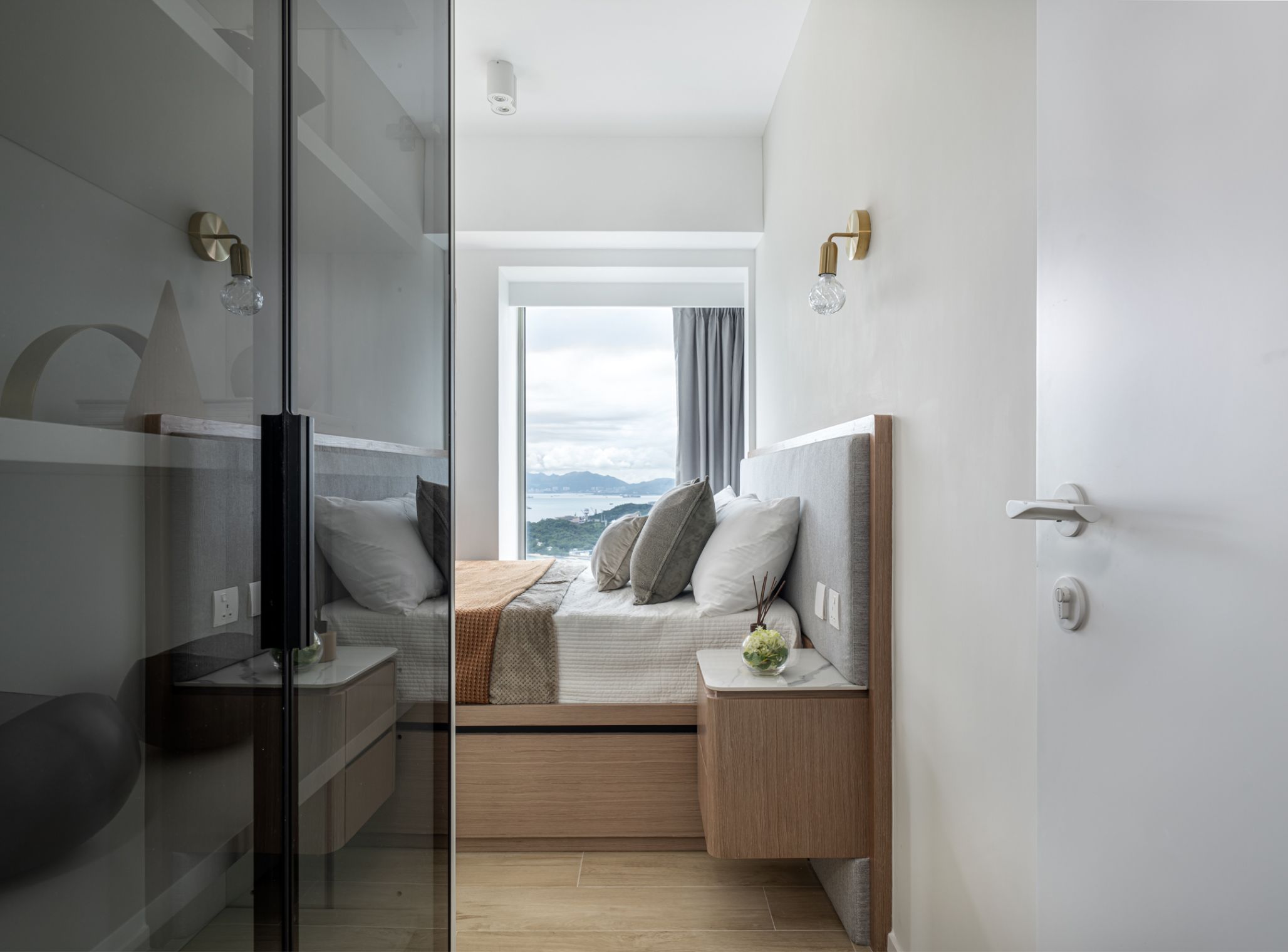
In the homeowners' resting space, the master bedroom - which is cleared out part of the area to expand the living space for the couple. To increase storage, a floor-to-ceiling wardrobe and display cabinet were added at the entrance, with glass doors designed to reduce the sense of confinement upon entering. The bedroom maintains a minimalist style, featuring a light grey headboard combined with wood to keep the sleeping area comfortable. The other bedroom is reserved as a guest room, making it convenient for friends who come to stay.
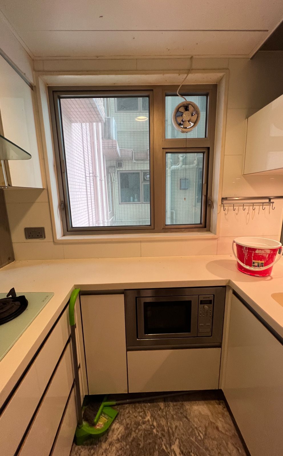
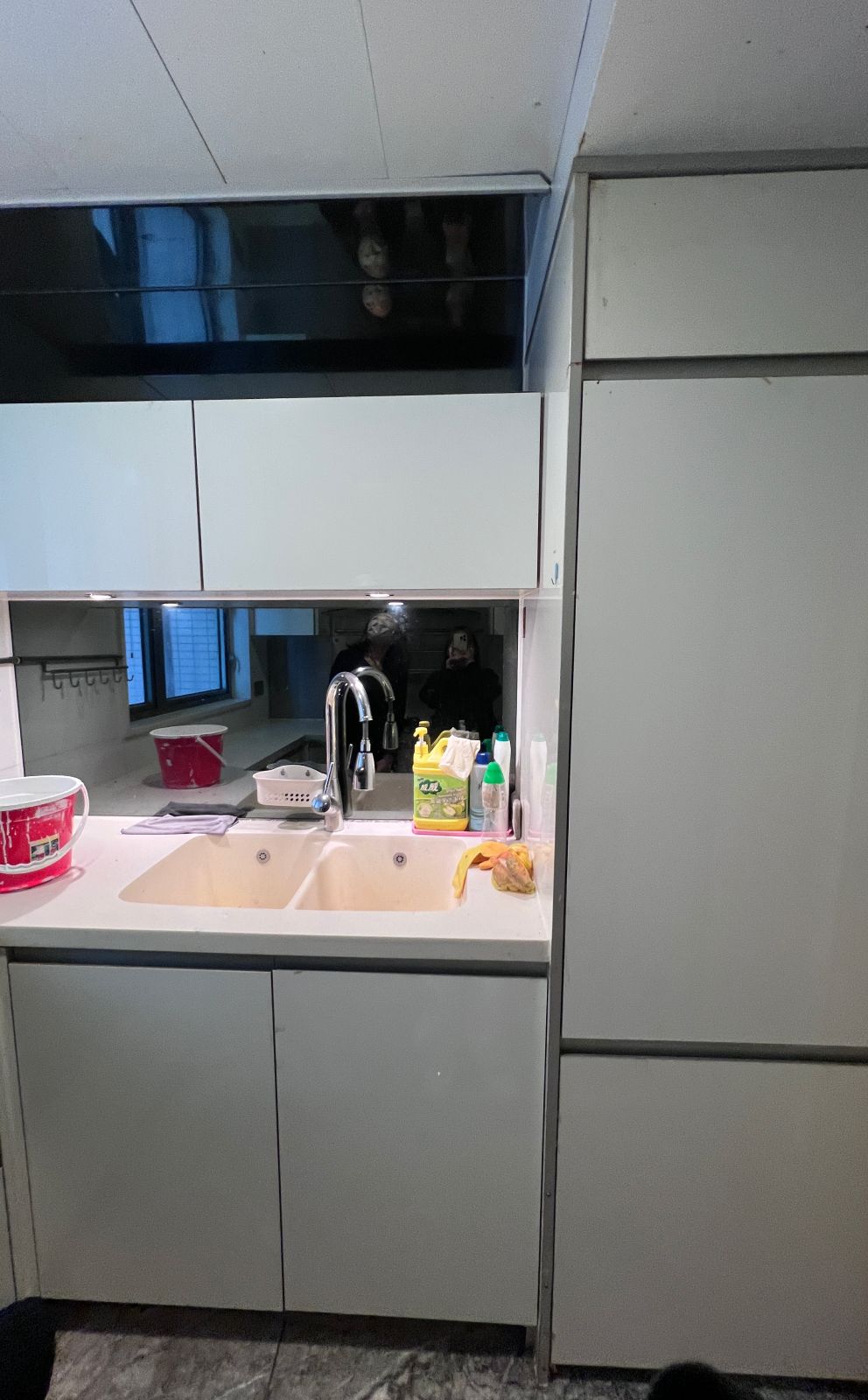
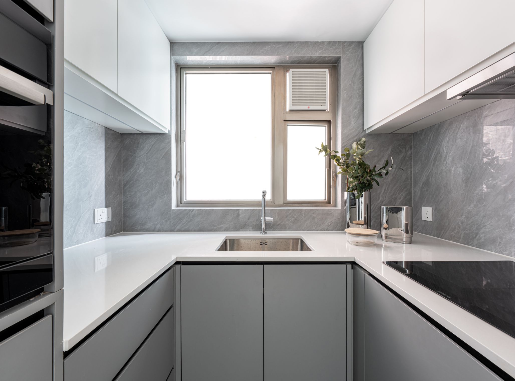
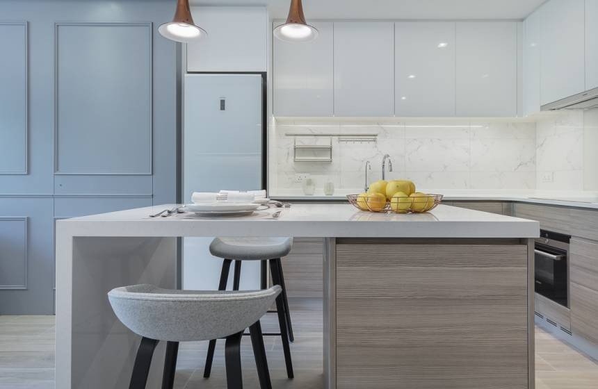
The young couple values their private time, especially moments spent cooking at home, so the focus of this renovation was placed on the kitchen space. The original kitchen showed signs of wear from years of use and lacked sufficient storage, often appearing cluttered. To better accommodate their cooking habits, the renovated kitchen features built-in appliances such as a dishwasher, washing machine, refrigerator, and kitchen cabinets, creating a more cohesive and tidy visual. Additionally, the kitchen door was replaced with a sliding door made of feature glass, further minimizing waste of corridor space.
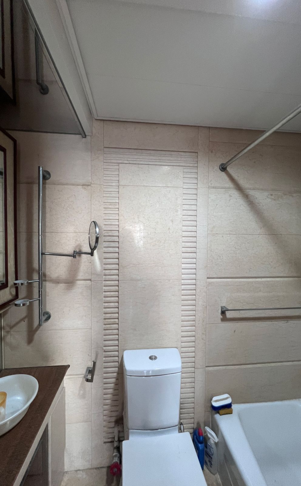
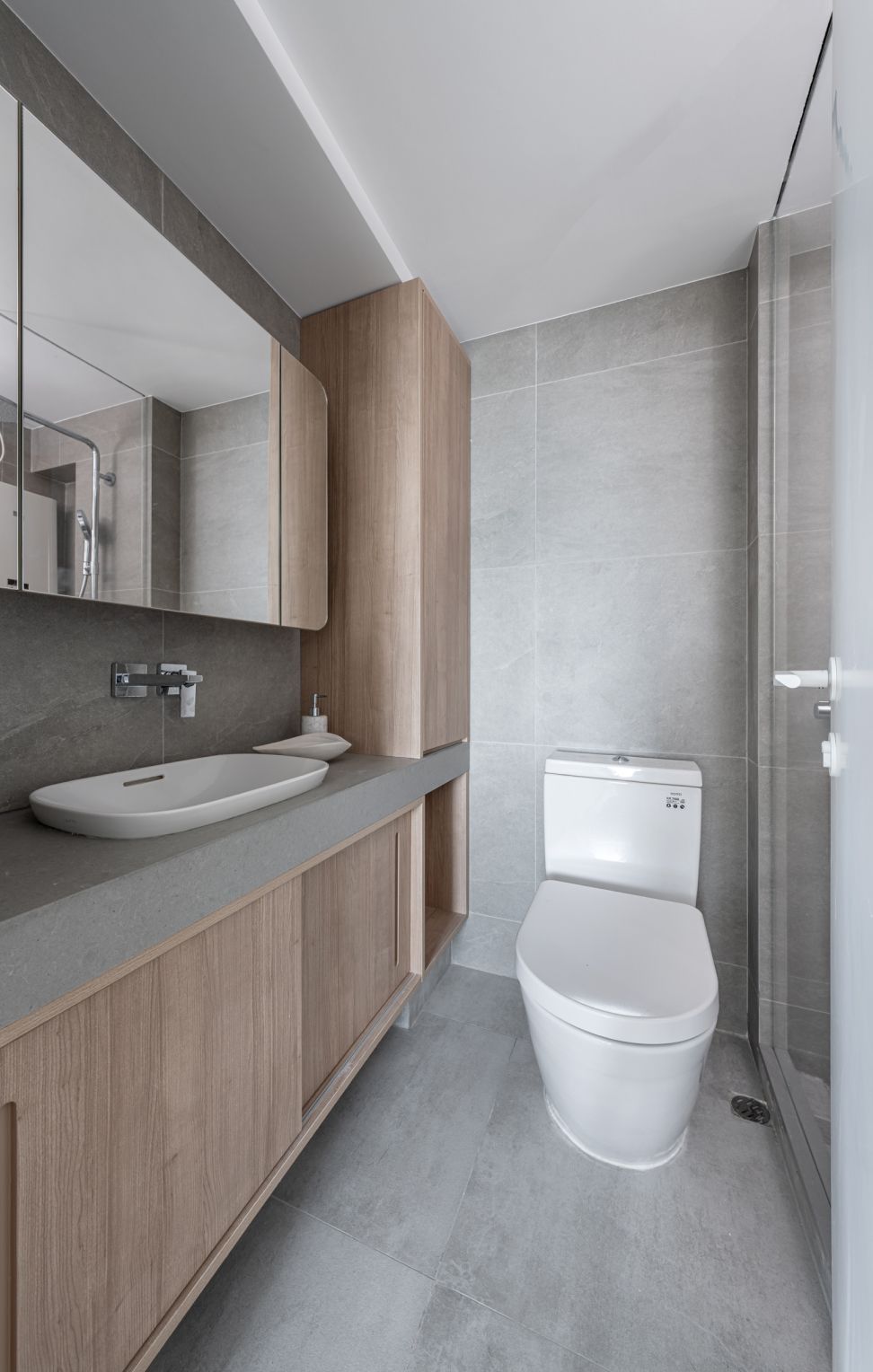
The original bathroom before the renovation was relatively outdated, with dark color tones that lacked natural lighting. Considering the homeowners' desire to bring a 'natural feel' while ensuring durability, we combined light wood and pale gray tile as flooring materials to create a more relaxed atmosphere. The use of natural stone also enhances the bathroom's durability, making it easier to maintain.

