Finding Openness in Compactness Through Semi-Open Design
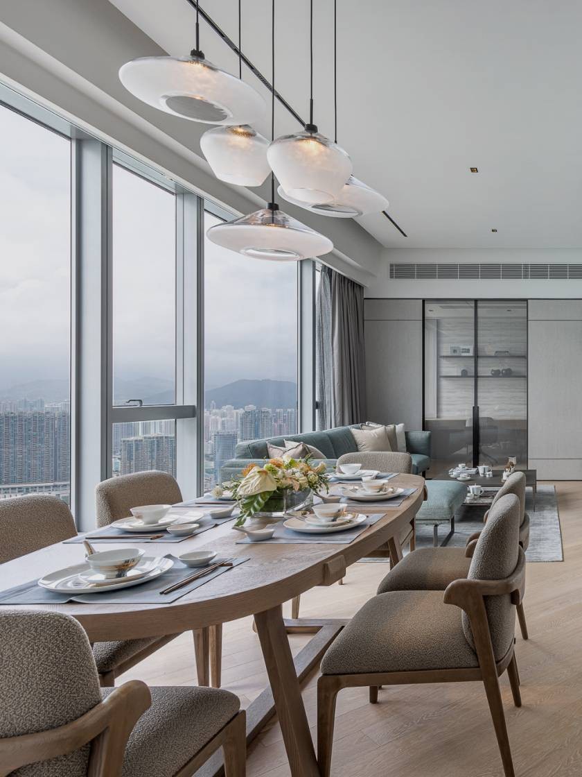
In Hong Kong, where space is at a premium, designing compact homes presents a unique challenge compared to more spacious units. The goal is to create a cosy urban haven tailored for individuals, allowing them to enjoy unrestricted personal time even within limited spaces. This time, we designed a distinctive unit for a single homeowner, who sought to shed the outdated appearance of their home. With nearly 500 square feet of usable space, the homeowner wanted to rearrange the layout and design for a fresh new look. The design objectives focused on "openness" as a core principle.
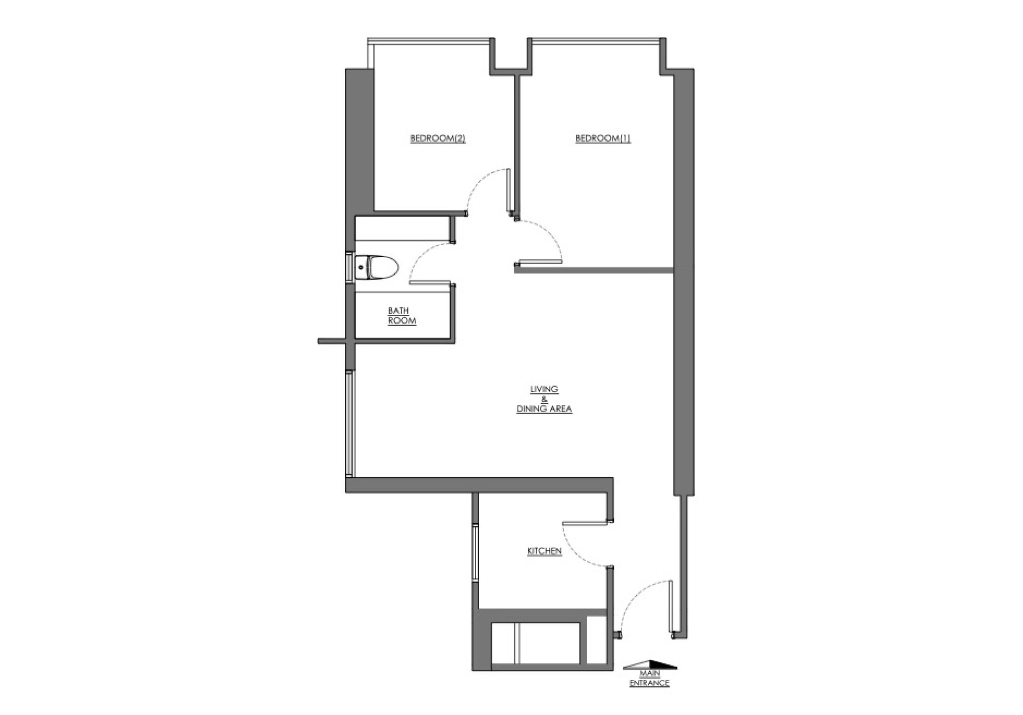
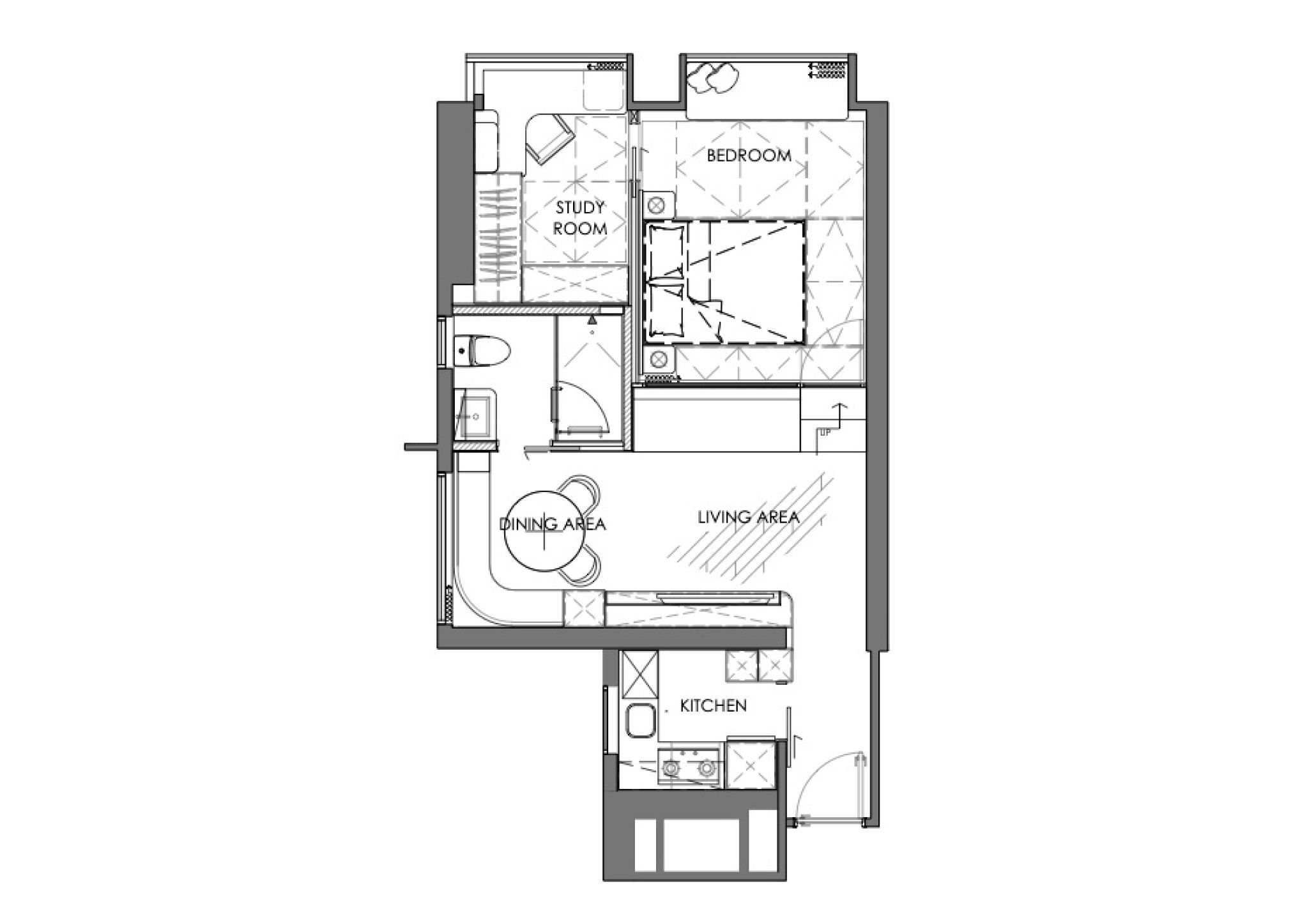
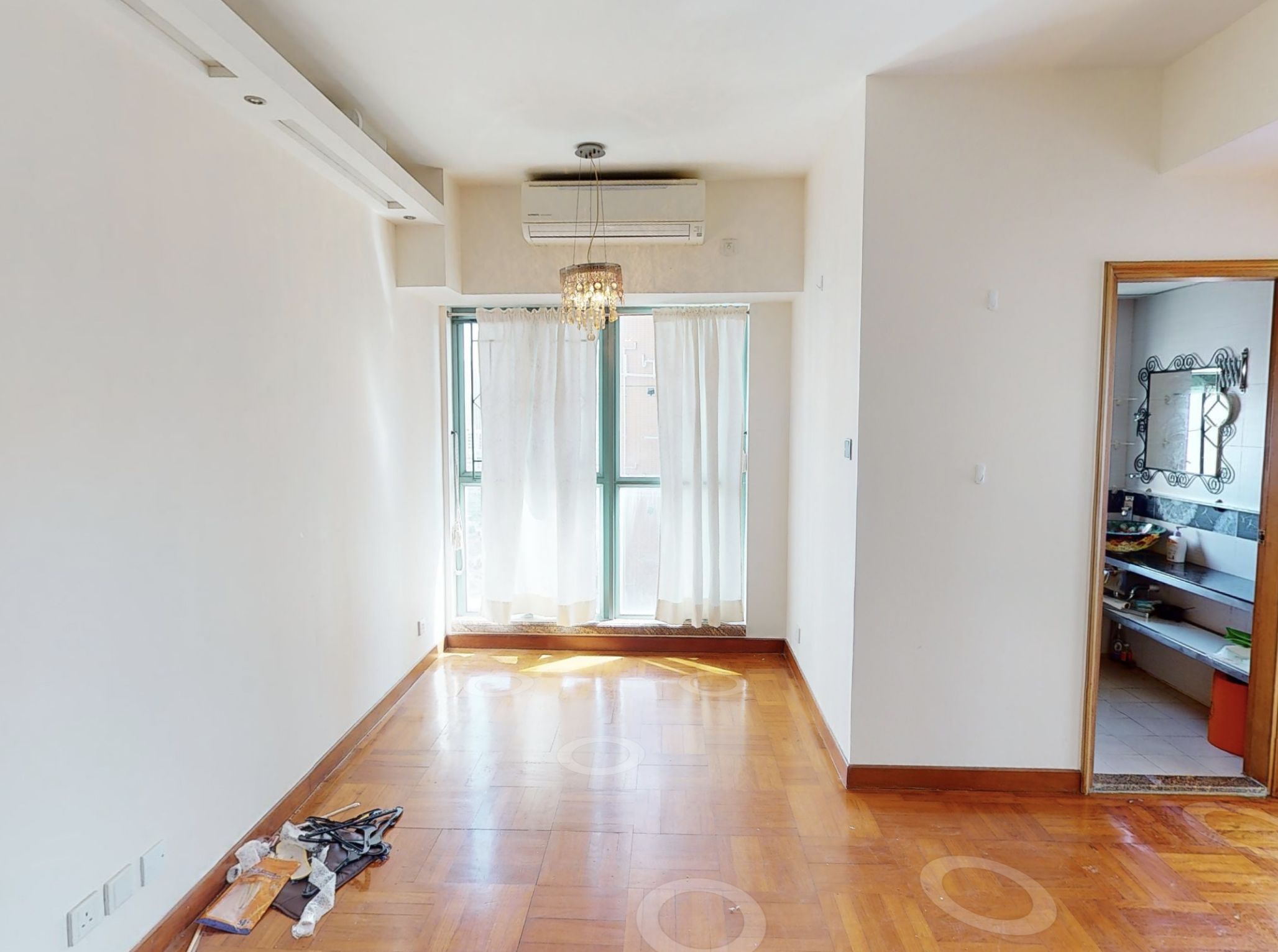
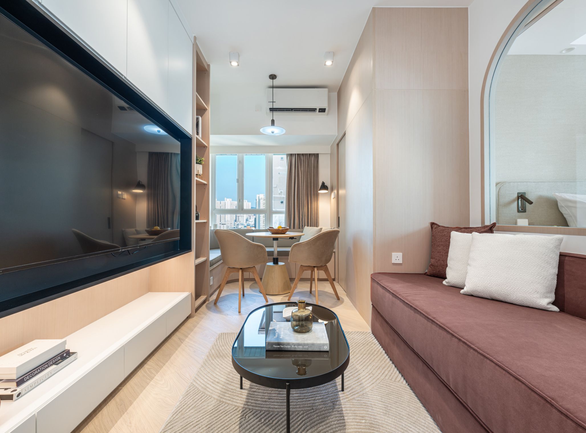
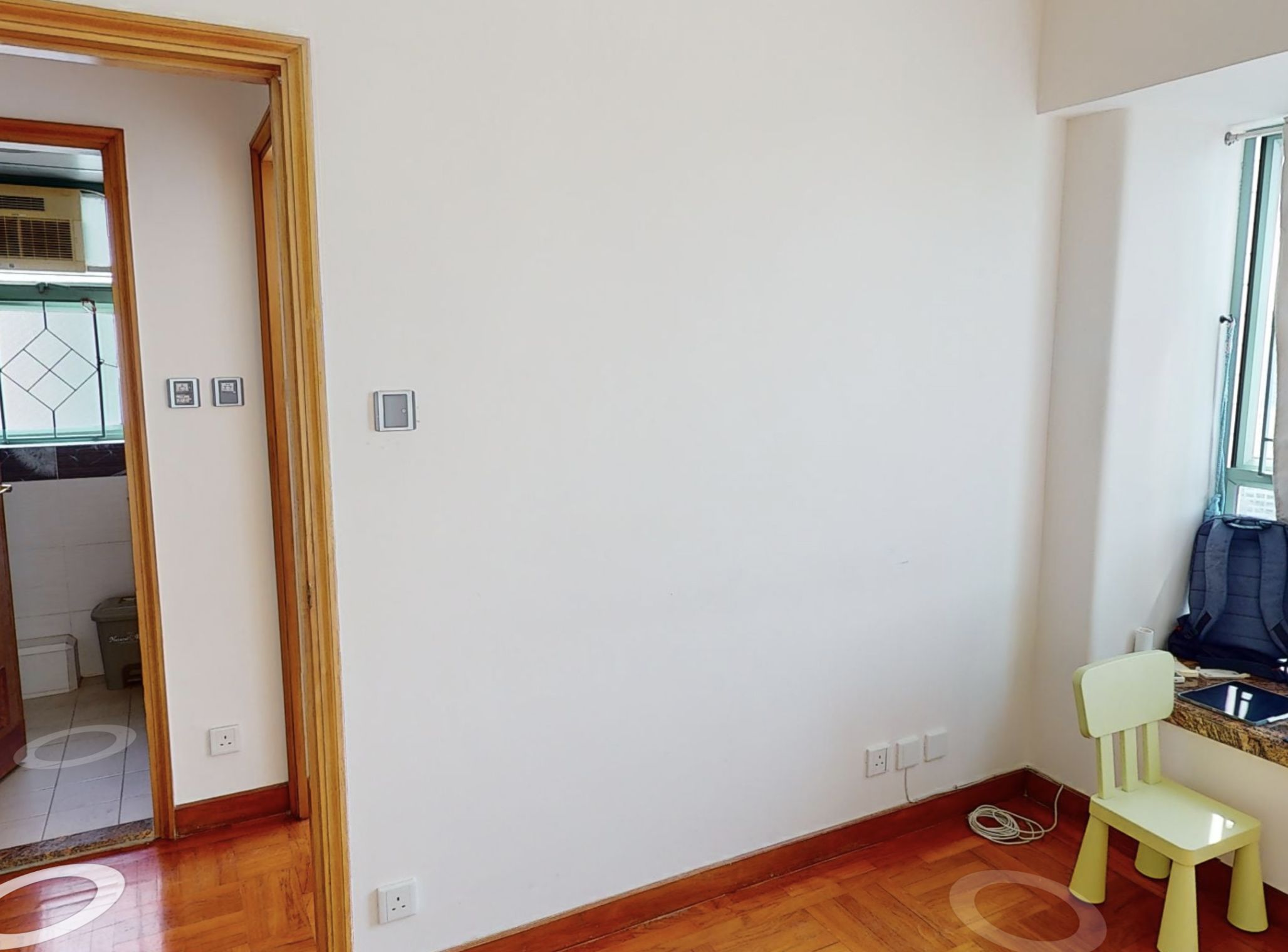
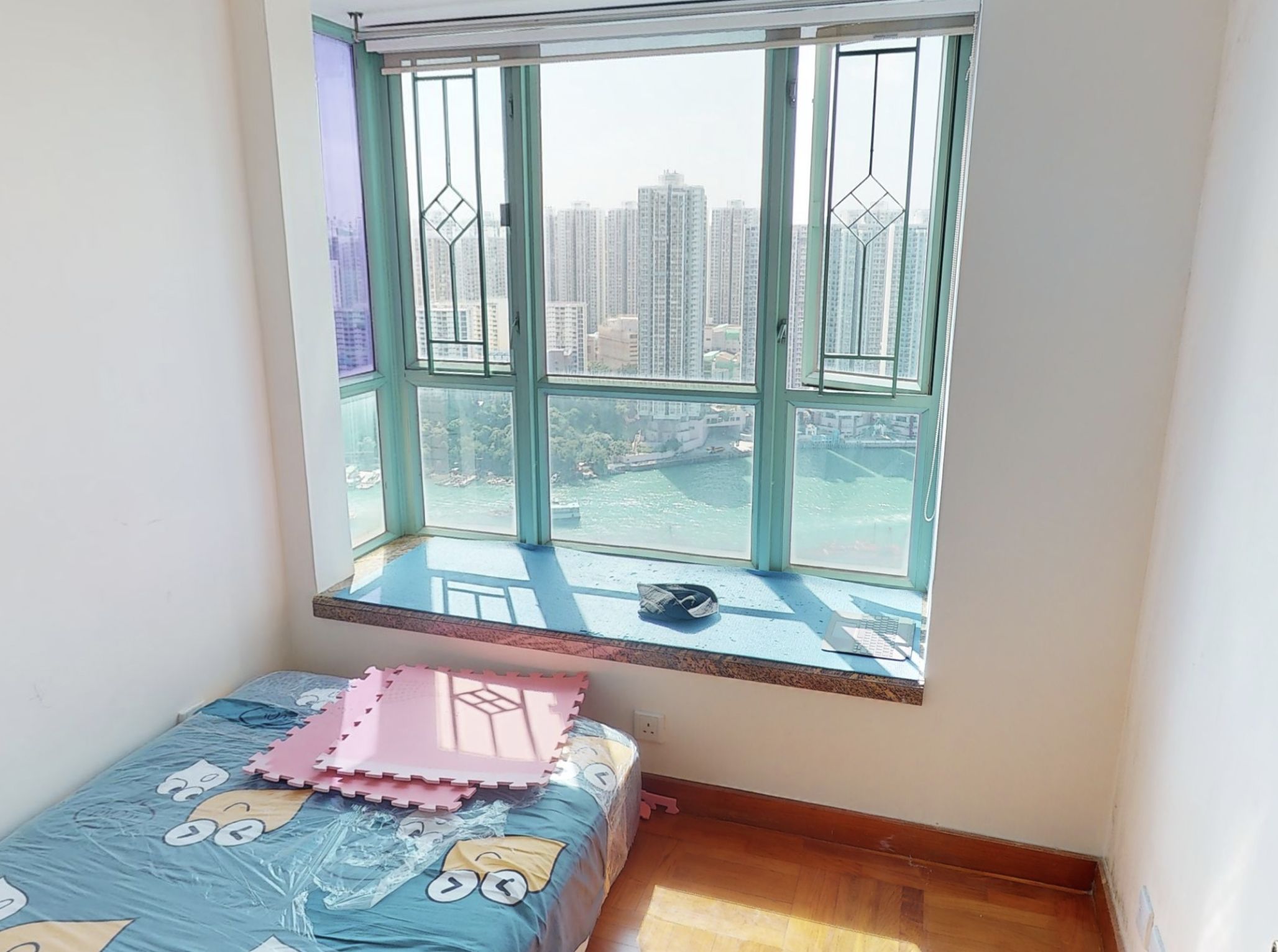
Originally, the unit featured traditional partitioning with white walls and walnut flooring. Considering the owner's desire to enhance the sense of space in the living and dining areas as well as the bedroom, we utilized light tones throughout the design. A small cushion was added to the living and dining area for the homeowner's convenience during gatherings with friends. The television area was designed using a feature wall, incorporating floating storage cabinets that avoid creating a visually cramped feeling. Additionally, LED lighting was integrated beneath the cabinets to enhance the modern aesthetic and brighten the atmosphere.
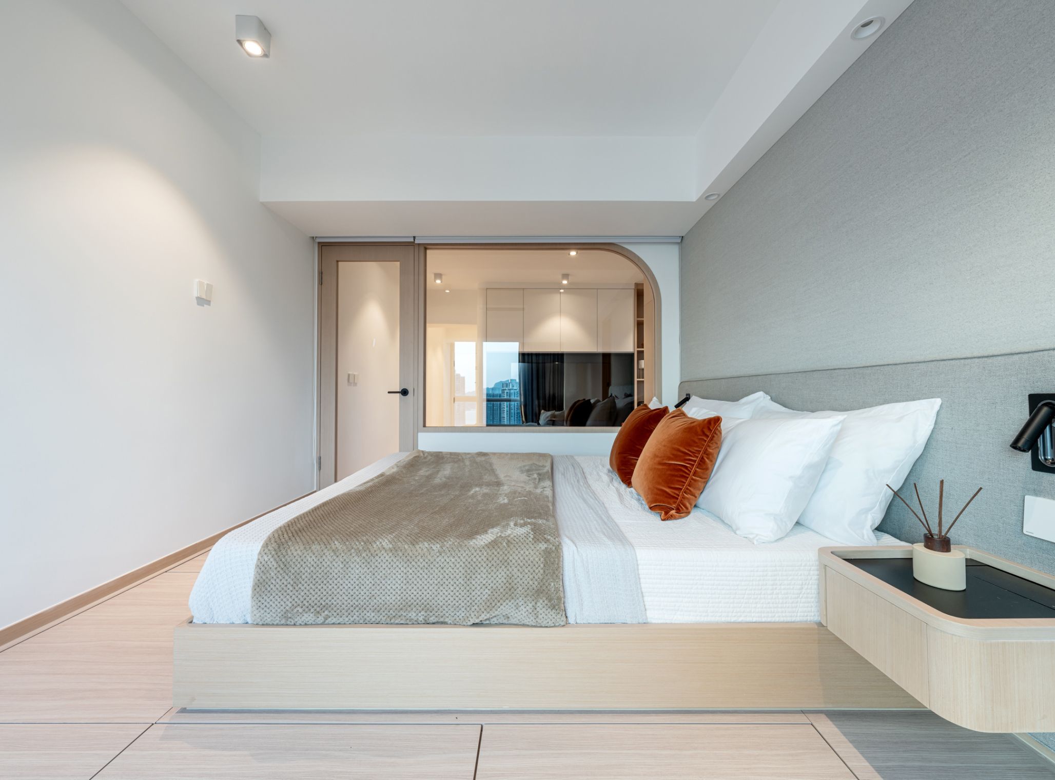
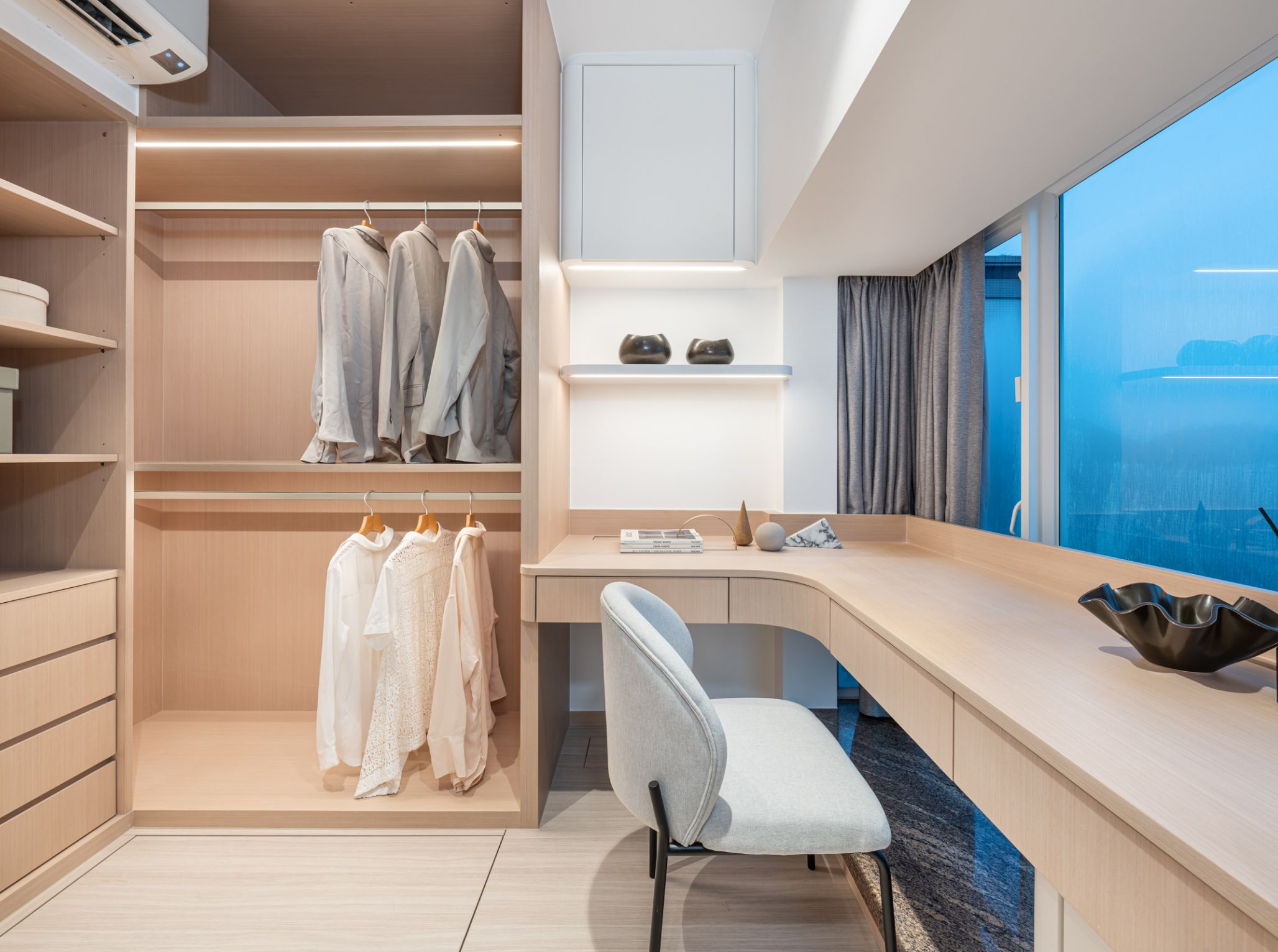
Given that the owner lives alone, privacy was not a primary concern in the design. After discussions with the owner, we decided to remove part of the walls and replace them with glass partition walls to delineate the living and dining areas from the bedroom, creating a sense of openness and expanding the functional space. The glass allows for ample natural light, reducing the need for excessive task lighting. The enlarged master suite includes enough space to create a study and a walk-in closet, both intentionally situated within the bedroom area to retain a sense of privacy. The study also features a sliding door design that saves space, making efficient use of every available inch of space.
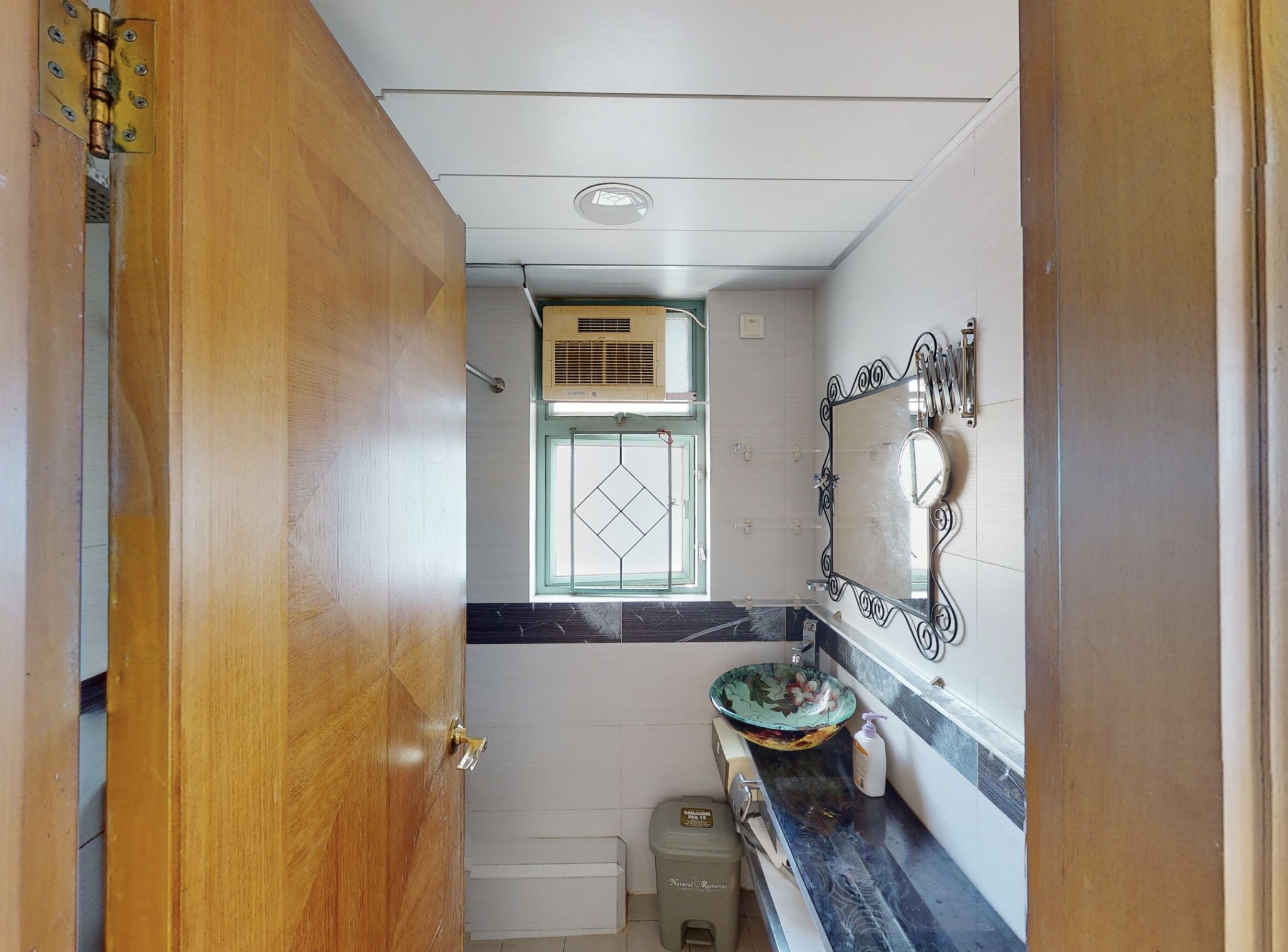
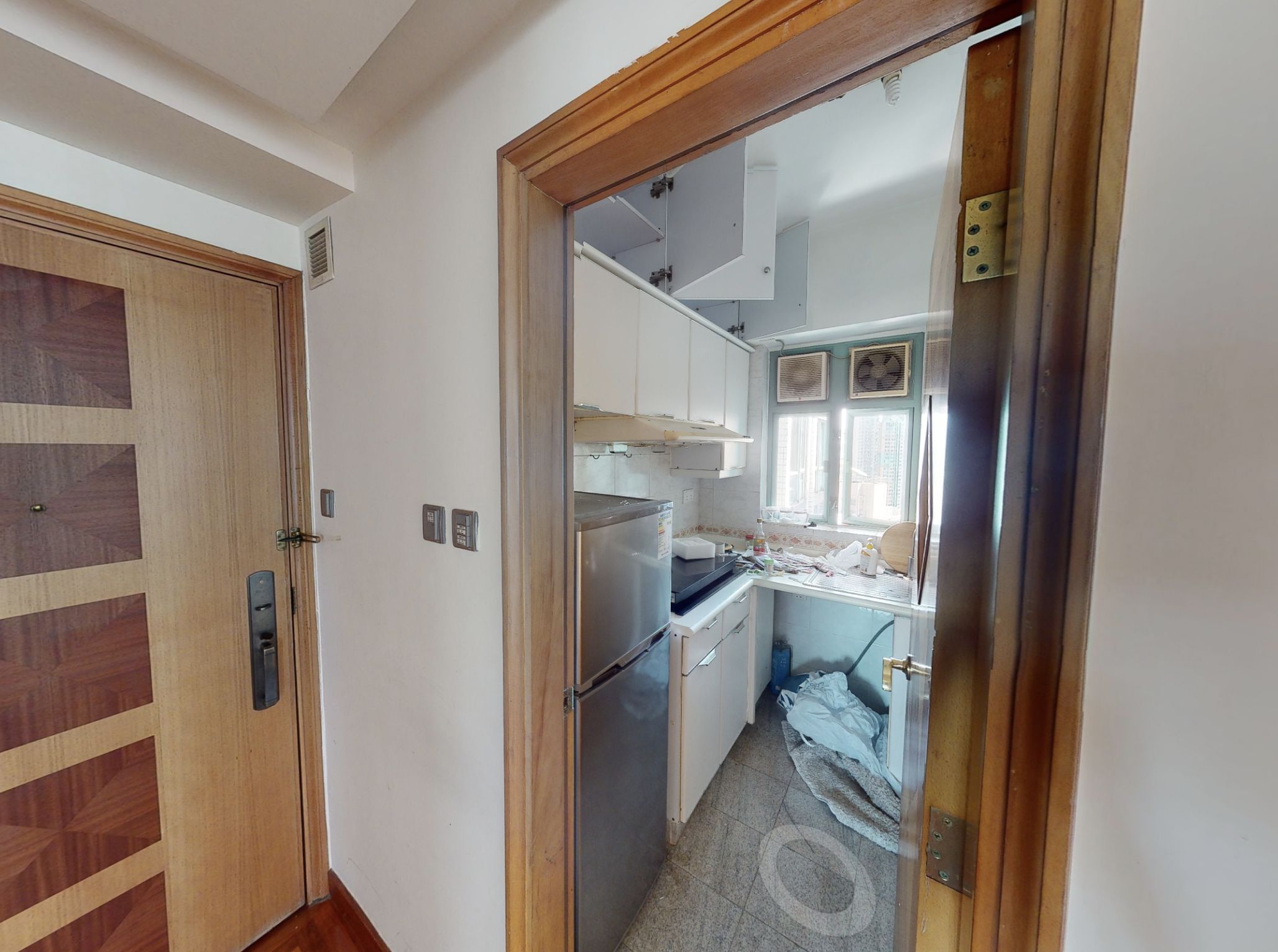
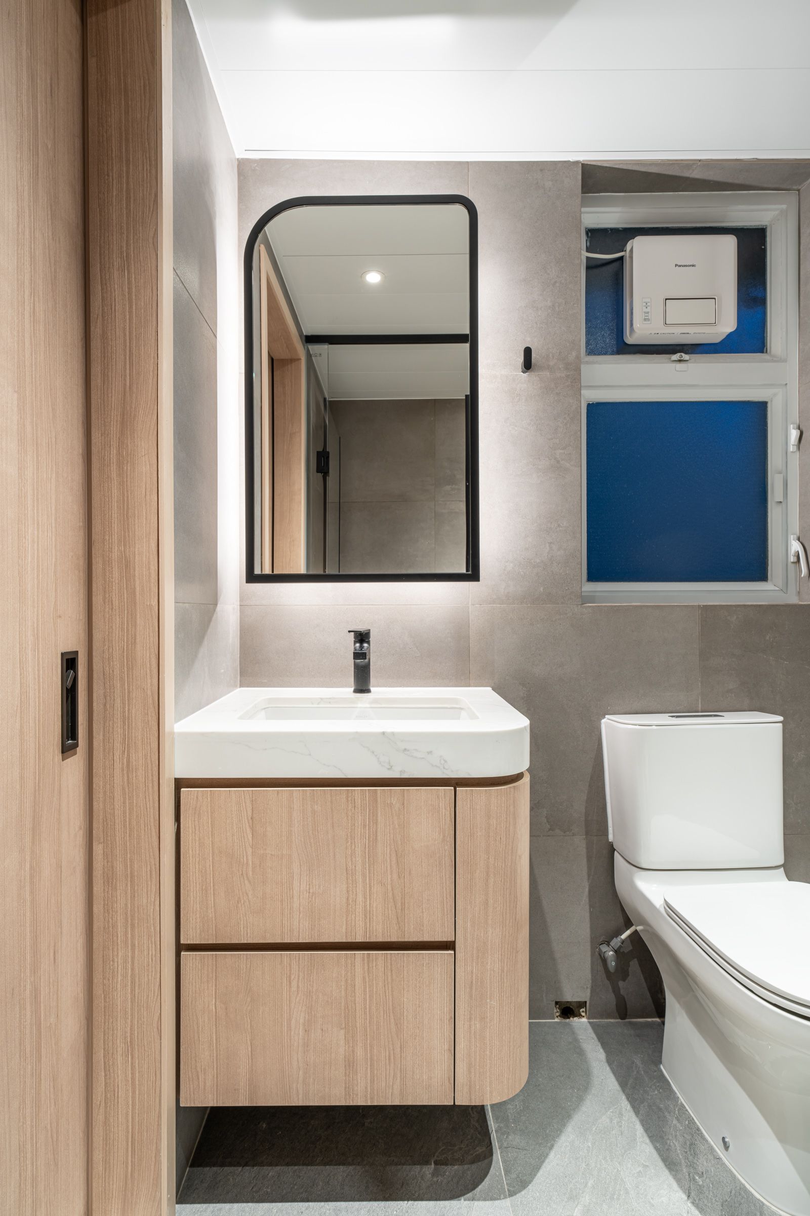
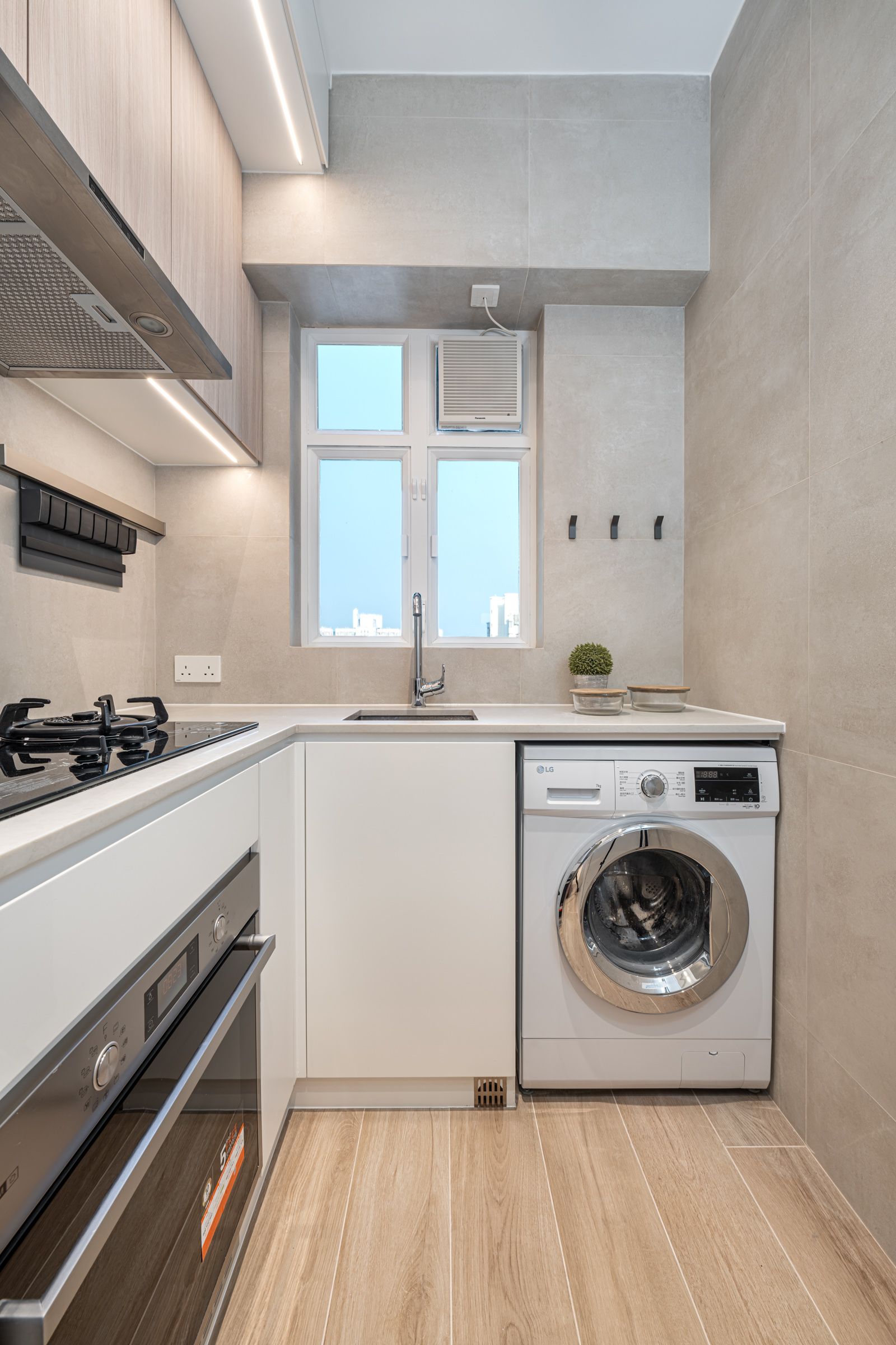
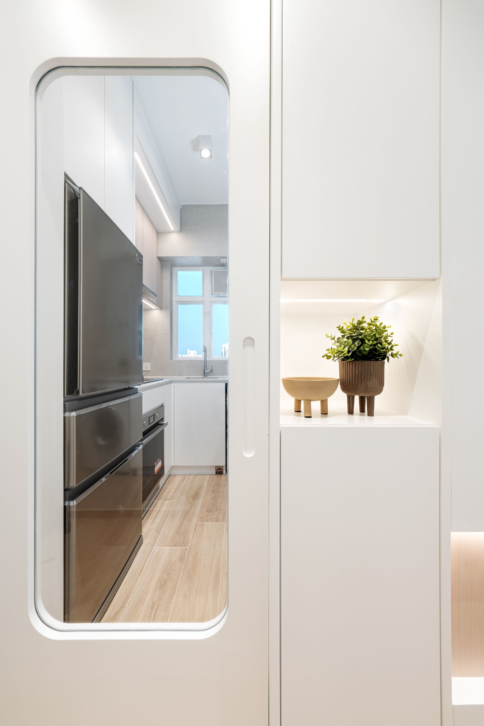
The original bathroom was also demolished and integrated into the master suite as the main bathroom. We replaced the typical door with a sliding door design, using a simple light wood tone throughout to create the ambiance the owner envisioned. The kitchen retained its original location but now features a glass door to maintain a cohesive feel with the living and dining areas. It also remains bright and minimalist, utilizing tile finishes to make the space easier to maintain.

