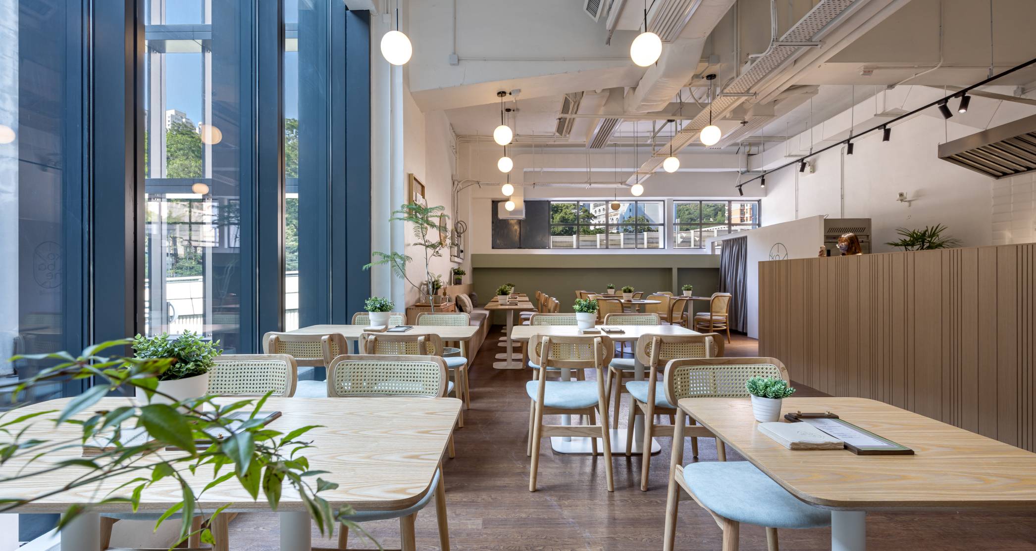
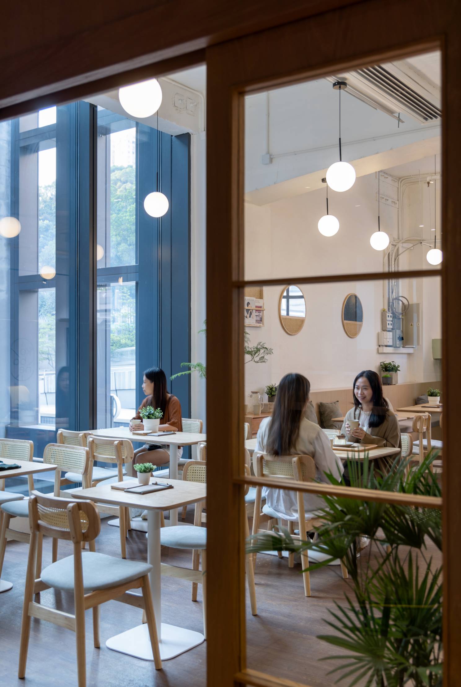
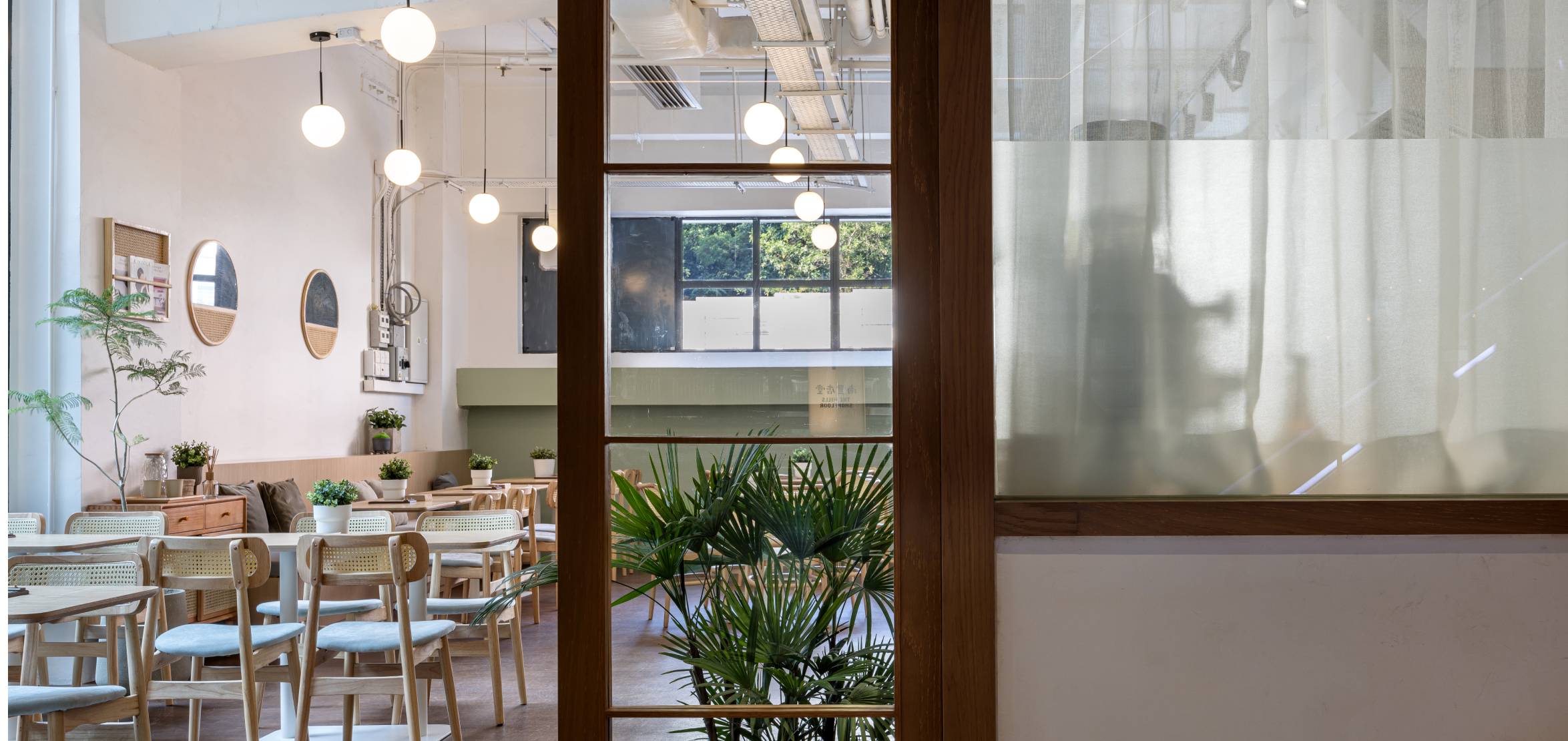
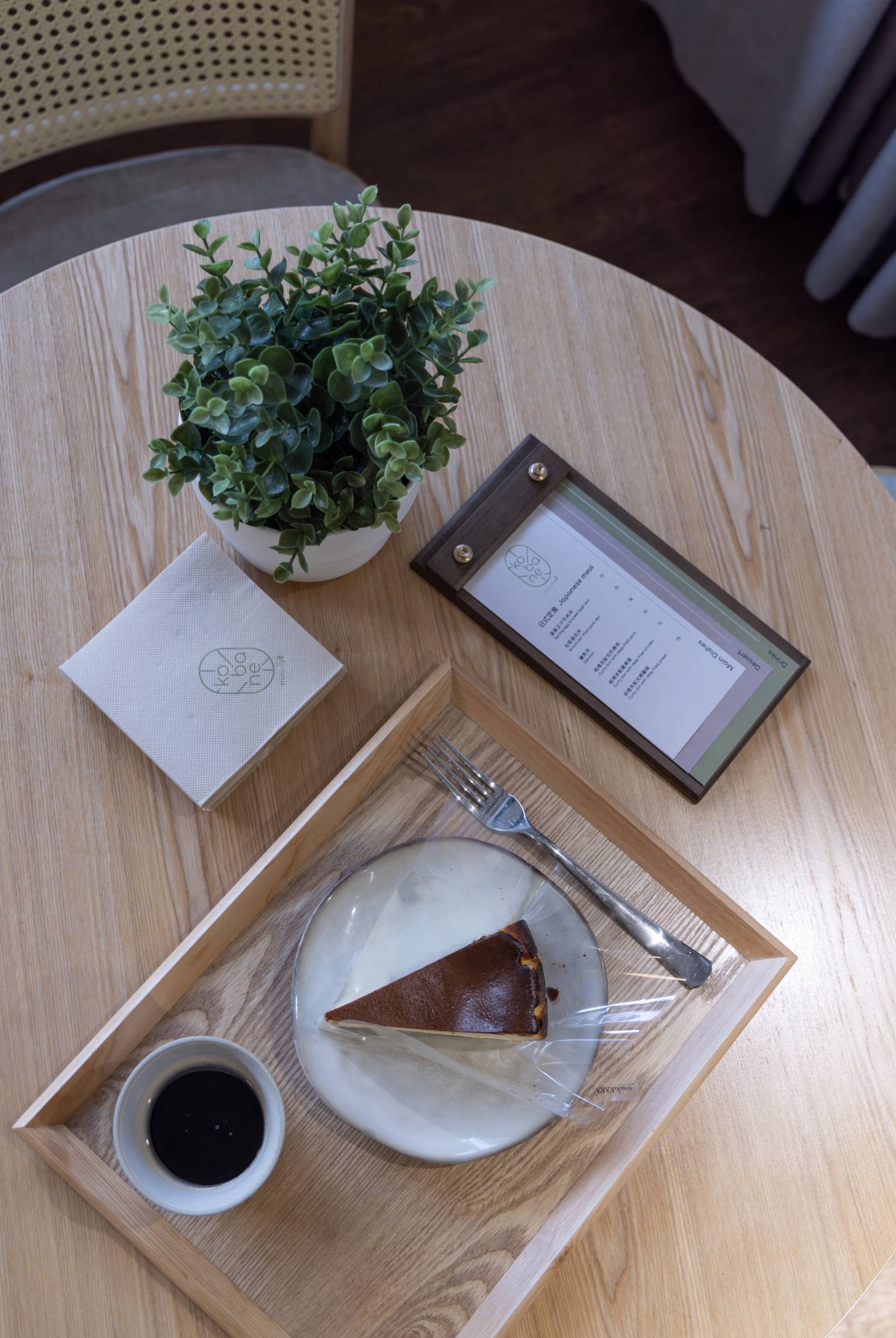
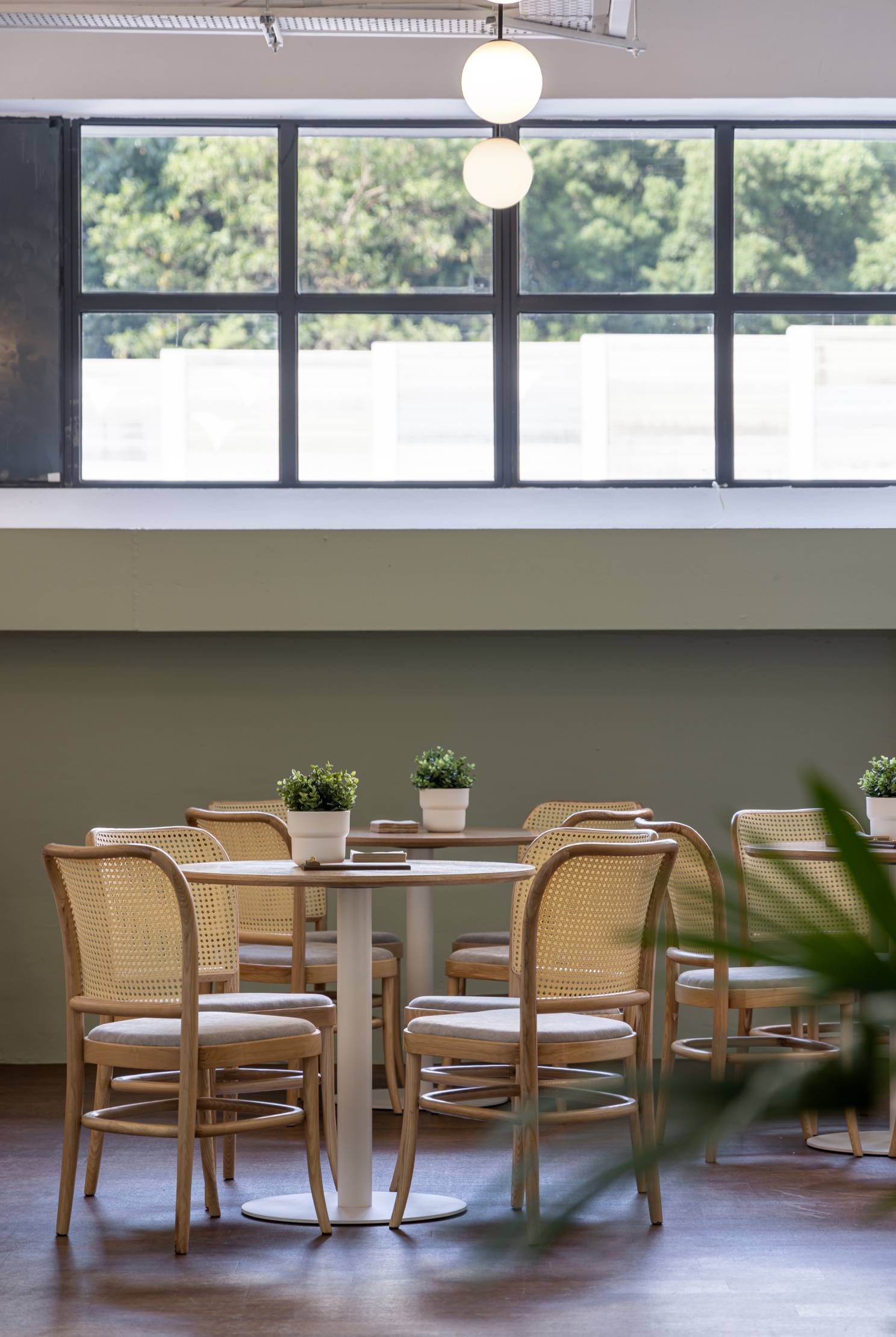
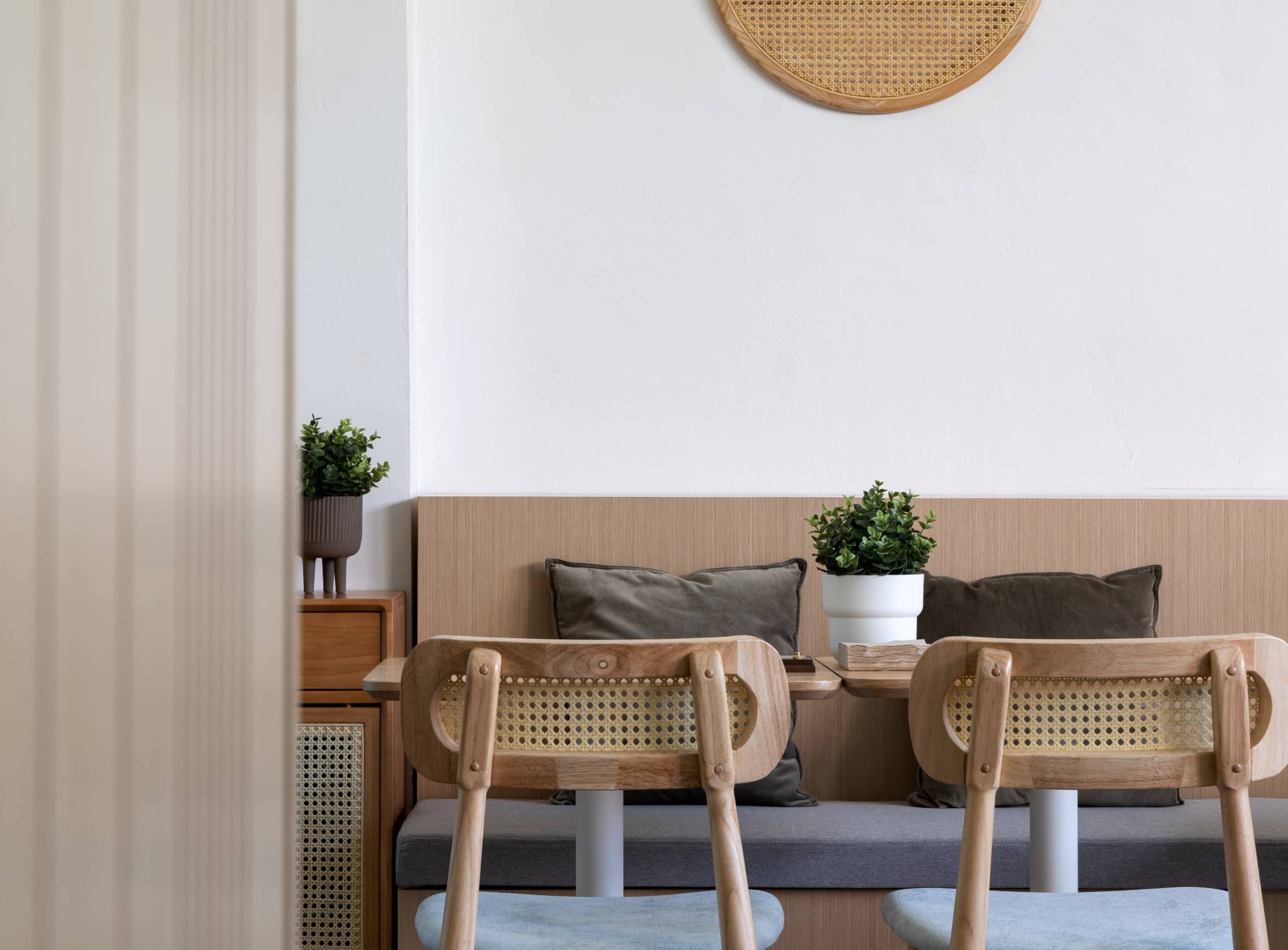
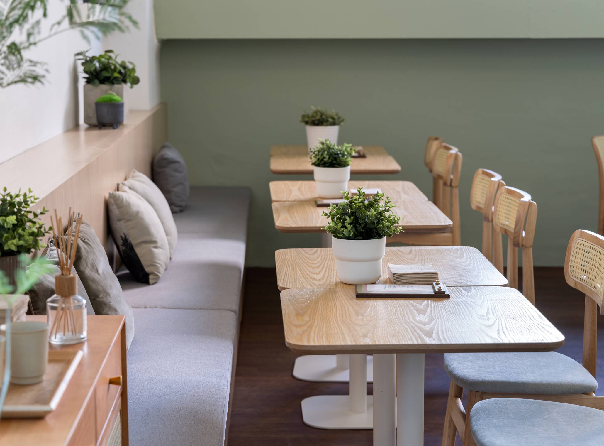
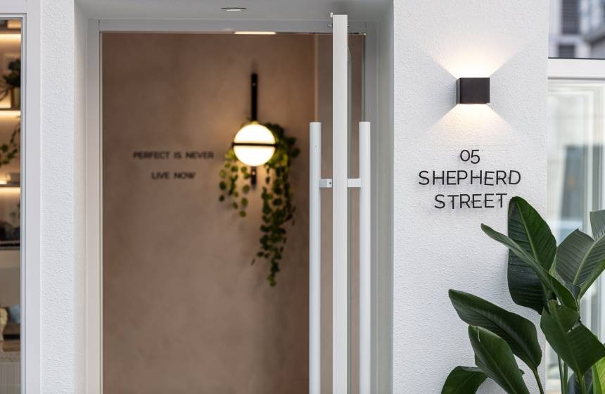
A woody aesthetic is running through the restaurant in a soft setting aura. Using wood as a material palette is the focus to interpret the cleanliness on effortless Japanese-style interiors with minimal sensations, while colors are mild to invite natural lighting go through the space, mixing with several details like bronze, rattan chair panels, and greenery for some layerings.
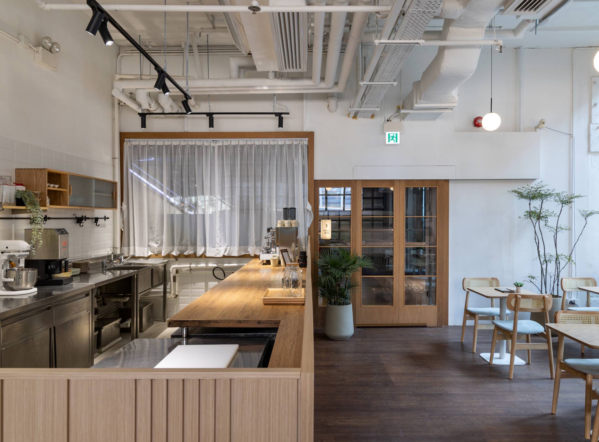
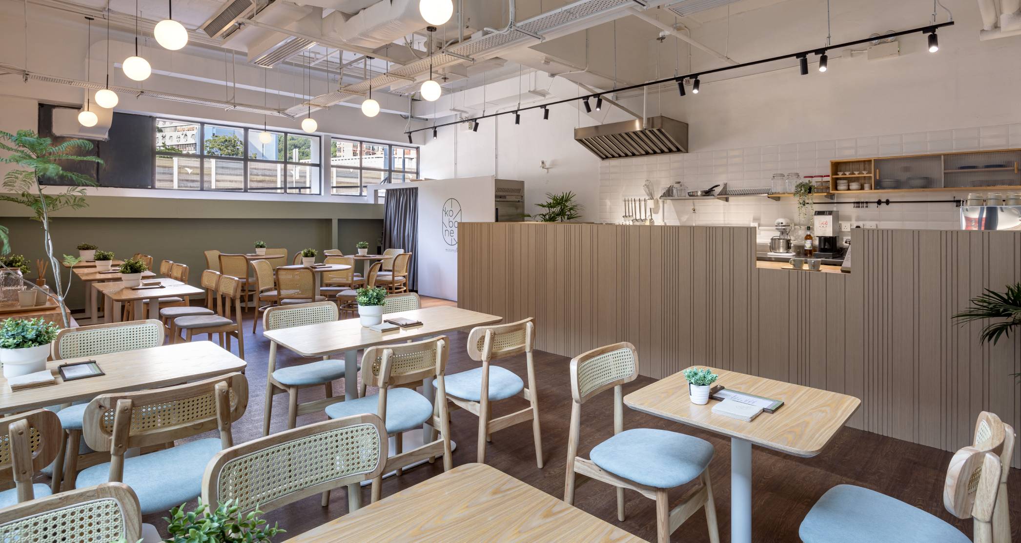
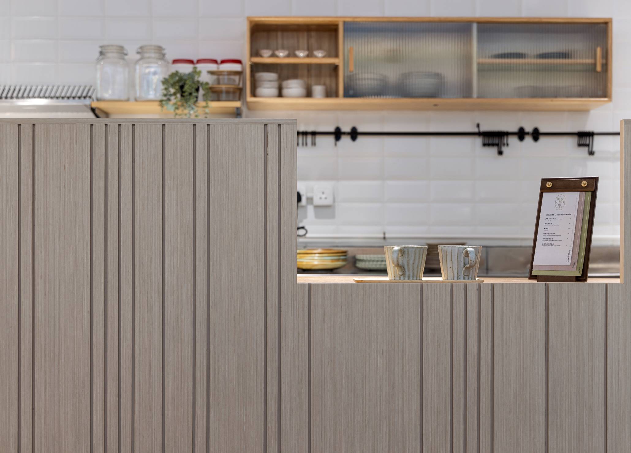
At the entrance of Kobane, a wood-framed glass door decorated as an opening for this Japanese cafe to welcome visitors, planters and greenery are everywhere when stepping into the cafe to give a Japanese natural blend with wood aesthetics. The kitchen is located at the side with a wide wood-made panel decorated with a unique stripe pattern, guilelessly brings in the vibes.
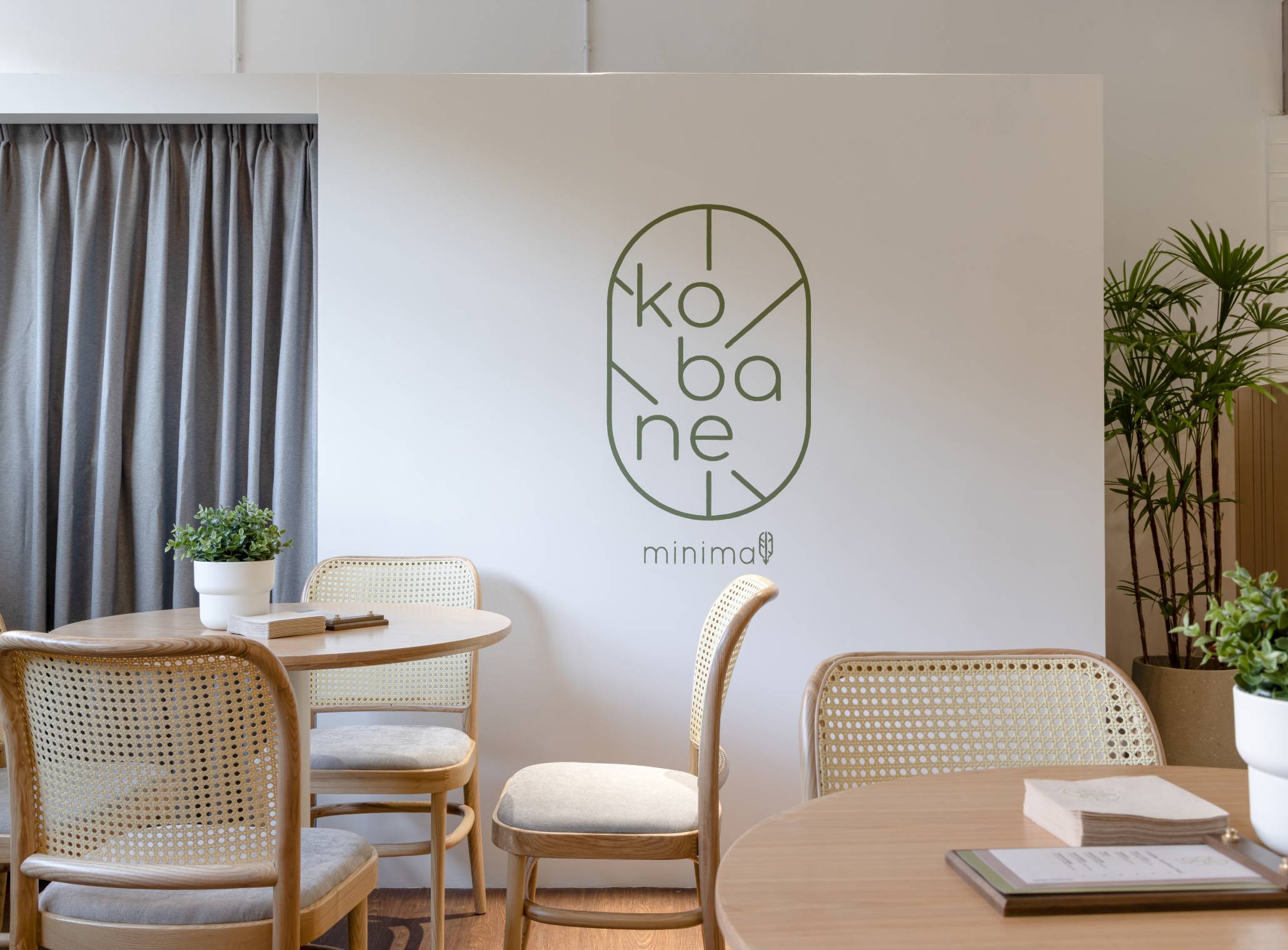
Equipped with several wood-made table and chairs, orderly placed with tiny spherical-shapred soft light pendants on the ceiling, this area is blending in nature into indoor space with the use of materials for a relaxing Japanese-style sensation. At the more inner part of the cafe, a feature wall that is printed on Kobane logo is being a focal spot to stand out the brand image.
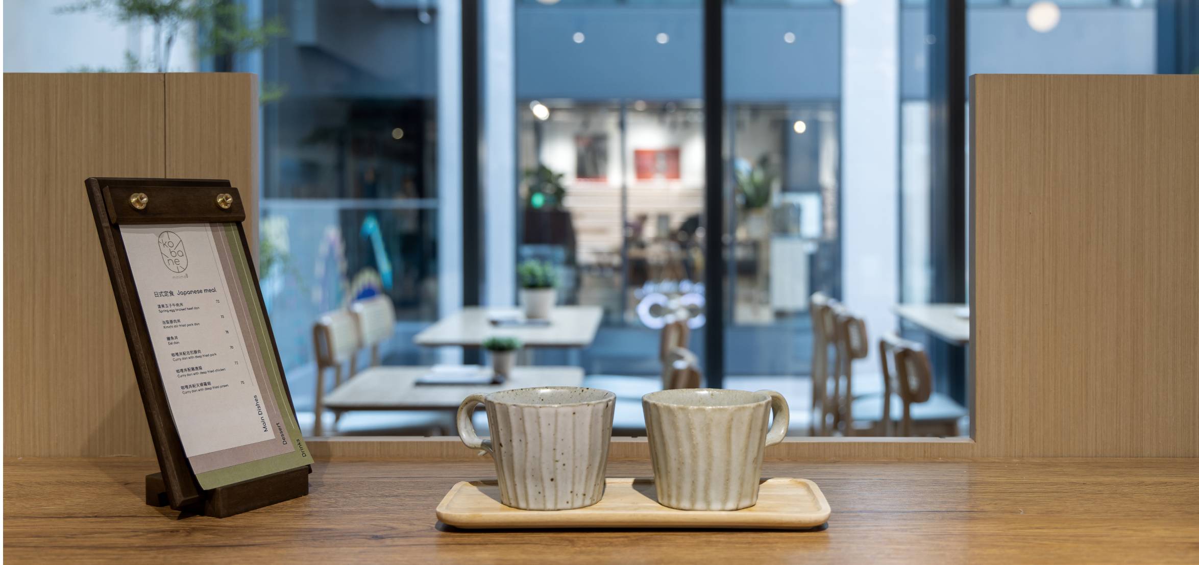
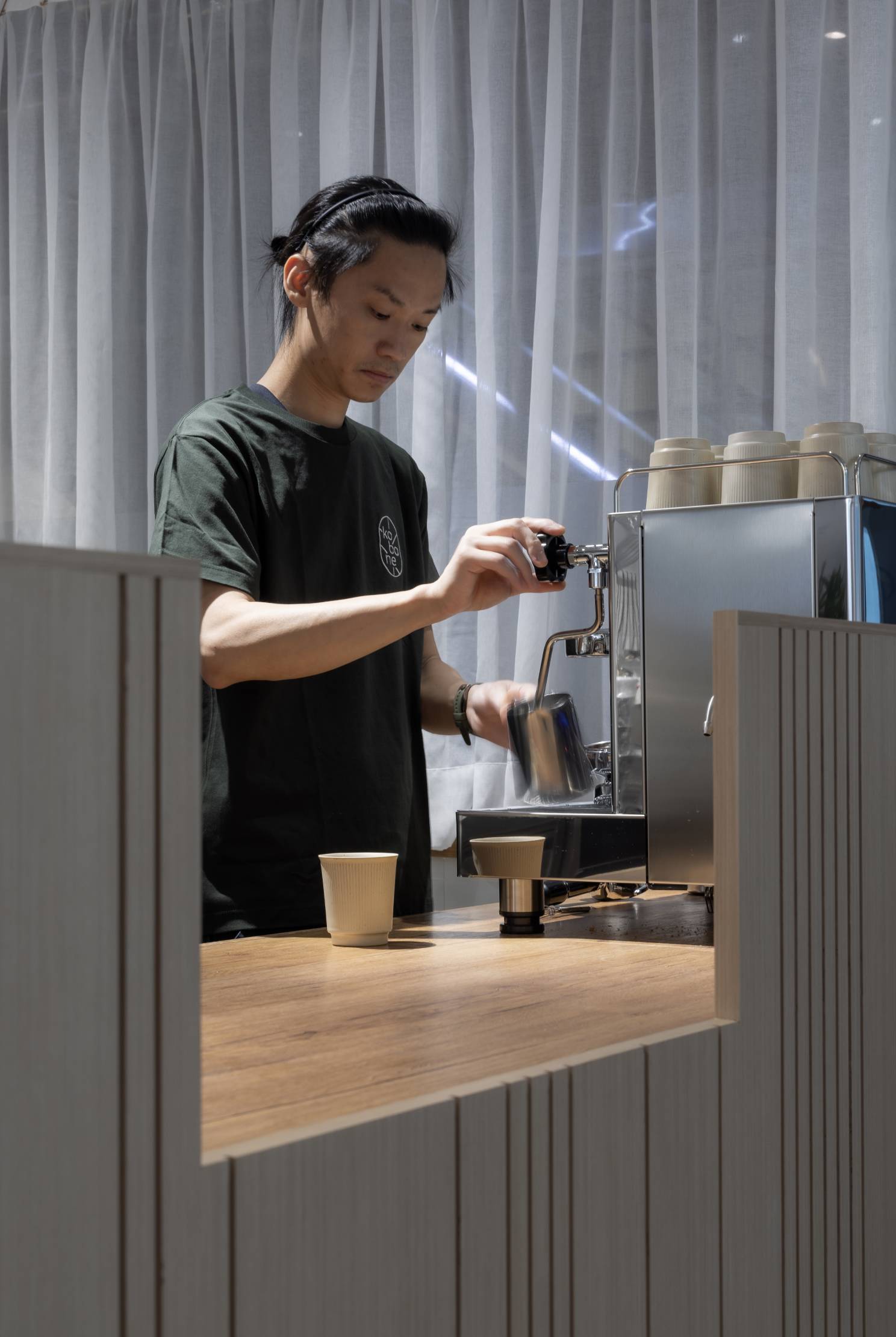
Apart from completing a space design and planning for Kobane, a range of branding service has also been done to illustrate the brand DNA and bring life to the space design. Covering from a signage design at the seating area, menu and staff’s uniform design, bringing the prominent image of the cafe with all elements together.

