Exhibiting a refined sense of space within simplicity
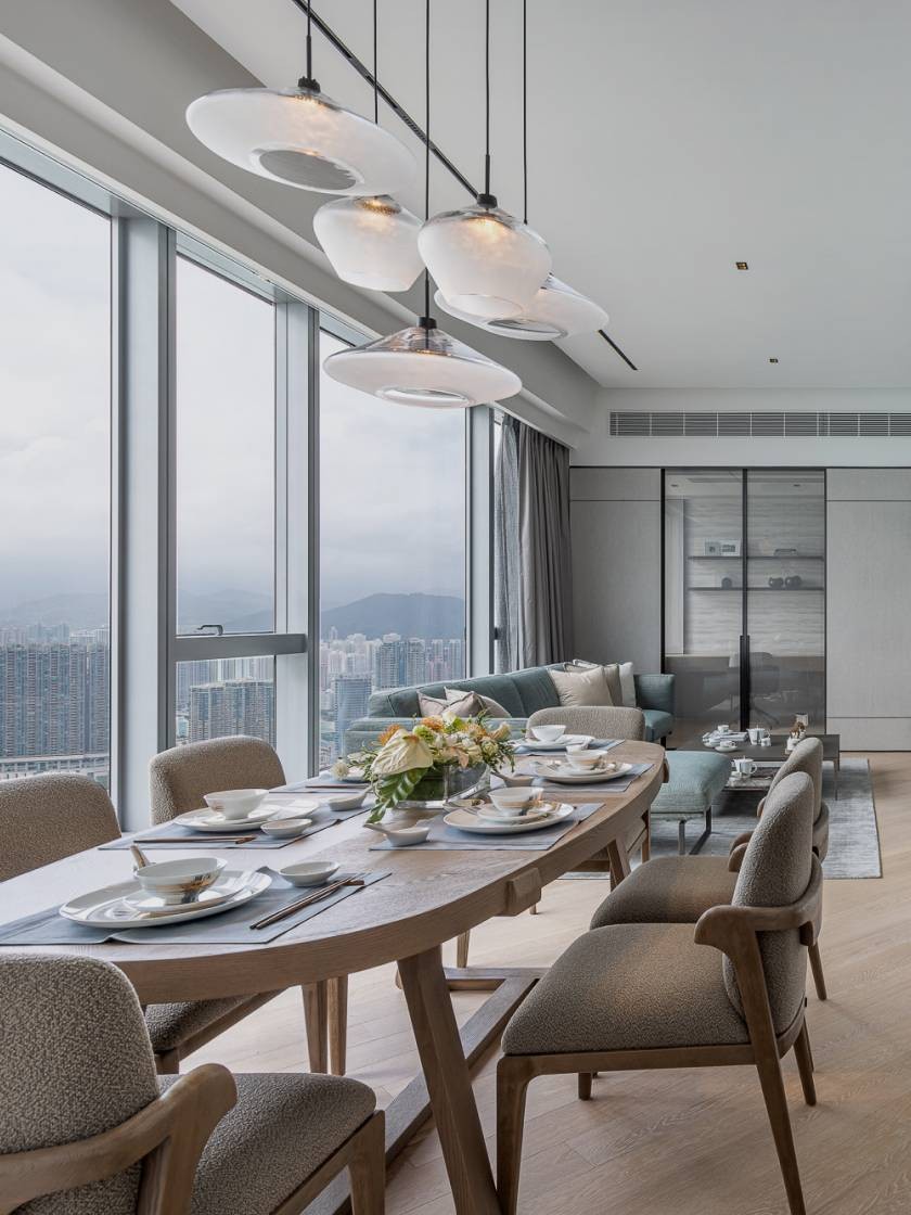
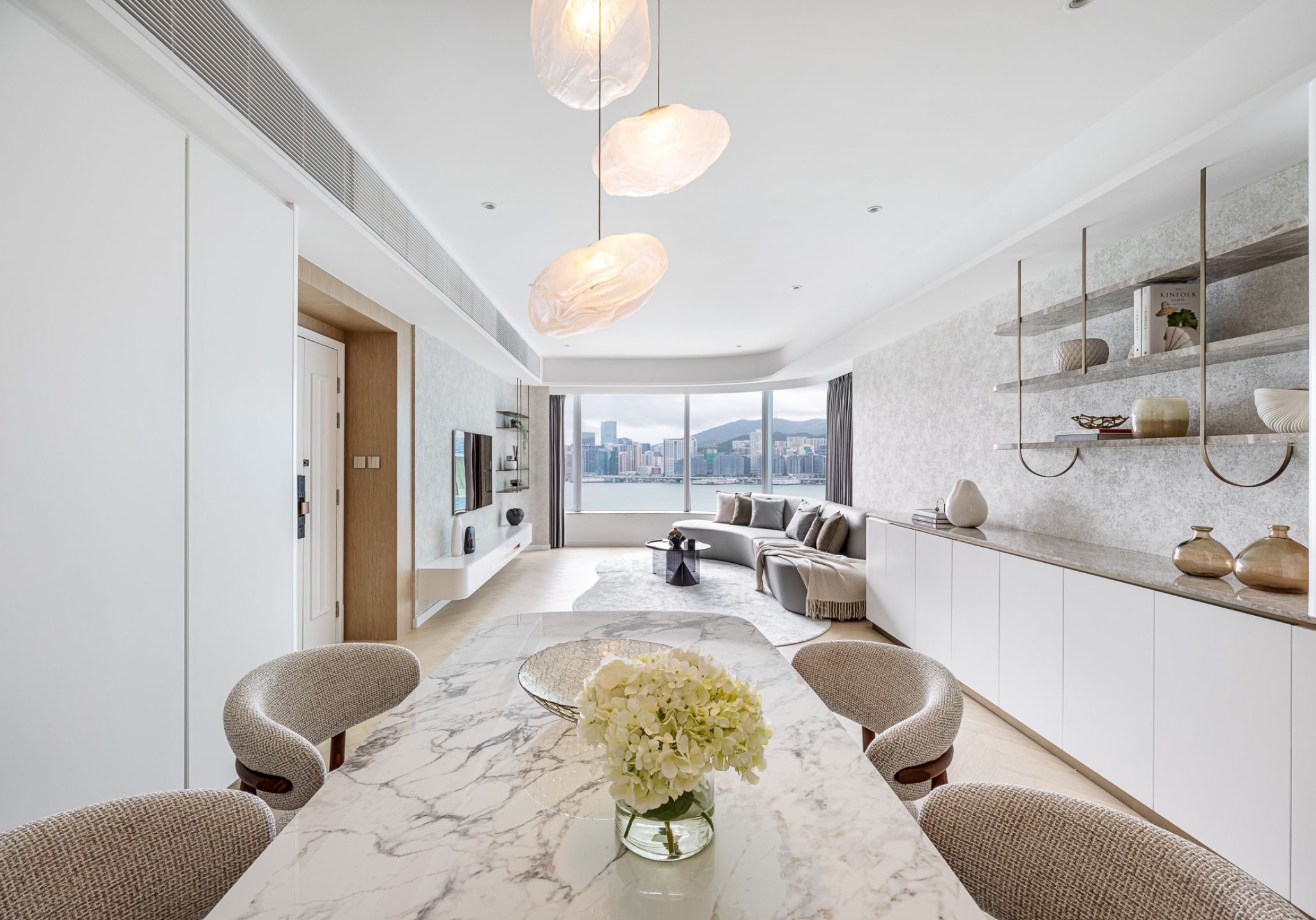
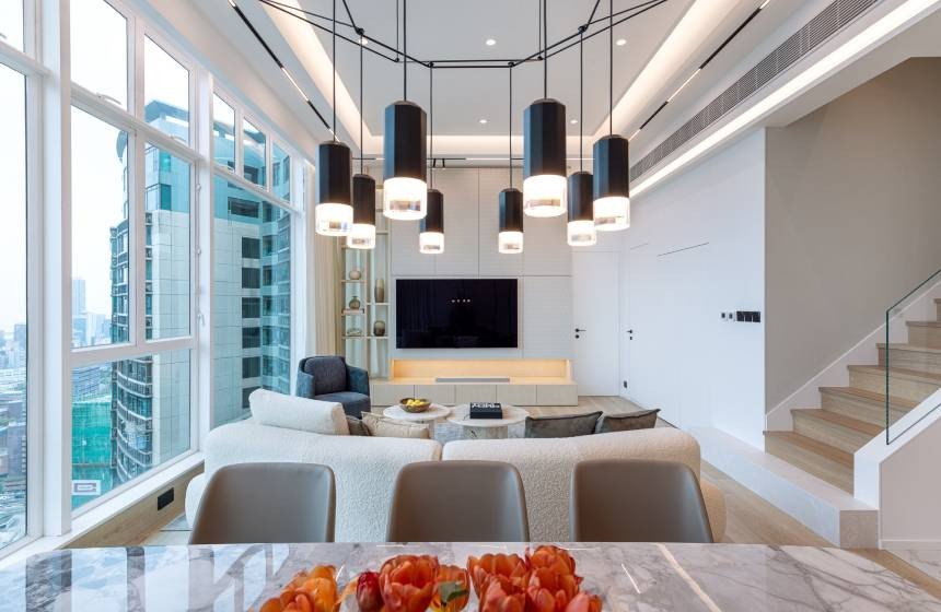
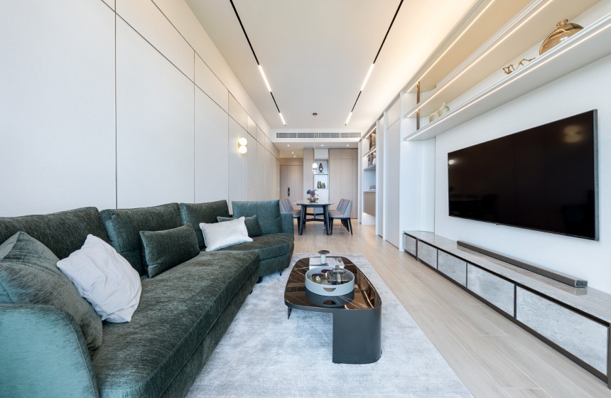
Located in Hung Hom, an upscale residential, Harbourfront Landmark boasts an expansive area of over 1,400 square feet. The elongated living and dining room features a distinctive curved glass window that offers a glimpse of the harbour. A family of three, with the two owners preferring a simple straightforward style, avoiding excessive ornamental elements, while the other one desires an elegance and comfortable living space, our designer Maggy skillfully combines these two ideas, by merging "simplicity" with "refinement." She uses a serene cool color palette, primarily light grey, to carry out through the living space. Complementing the curved glass window, she gently sculpts furniture into curved forms, emphasizing the textures in space within the tranquil color palette.
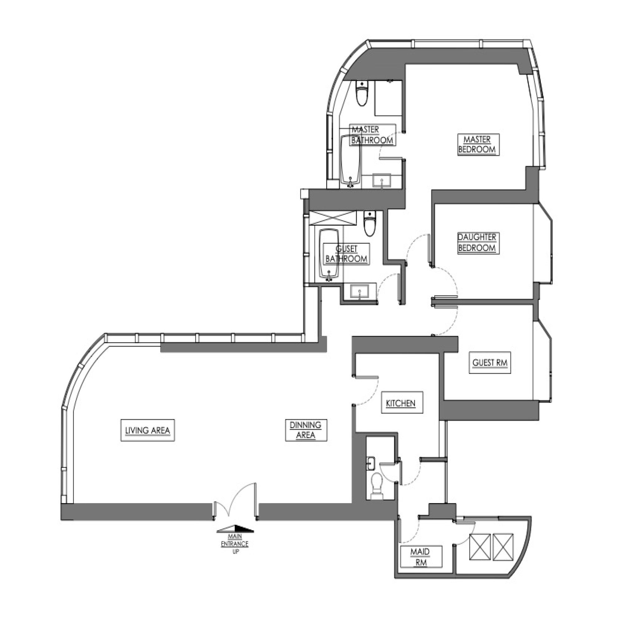
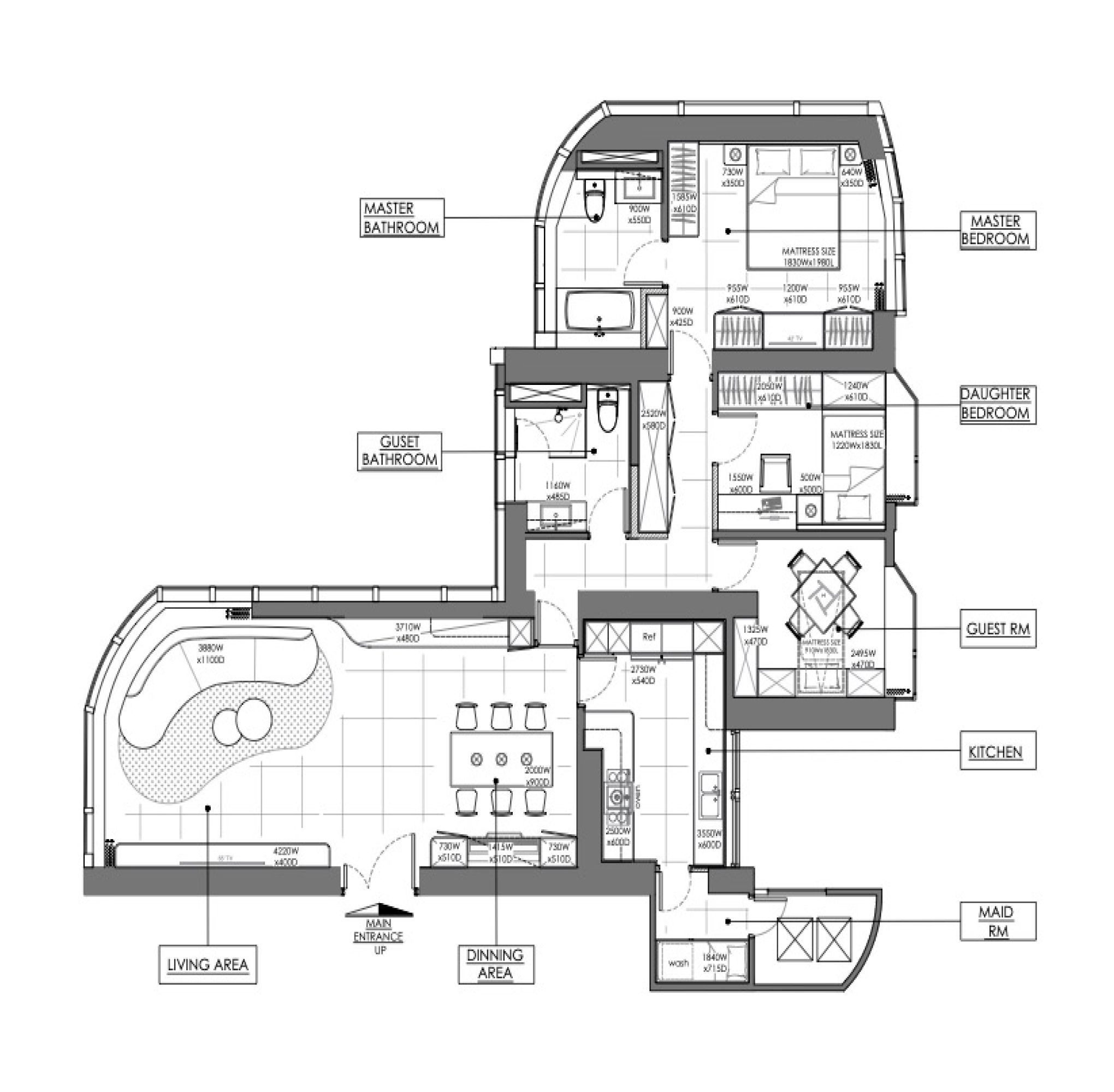
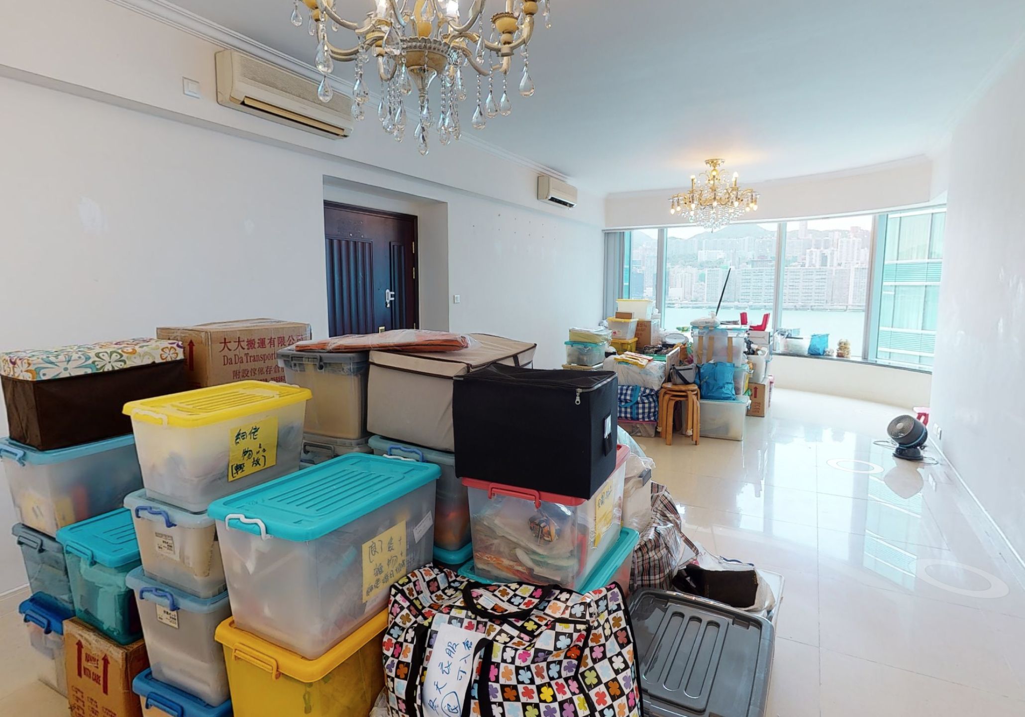
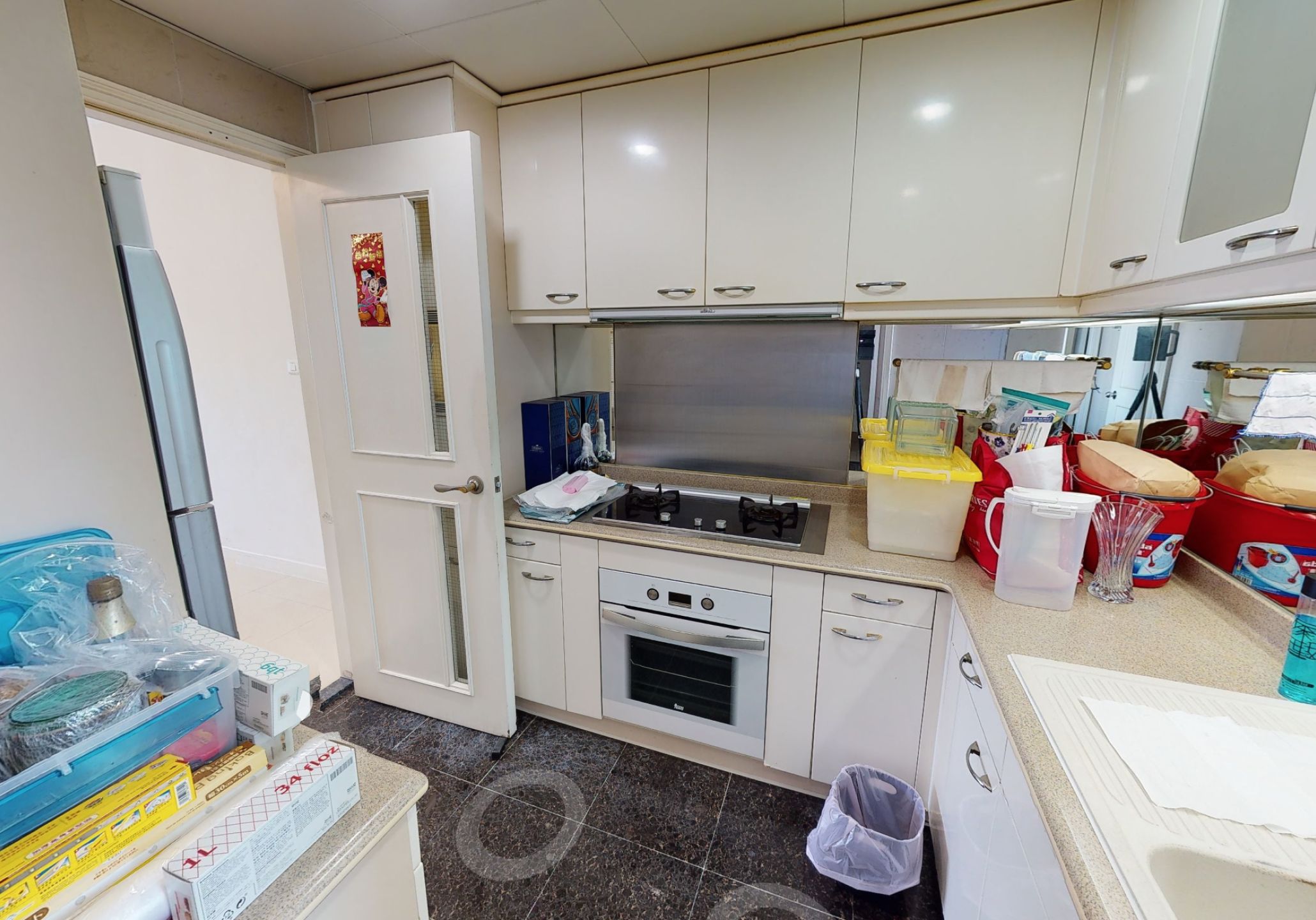
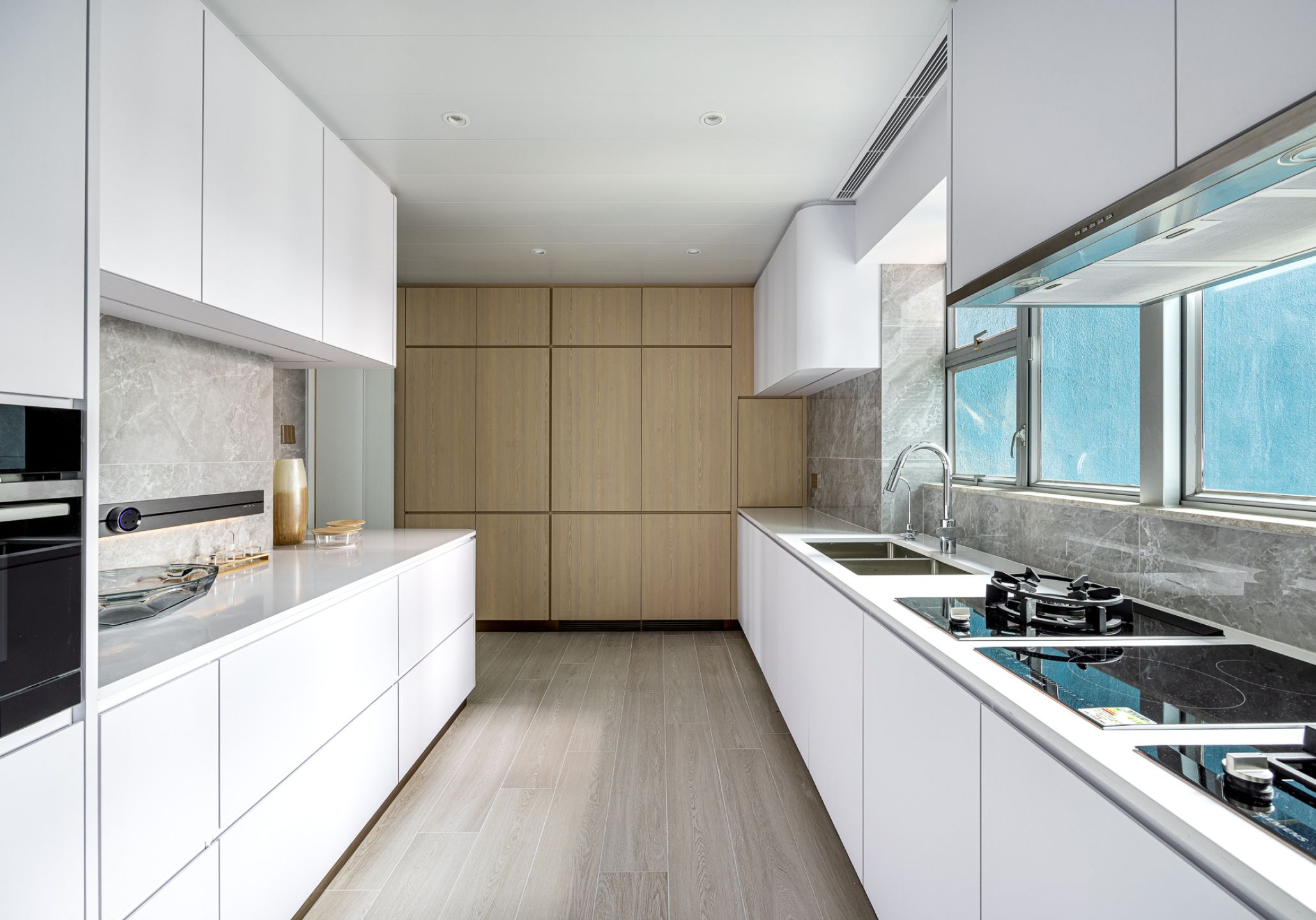
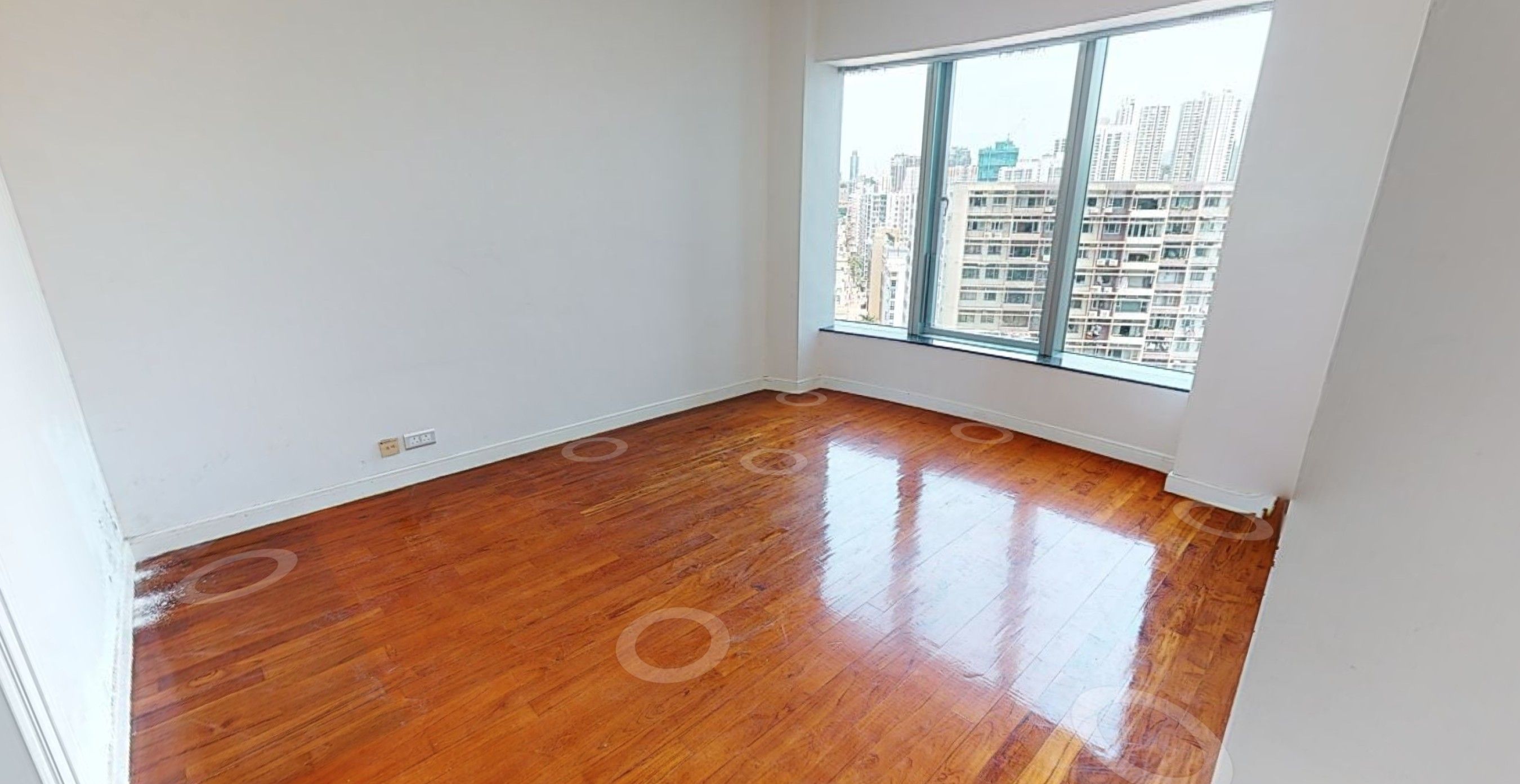
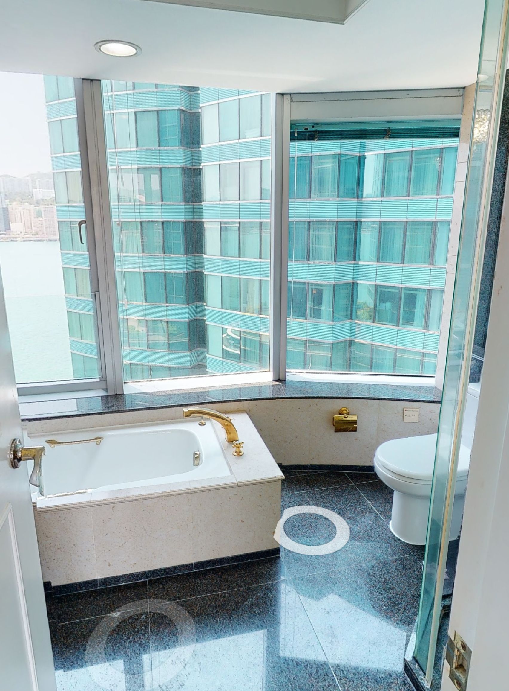
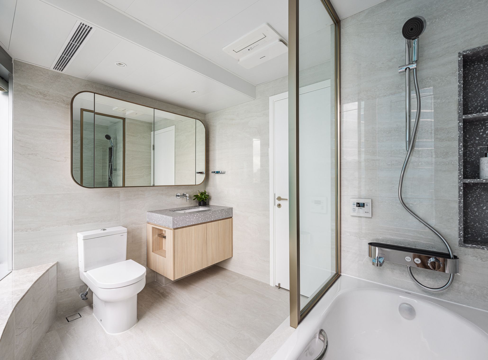
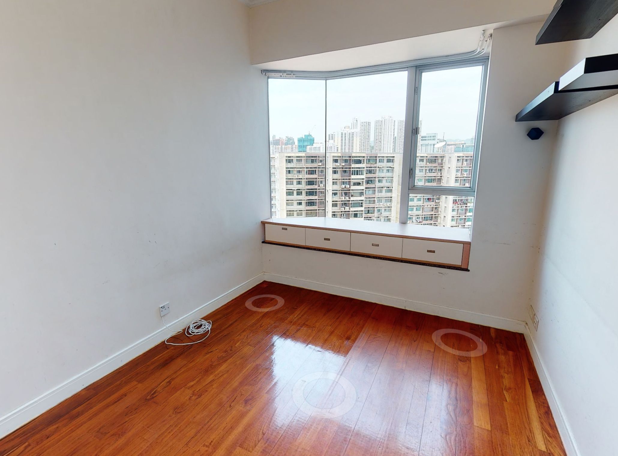
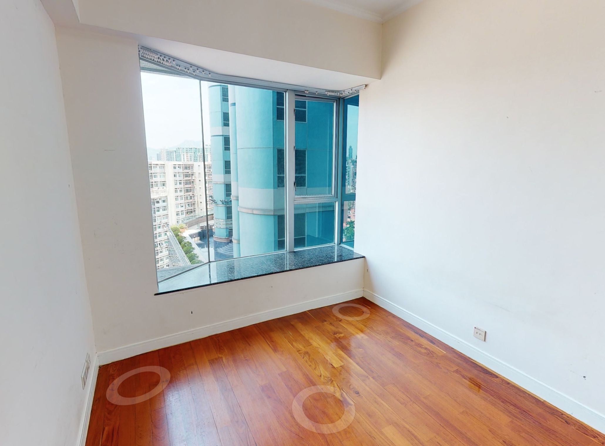
The original unit had a design with wooden floors and conservative white walls, reflecting a more dated style. After the renovation, a calming grey-toned theme permeates the living space, and the ceiling features curved lines to highlight the original architectural features. Maggy incorporated spotlights, light fixtures, and added light effects on shelves throughout various spaces to accentuate the sleek and modern lines. In the living and dining area, there are also some wooden elements, paired with diverse materials like tiles, marble, and metal, creating a light and clean yet luxe elegant ambience. With an original which is connected with a maid's room which is not useful, Maggy transformed it into a more spacious kitchen, allowing the family to make better use of this cooking space.
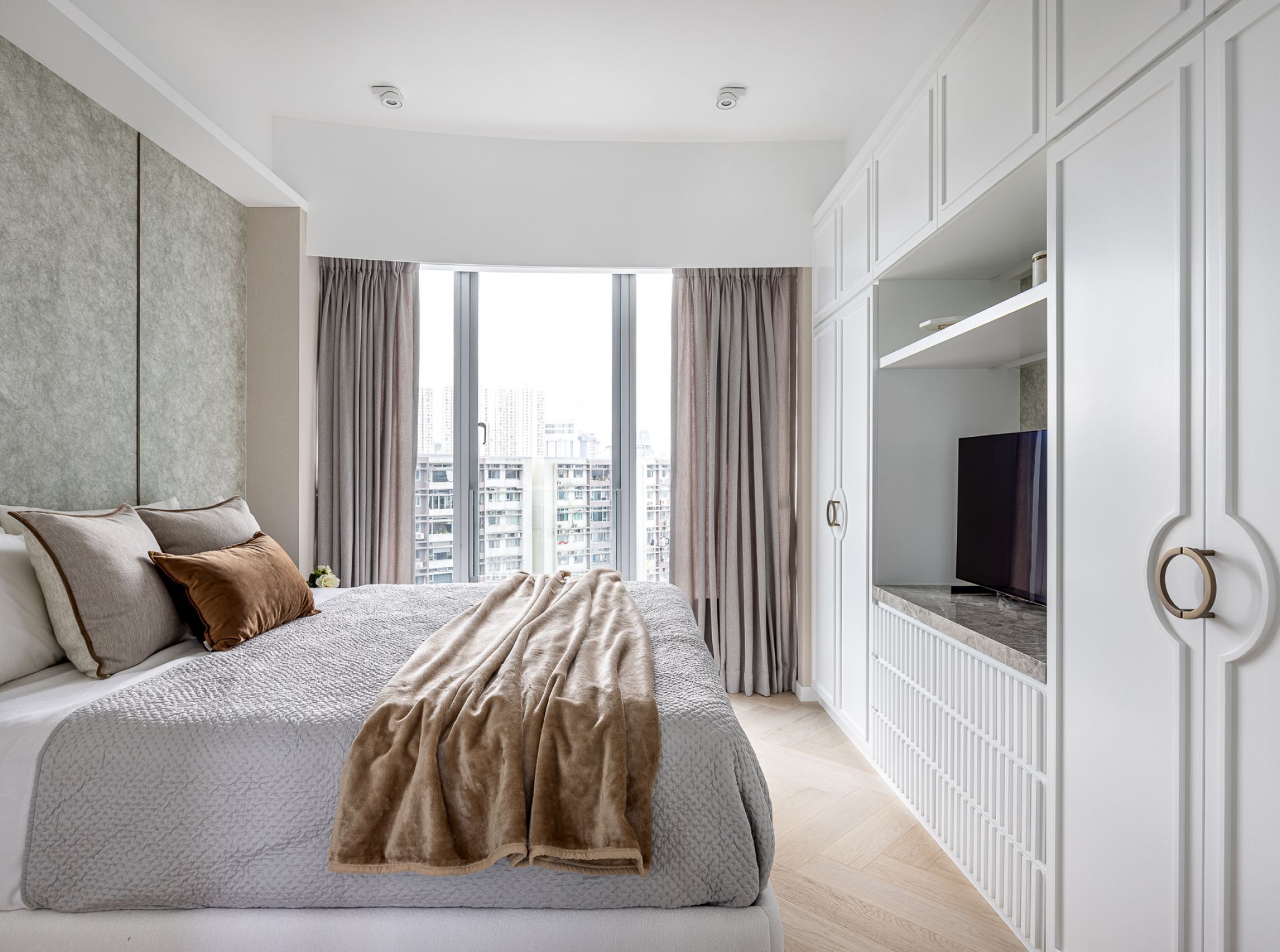
In response to the preferences of the female owner, the design also aimed to infuse "refined elegance" into the living space. Maggy utilized this element in the master suite. She adorned the space with European-style mouldings and metallic elements, combining them with minimal colors and lines that echo the living and dining area, evoking a sense of noble elegance. One significant feature is the design of the headboard, utilizing textured wallpaper with metallic accents, she juxtaposed it with fixed furniture like bedside cabinets mixed with loose furniture, creating a deliberate sense of imbalance that infuses the master bedroom with a casual stylish feeling.
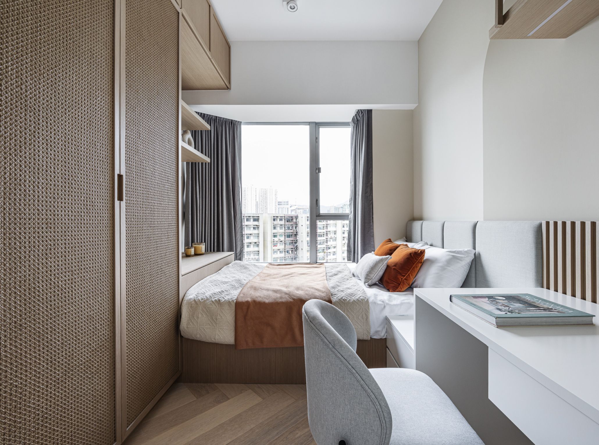
As for the daughter's bedroom, as she has grown older, she had certain expectations for her own space. She didn't want a design that was cold and plain in white but rather desired a room with earthy colors. Therefore, Maggy embraced the theme of Wabi-sabi, which is currently very popular nowadays. She incorporated elements like natural earthy tones, wood, and Japanese rattan into the furniture, balancing the overall room with warm and muted tones. In the study desk area, she also created a curved feature wall with a lighting effect, echoing the design in the living and dining areas.
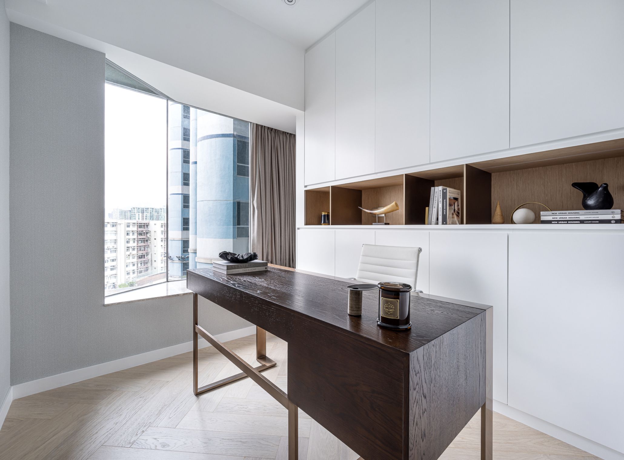
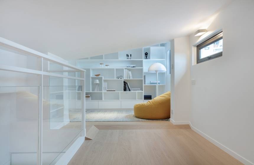
Next to the daughter's room was originally another bedroom, but considering that this family didn't require too many rooms, Maggy reinvented it to serve as a multi-purpose room. It's equipped with a long wooden desk and storage display cabinet. On regular days, it can be used for work and studying, while during leisure time, it can transform into an entertainment room for playing mahjong, fostering family bonding. When guests visit, the fold-down bed hidden within the storage cabinet, which effortlessly converts into a guest room, achieving a versatile and multi-functional space.

