Redefining The Core of an Indian Family Through 'Light Continental' Aesthetic
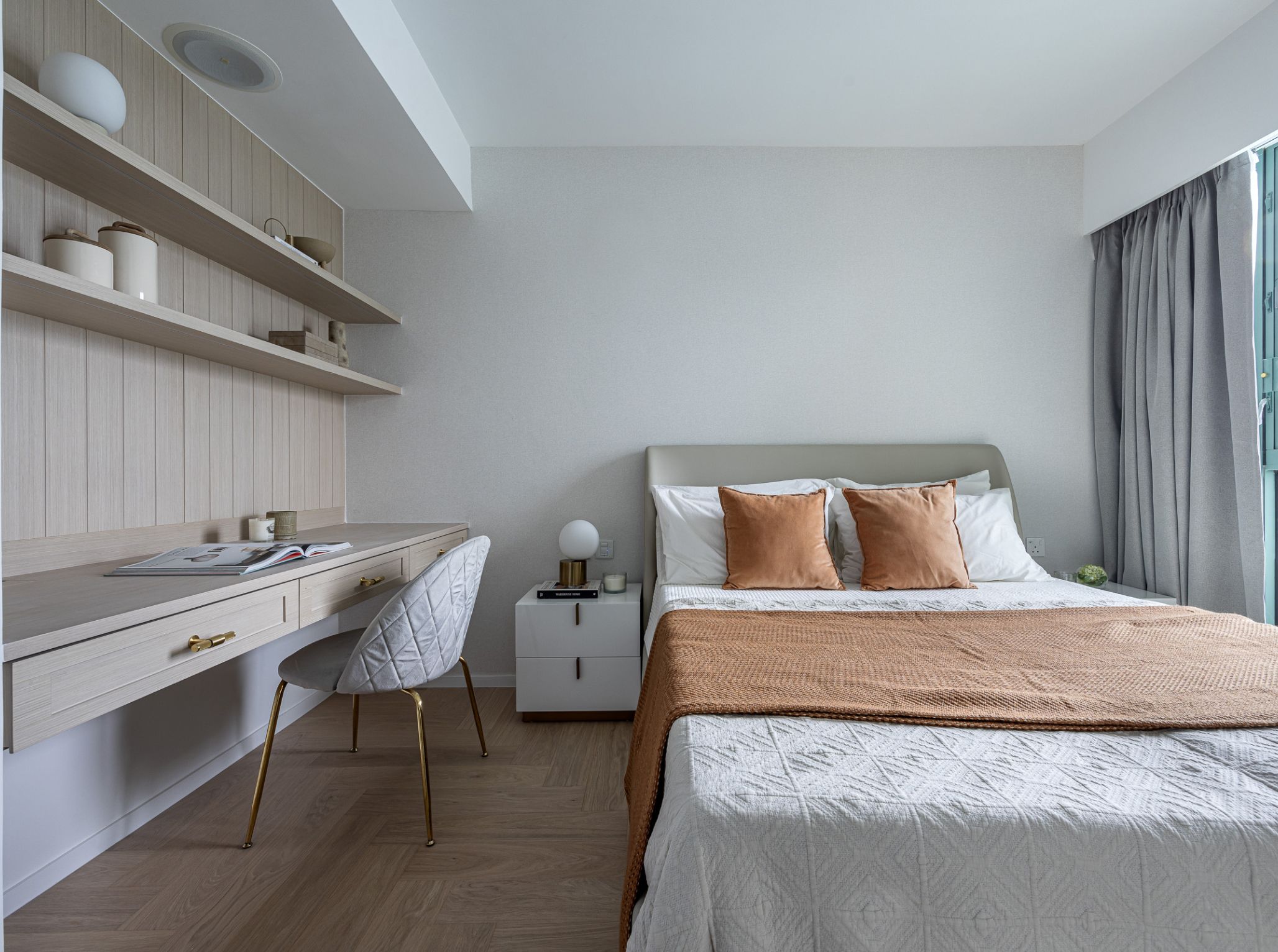
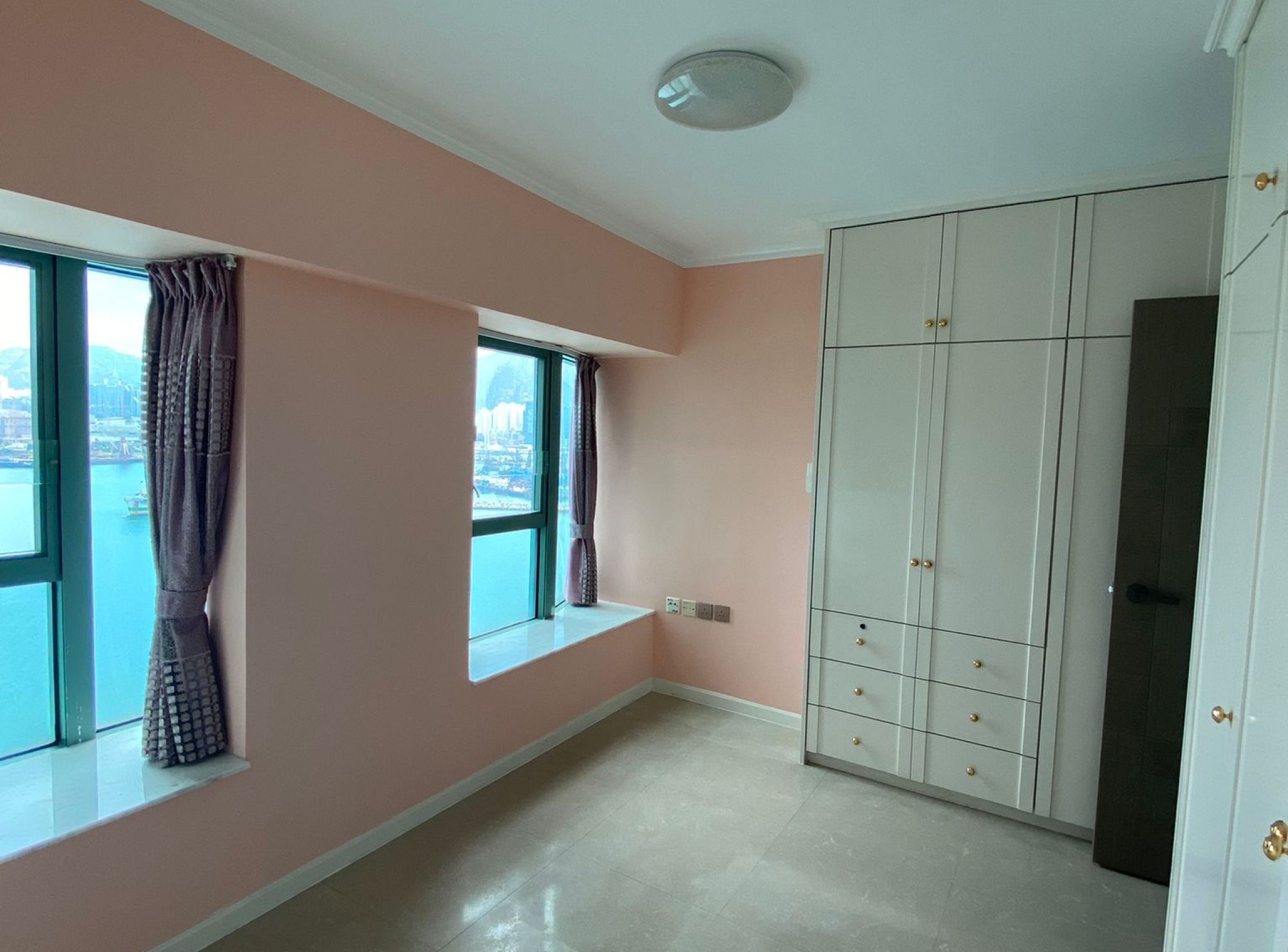
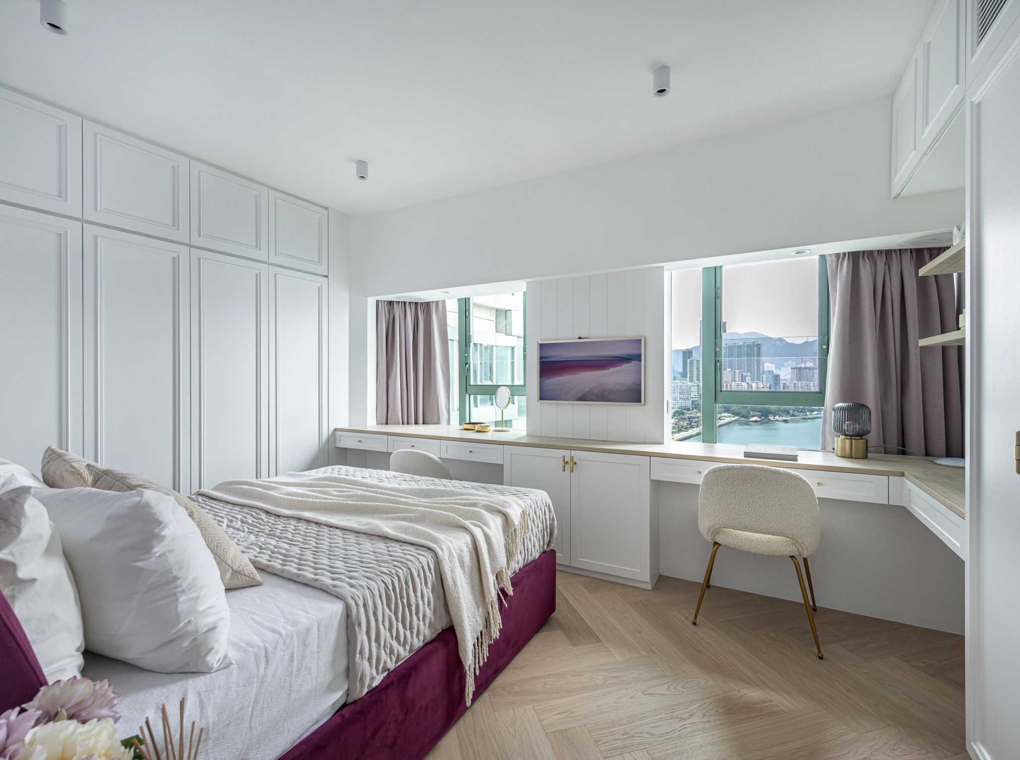
The bedrooms are the spaces where personal styles can be expressed. With two daughters, each with different personalities, the design of their bedrooms is tailored to meet their individual needs. The elder daughter's bedroom leans towards cosy simplicity, employing light wood tones for an earthy and warm feel, harmoniously blending with neutral colors. In contrast, the younger daughter's bedroom features more feminine elements, such as a colorful bed frame with intricate moulding patterns on the wardrobe, evoking a sense of refinement. Each bedroom comes with an ensuite bathroom, using tiles, wood, and small pendant to create a simple yet rich texture. To ensure equal storage space for both the owners and their children, additional storage cabinets are thoughtfully added to the walls during the space division.
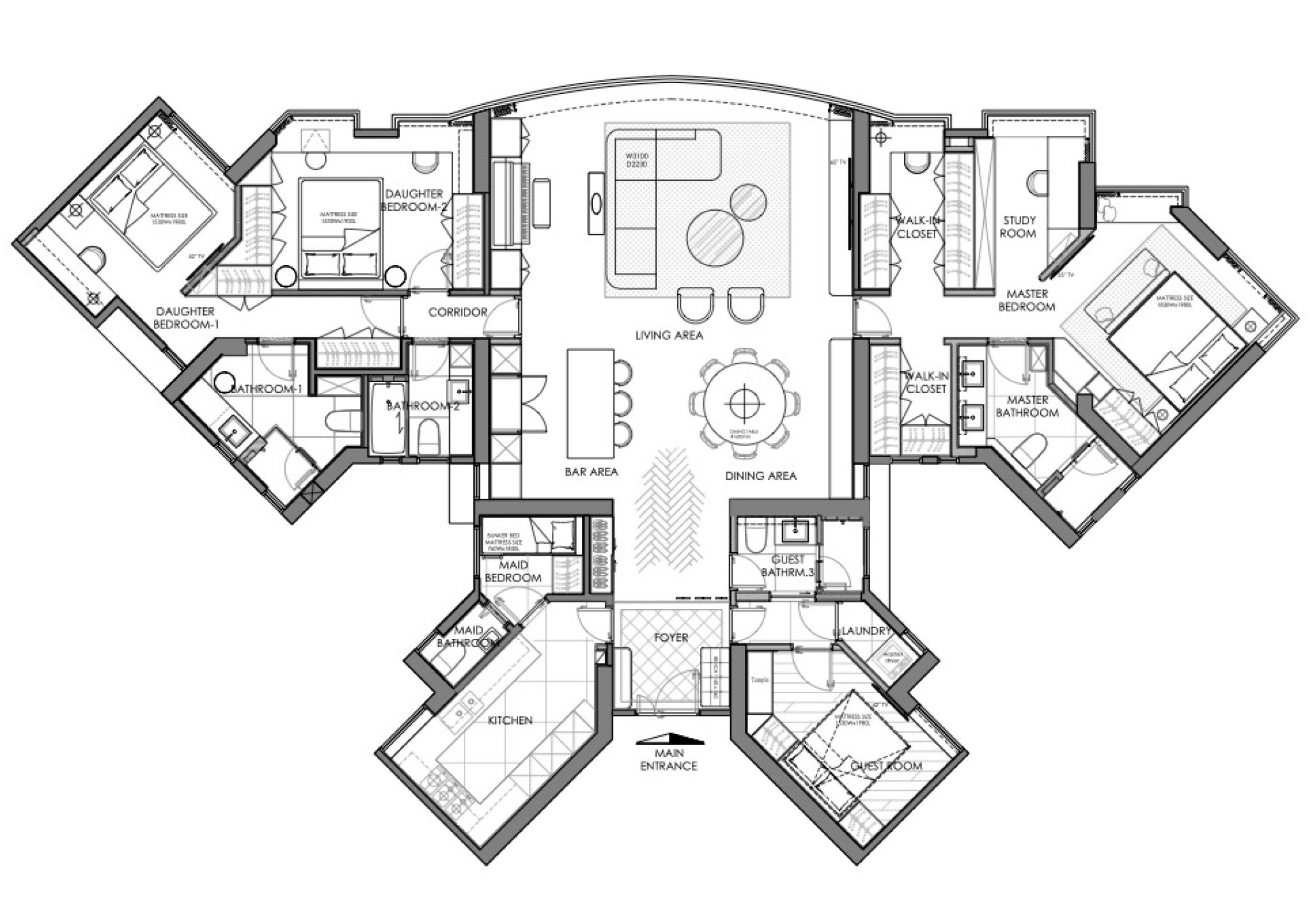
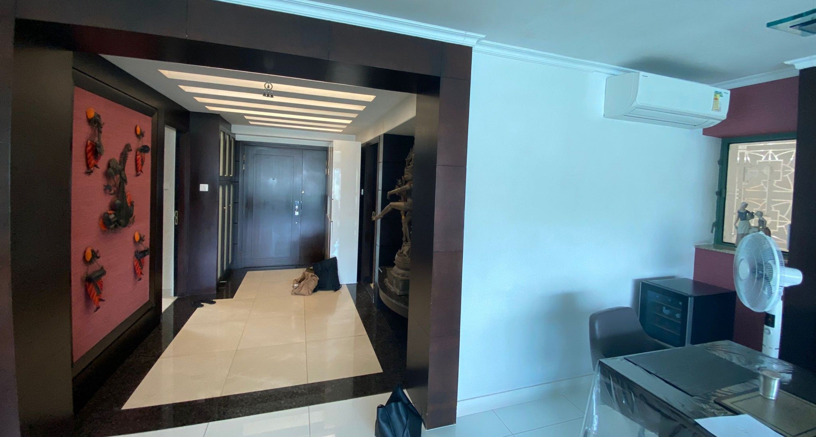
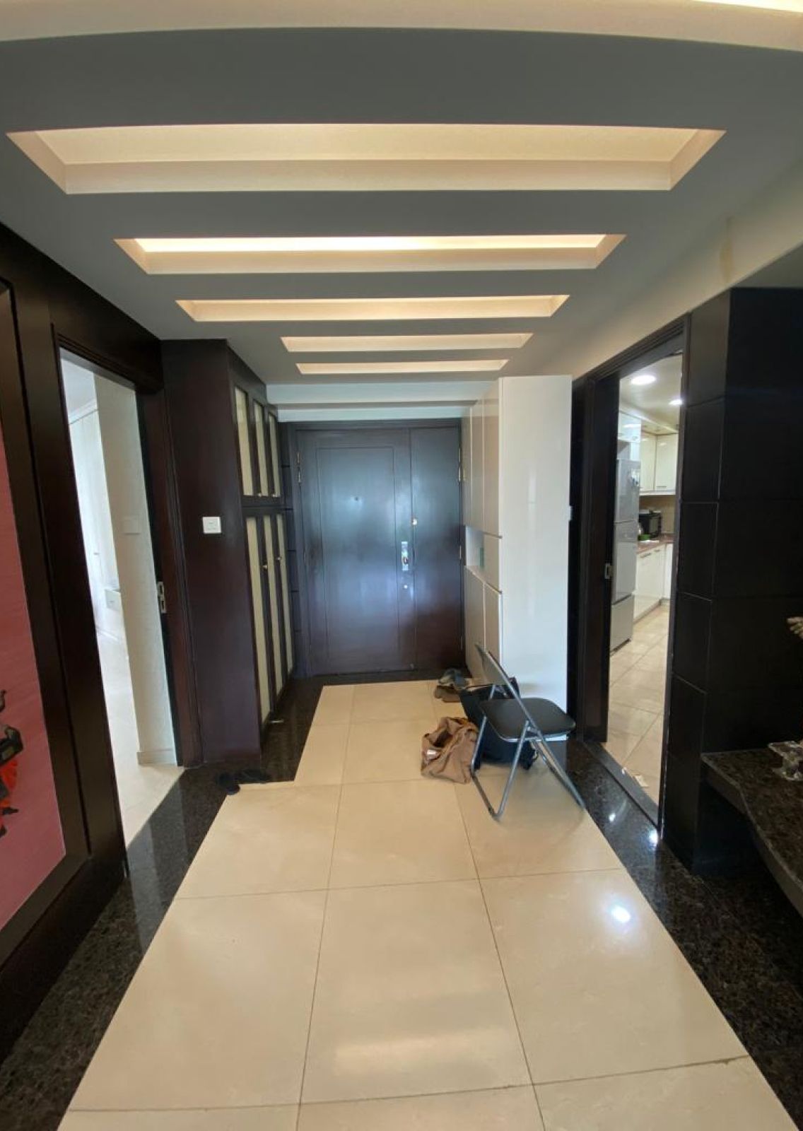
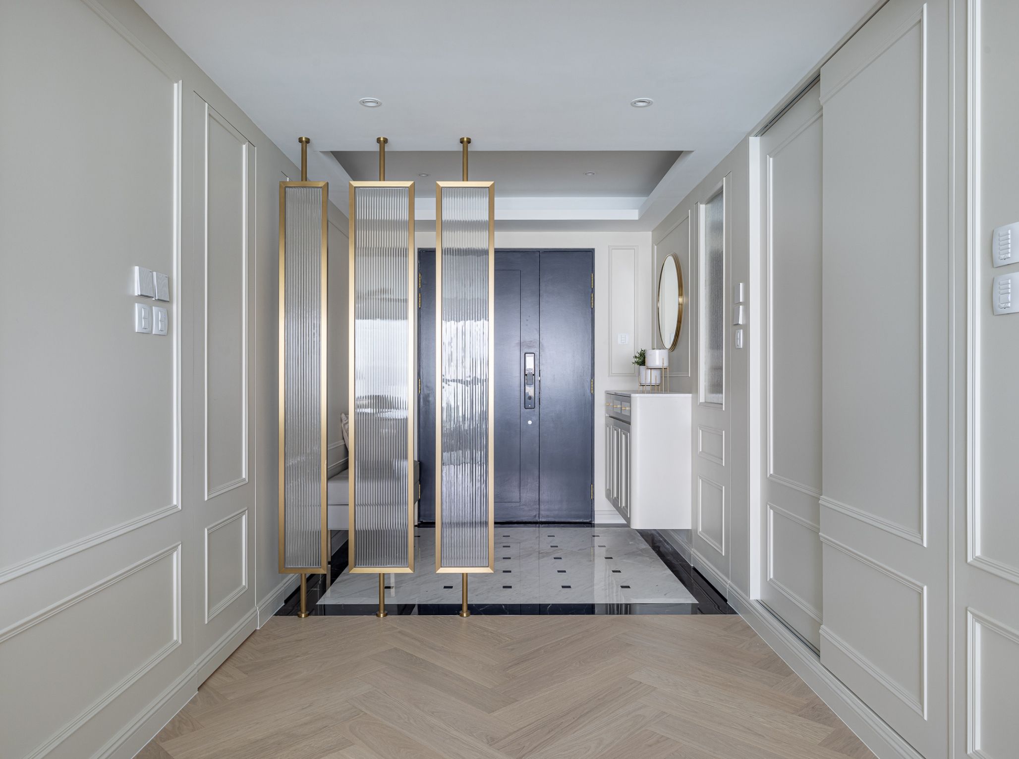
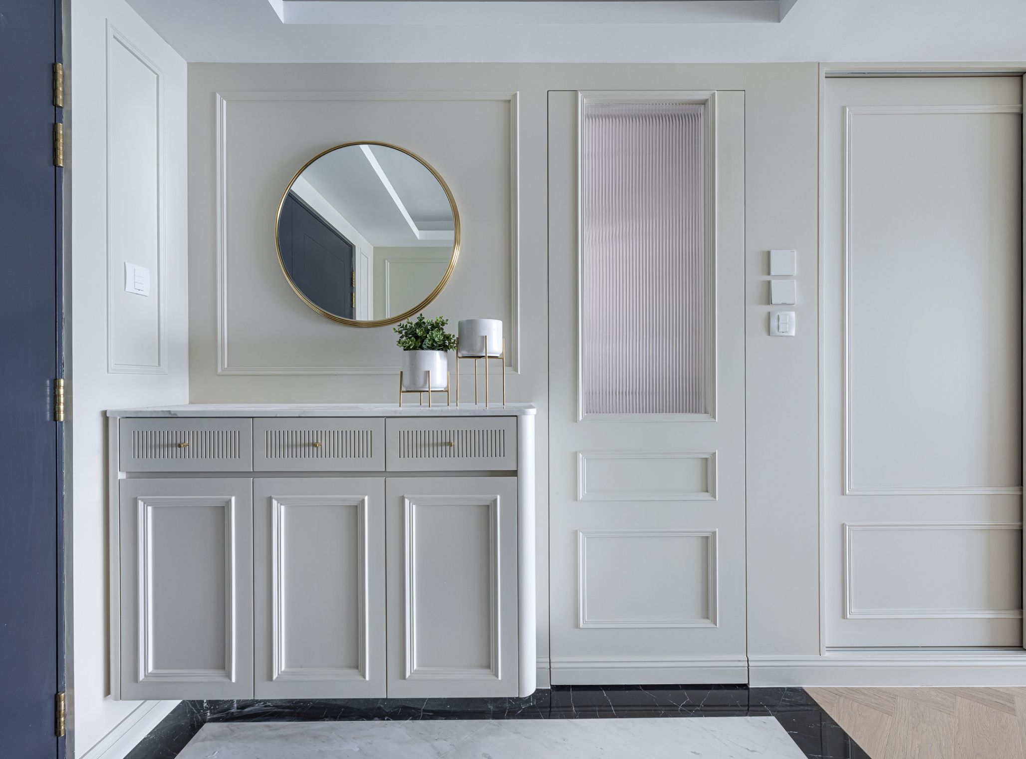
The original design of the foyer had a traditional feel, as Indian families place great importance on religious beliefs, and this space is seen as a significant ritual area when entering the home. Before the renovation, the space was filled with various feng shui-related interior elements, using more traditional and old-fashioned colours that created a sense of confinement. Adhering to the 'Light Continental' theme, we utilized white walls complemented by delicate mouldings and incorporated European-style patterned floor tiles to create a focal point in the primary entrance area. A glass partition separates the entryway from the living and dining room, maintaining privacy. The design modified the entrance of the guest bedroom, allowing it to retain its bathroom functionality while connecting to the guest room, serving dual purposes.
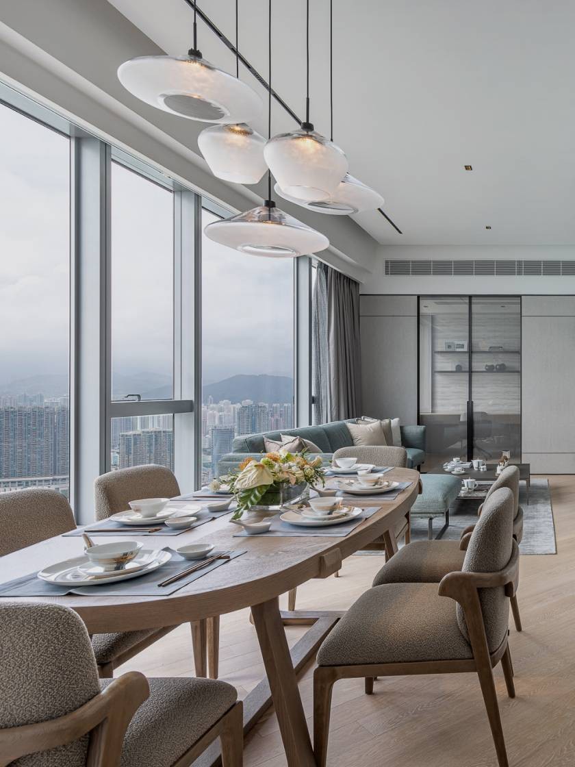
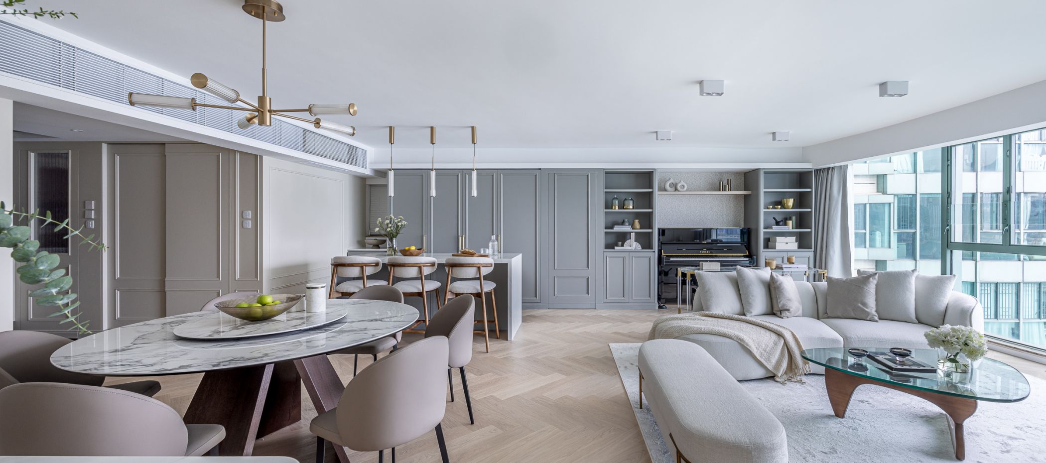
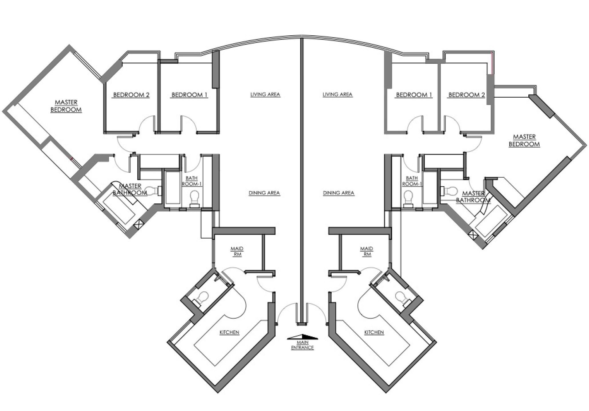
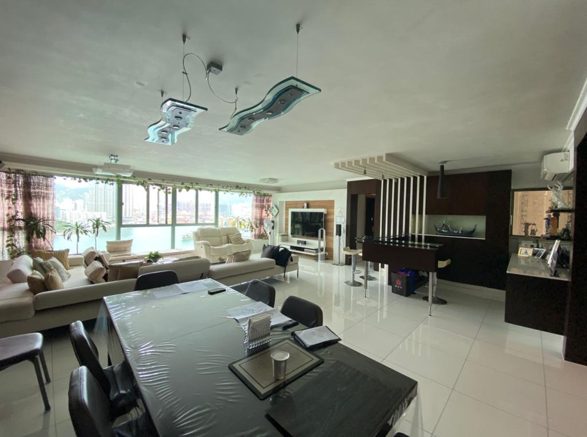
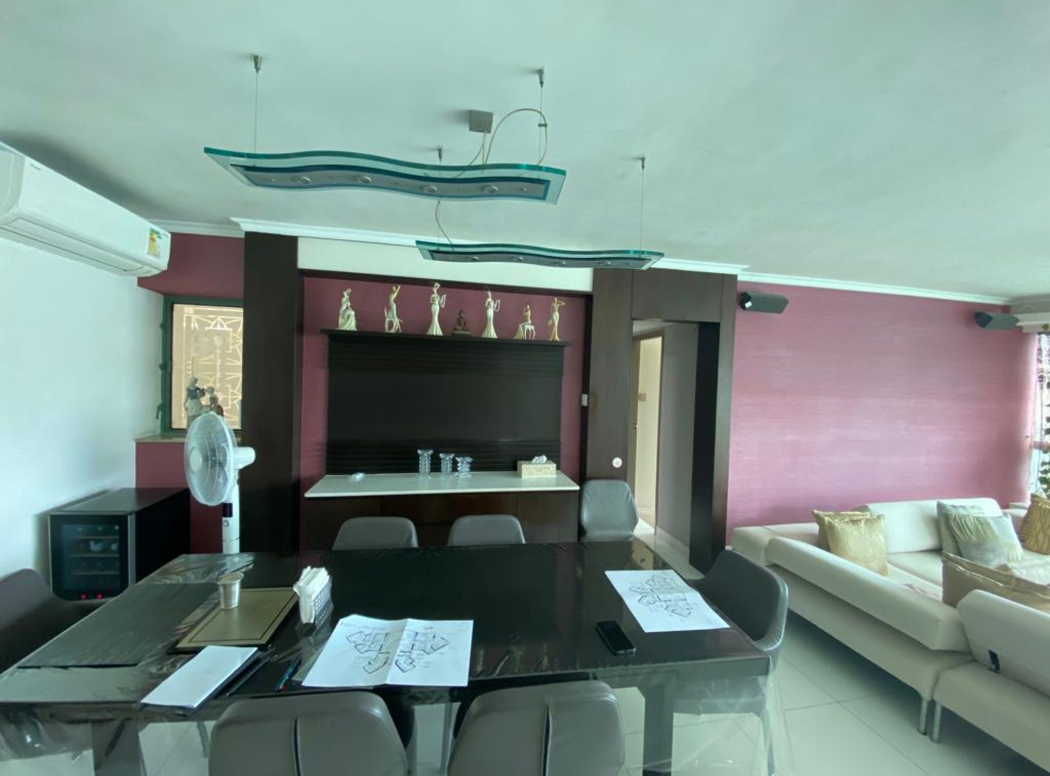
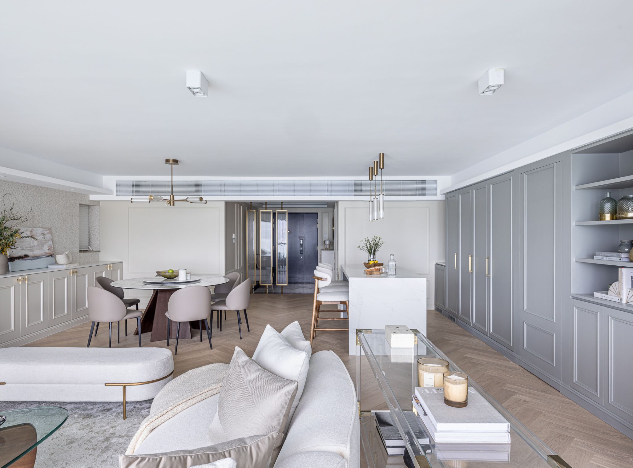
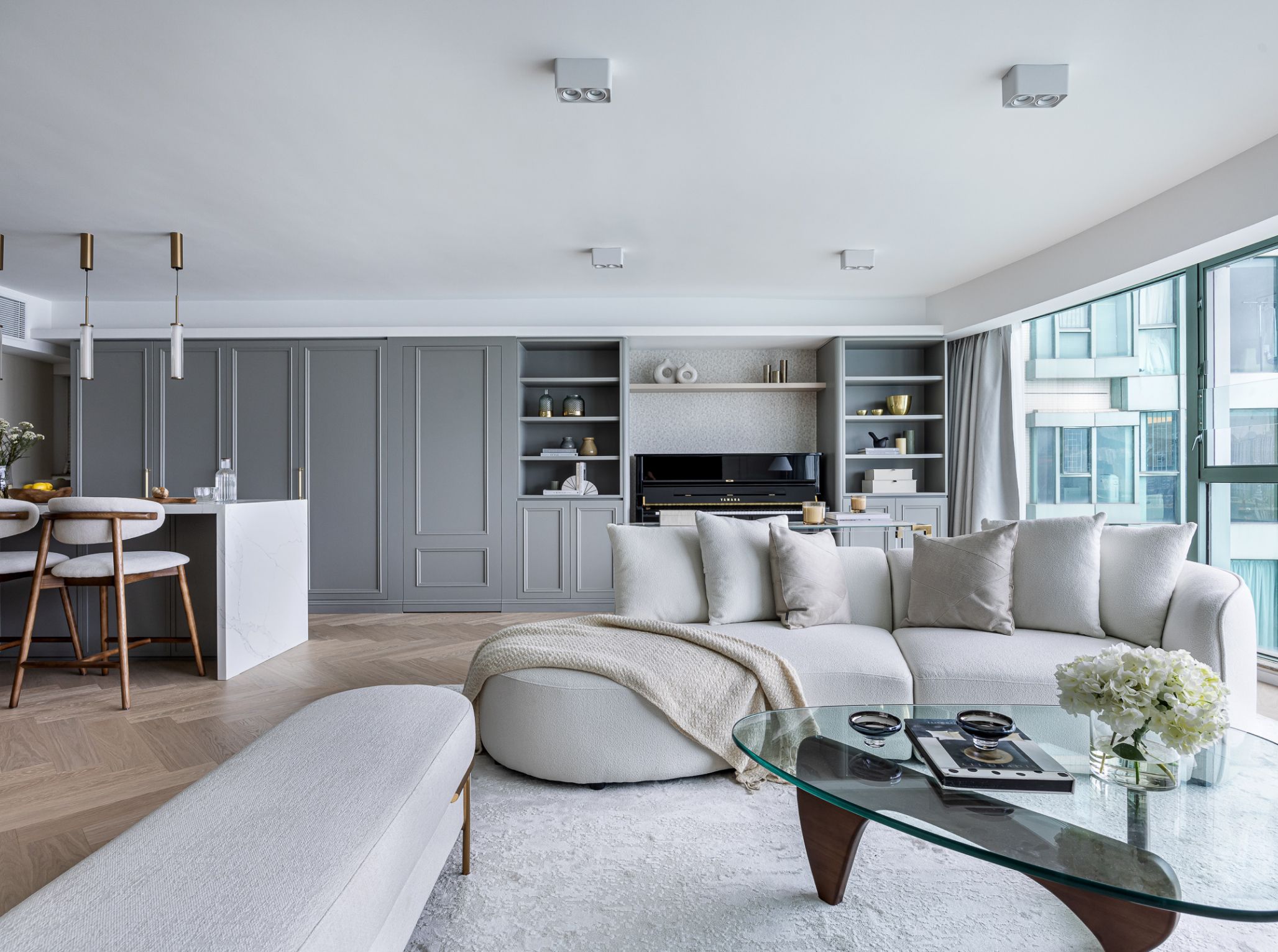
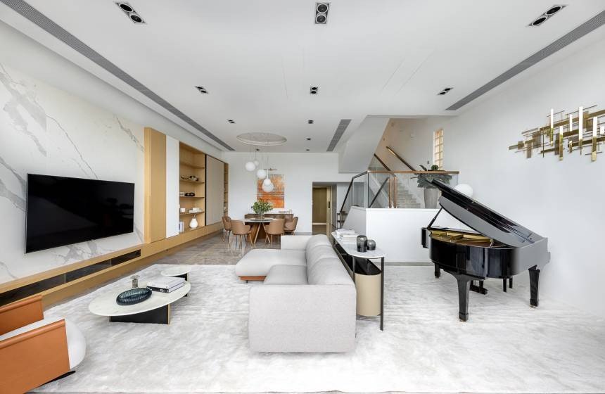
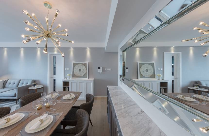
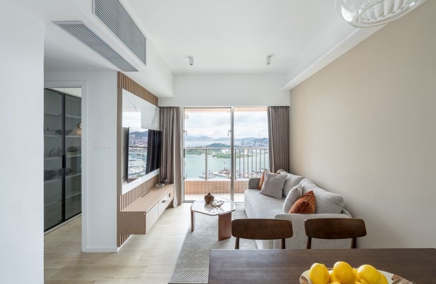
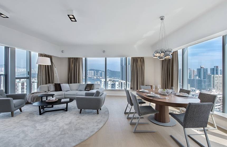
Upon entering the living and dining room area, the original layout had divided the space into separate zones for the living room and dining room. However, the two areas, although in the same space, had discordant styles - one side used relatively deeper colors, while the other side primarily featured lighter tones, diminishing the visual cohesion. After the renovation, we opted for a light colour scheme, using a neutral light blue-grey to accentuate the space. The design clearly delineated the different functional areas, maintaining a sense of harmony and flow throughout the combined living and dining room. Considering daily habits, we divided the space into a living room for family relaxation and entertainment, a dining area, and a chill-out bar. This layout allows for moments of conversation with family and friends while preparing meals, enhancing flexibility.
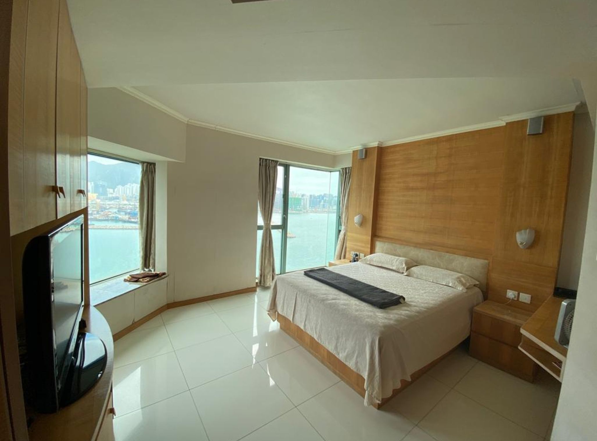
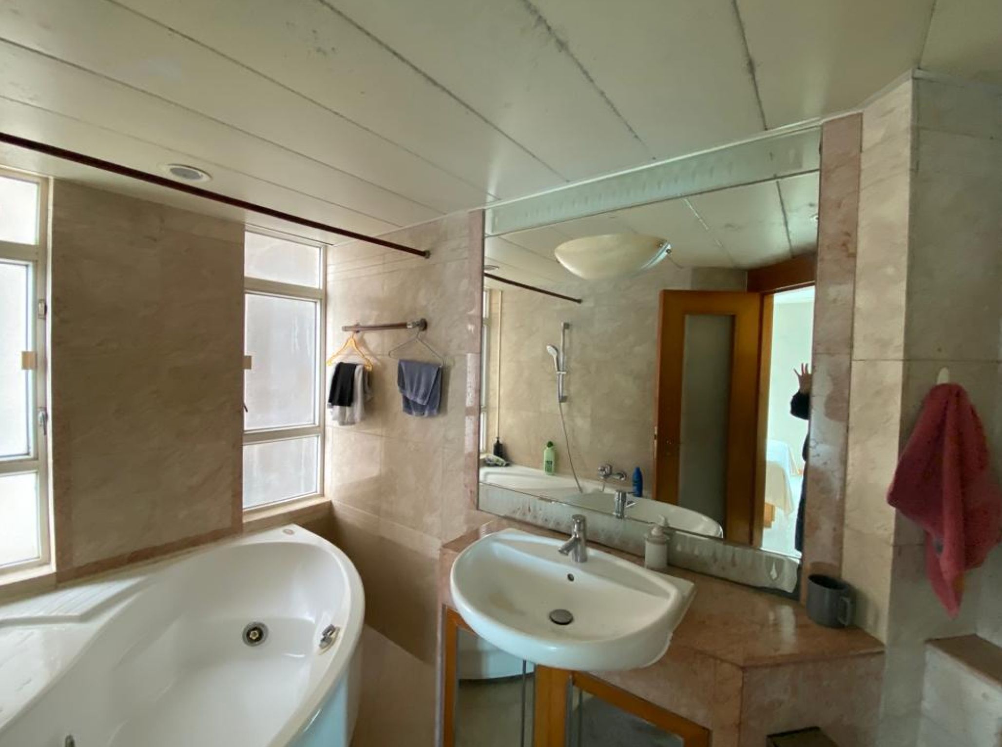
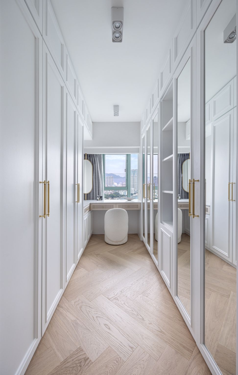
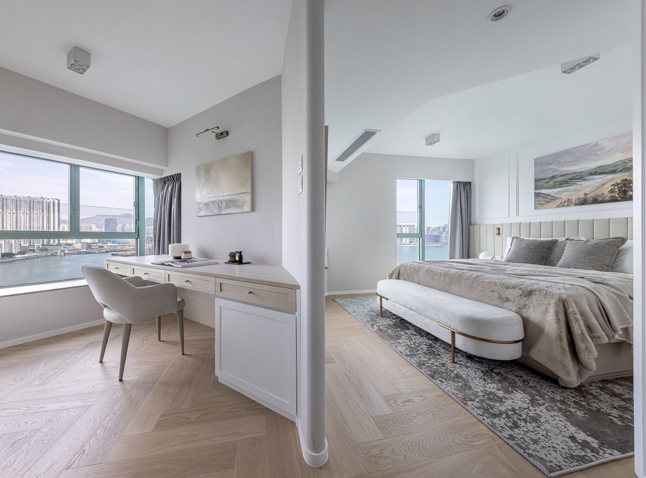
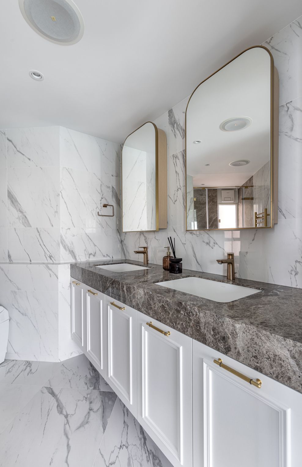
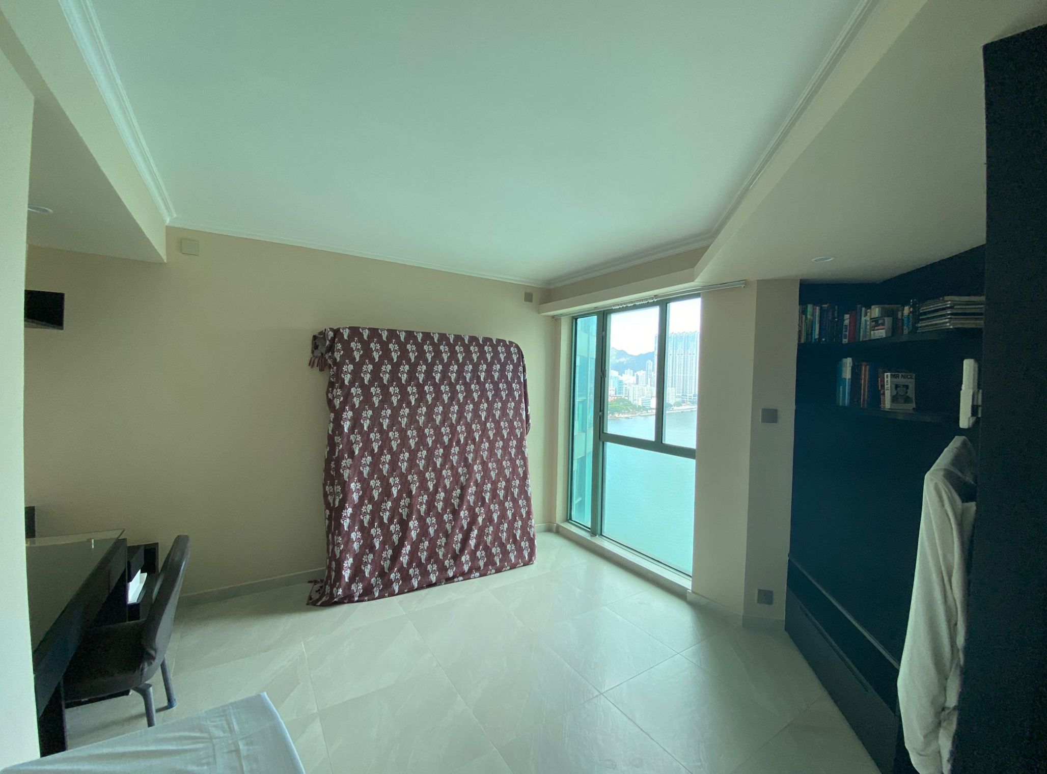
Since the owners desired a spacious master suite to increase their private space, the original master room only had a single bedroom and en-suite bathroom. Because the other bedroom was not used often, the owners decided to combine the two bedrooms. The new layout features a dedicated sleeping area, a home office, an en-suite bathroom, and a walk-in closet, all seamlessly integrated through the use of open, moulding-defined partitions and double-sided cabinetry, not only enhances functionality and storage capacity but also fulfils the owner' dream of a hotel-like master suite. The room maintains cohesion with the living and dining rooms, using white as the primary colour and incorporating velvet headboard details, metal, and exquisite natural tiles to elevate the ambience. The master bathroom has also been completely renovated, utilising natural stone and marble to create a sophisticated, easy-to-maintain space, complemented by a double vanity with metal mirrors for the convenience of the two owners.
The bedroom is the space that best reflects one's style, and the owners have two daughters with distinct personalities. As such, we carefully renovated the bedrooms according to the girls' respective needs. Originally, the two bedrooms lacked any specific style, after the renovation, each daughter's dream bedroom was realized. The older daughter's room leans towards a comfortable, minimalist aesthetic, utilizing a light wood tone to create a warm, earthy feel that harmonizes with the neutral colour palette. This design perfectly aligns with the older daughter's desire for a peaceful, relaxing retreat.
As for the younger daughter's room, a more feminine bed frame was used, such as one with European-style moulding, to convey a refined and elegant aesthetic. Both bedrooms have their en-suite bathrooms, where the use of stone, wood, and small pendant lights creates a simple yet rich material palette. In terms of space planning, since the owners and their children all desired ample storage in their respective bedrooms, we carefully added built-in storage cabinets along the walls to fully optimize the functionality on both sides.
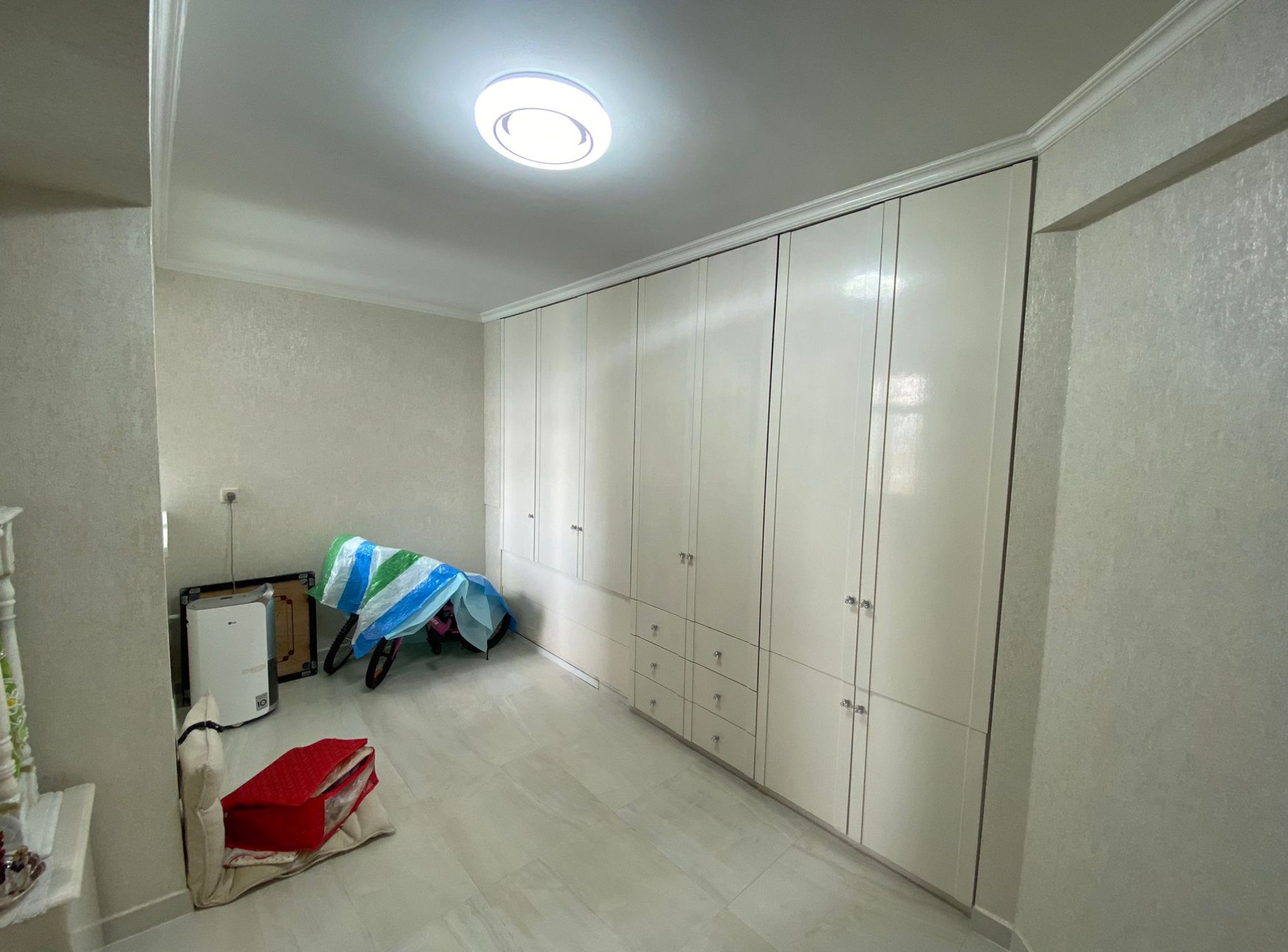
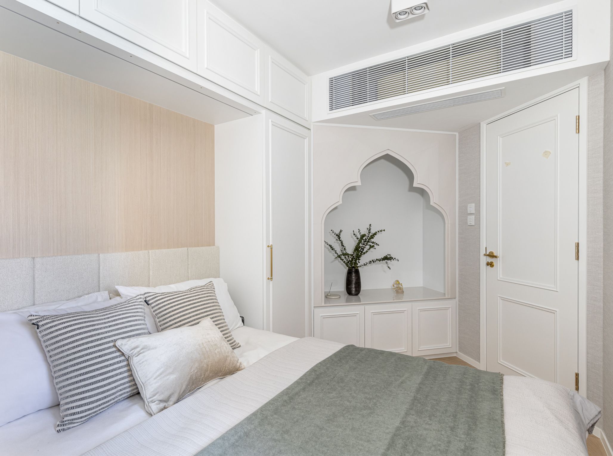
The storage room located at the entrance has been transformed into a guest room, designed with simplicity to accommodate family or friends visiting. The room features a niche design, reflecting the traditional culture of the family's Indian heritage, and serves a purpose in religious rituals. Following the redesign of the space, the guest restroom is connected to the guest room through a doorway, allowing it to function as a suite when guests are present.

