Embracing Curves - Sketching The Brand's Modern Chic Style
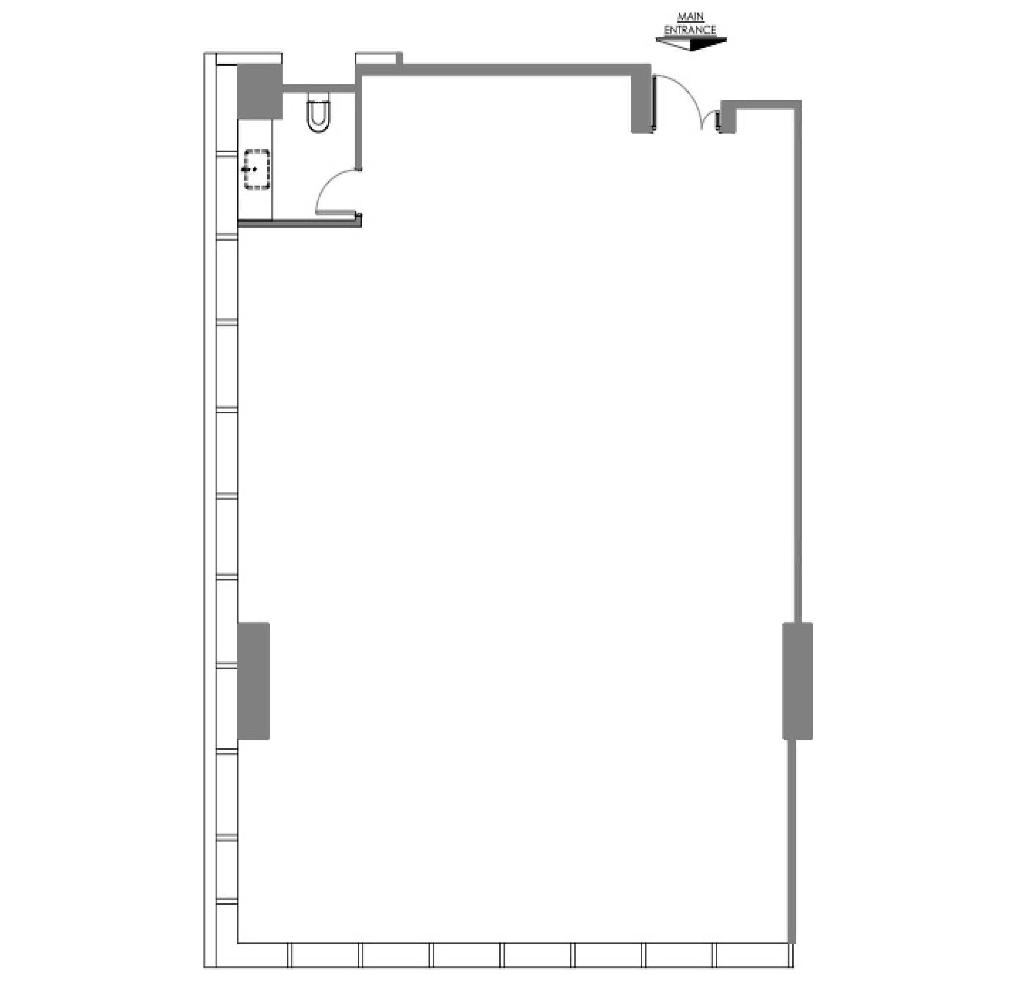
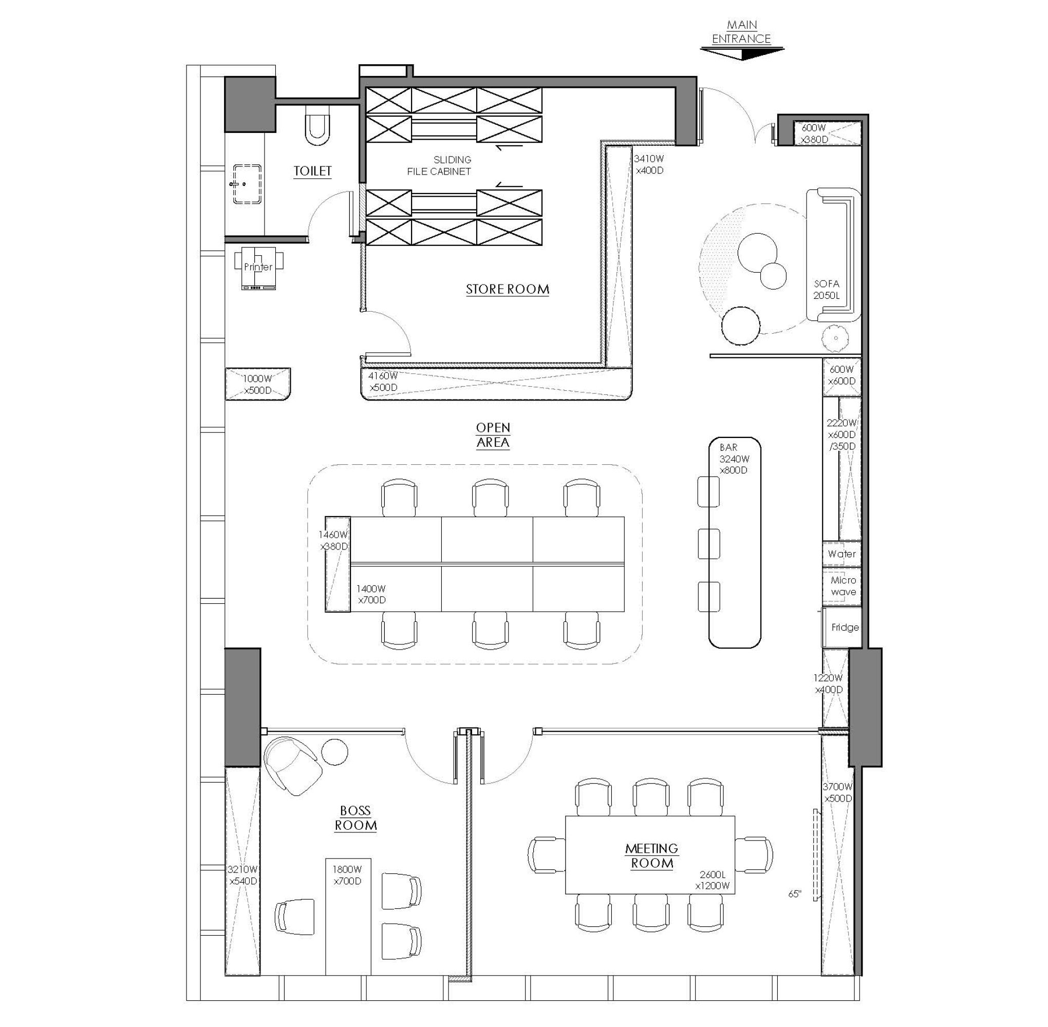
A well-designed office not only serves its functional purpose but also showcases the unique identity of a brand. In this tailored office design, the client's years of experience in the tobacco and alcohol industry are complemented through a thoughtful spatial transformation. Spanning approximately 1300 square feet, designer Elva incorporates chill and modern design elements, choosing a streamlined theme and modern minimalist furniture. The carefully planned layout combines earthy tones with high-quality natural materials, creating a refined and employee-friendly workspace.
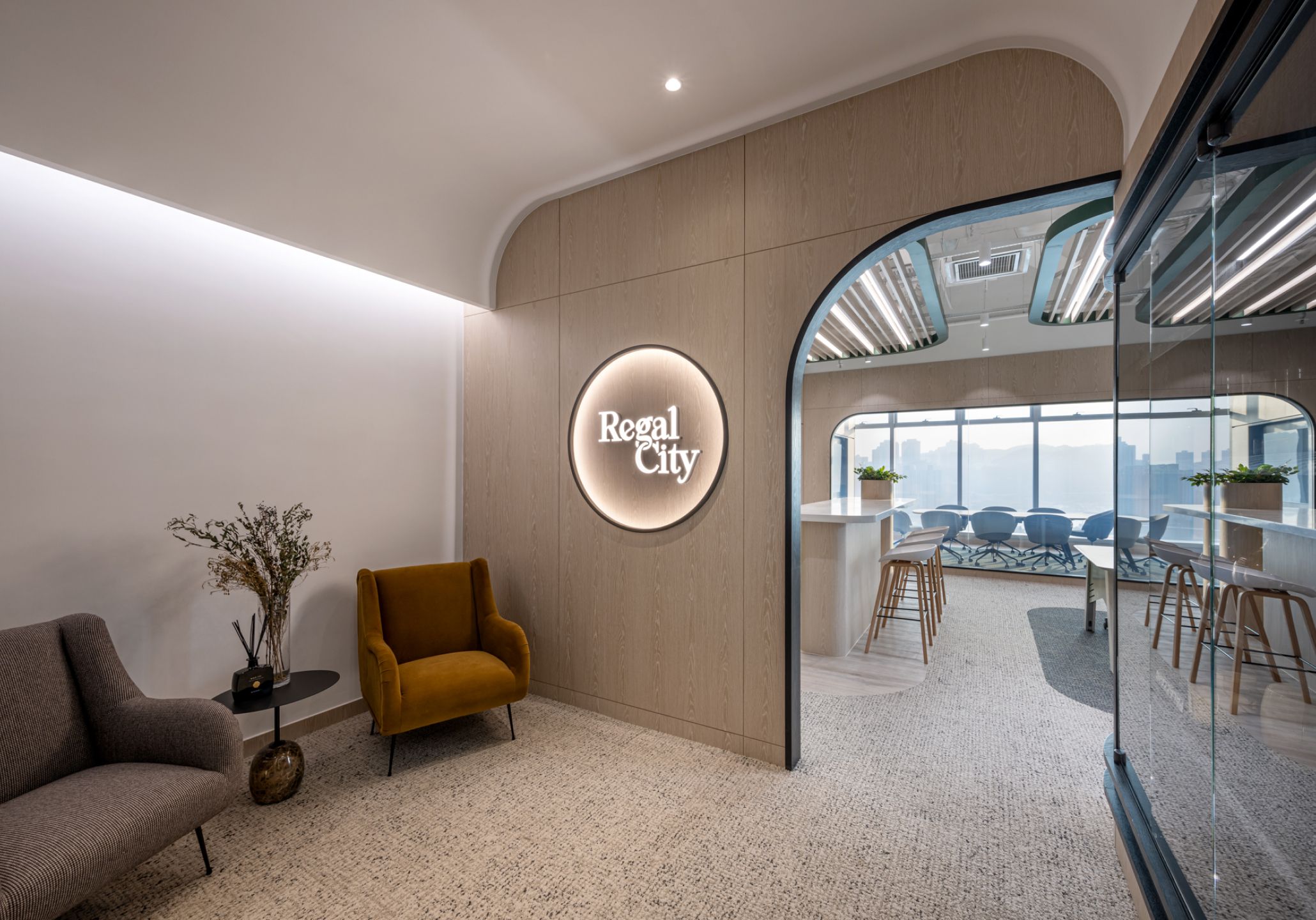
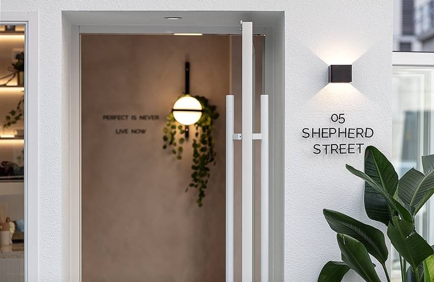
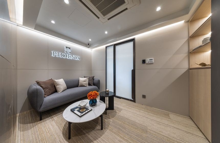
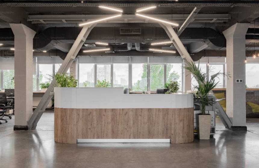
The reception area is a significant zone within the office, playing the role of the brand's facade and leaving a lasting impression on visitors. The focal point of this reception area is an arched entrance with the brand logo, introducing the curved theme of the office. The design exudes a sense of luxury. Additionally, Elva has added a top-lit glass display cabinet next to the arched entrance, showcasing items that reflect the brand's desired image, extending throughout the reception area and office space. This detail not only provides a designated space to showcase brand products but also enhances the openness of the space.
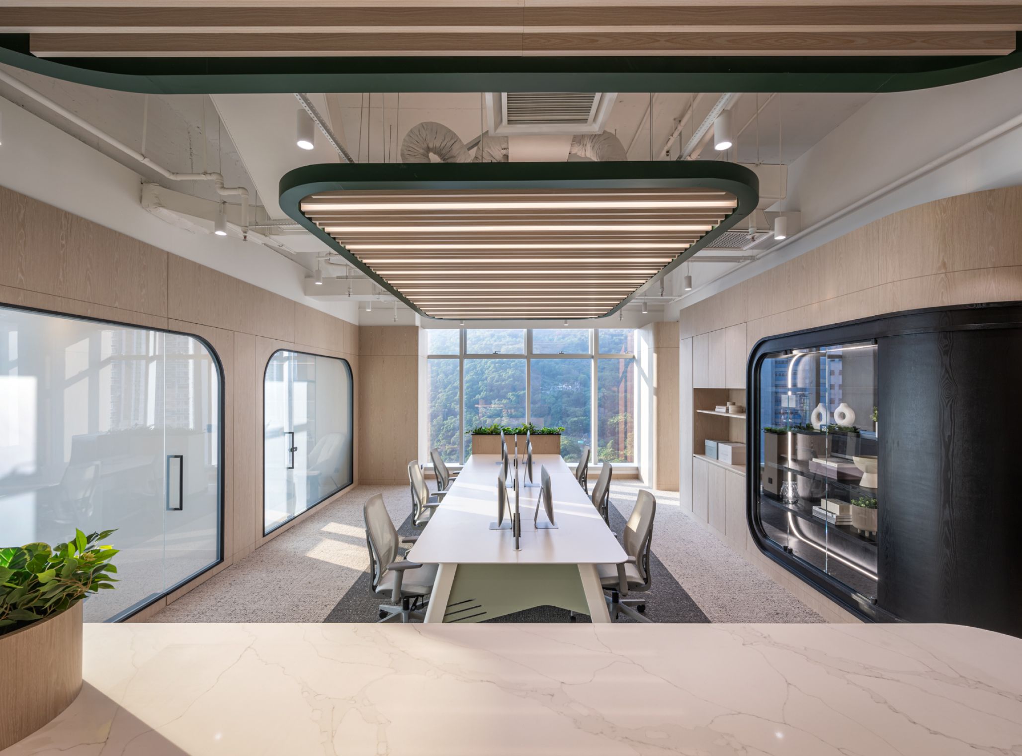
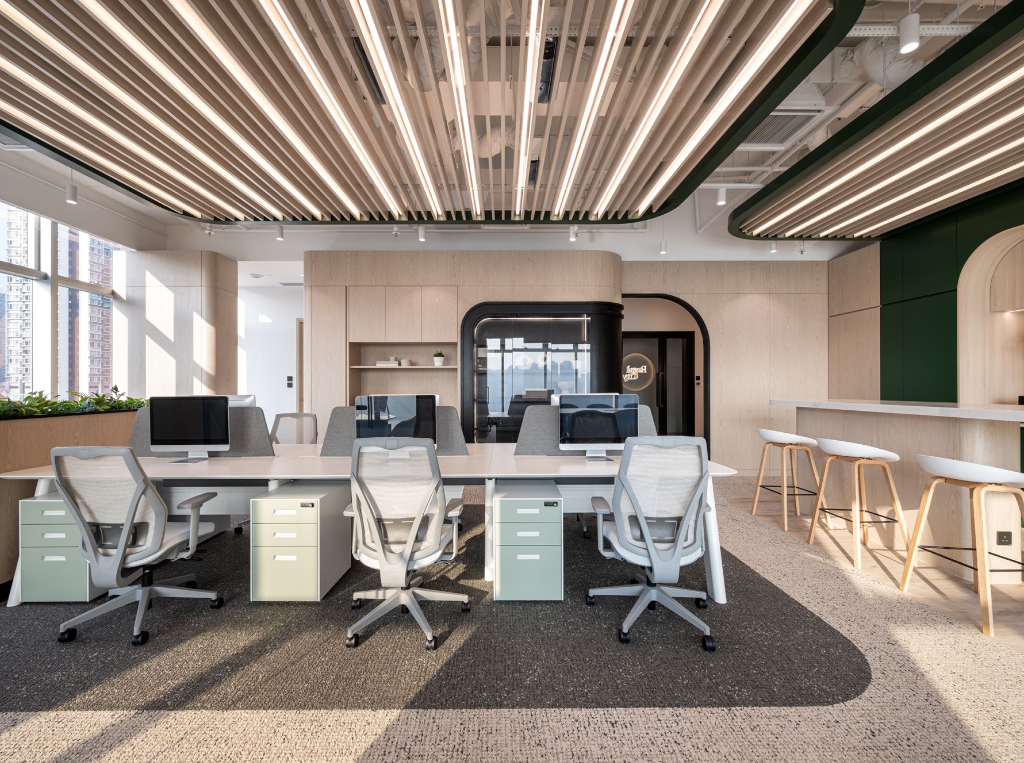
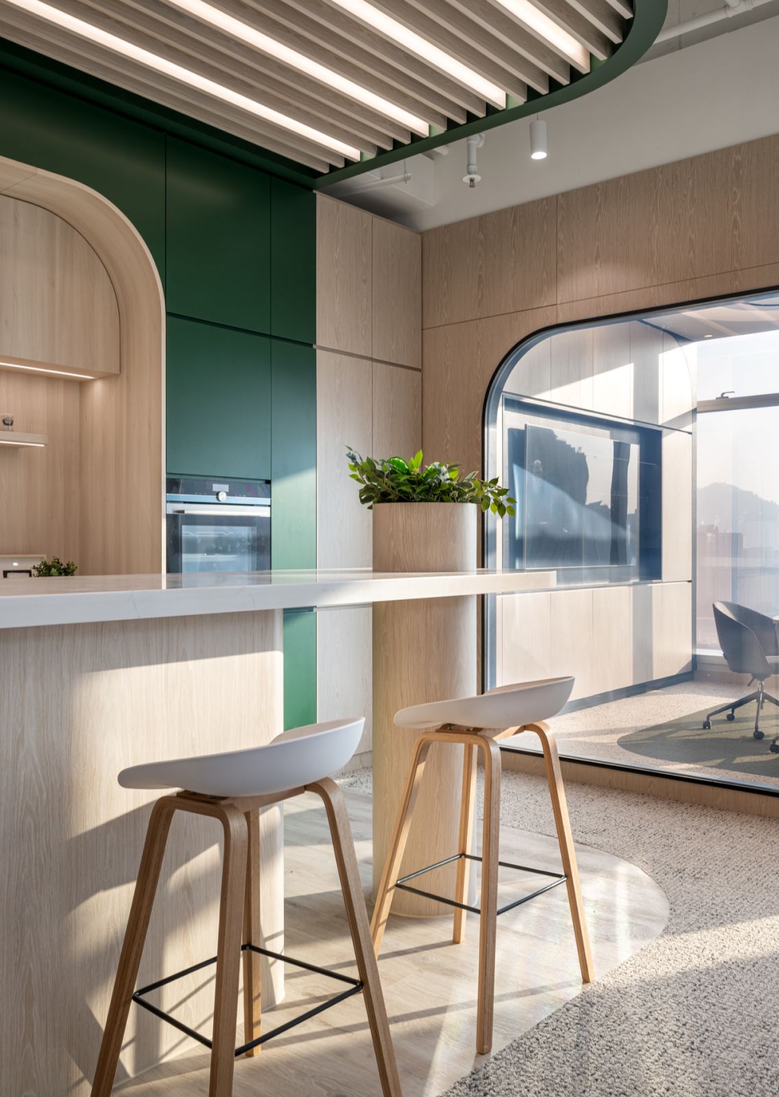
The primary area of the office is the open workspace for employees. The curved ceiling and carpet employ the same arc pattern, which has the advantage of clearly defining the purpose of each area and creating a sense of zoning while creating a seamless and cohesive visual effect. The arc pattern on the carpet complements the ceiling, further enhancing the consistency of the space and maintaining harmony in the open layout. Our designer Elva incorporates numerous curves in various locations throughout the office, such as on the veneer cabinets, furniture, feature walls, and ceilings, evoking fluidity within the space.
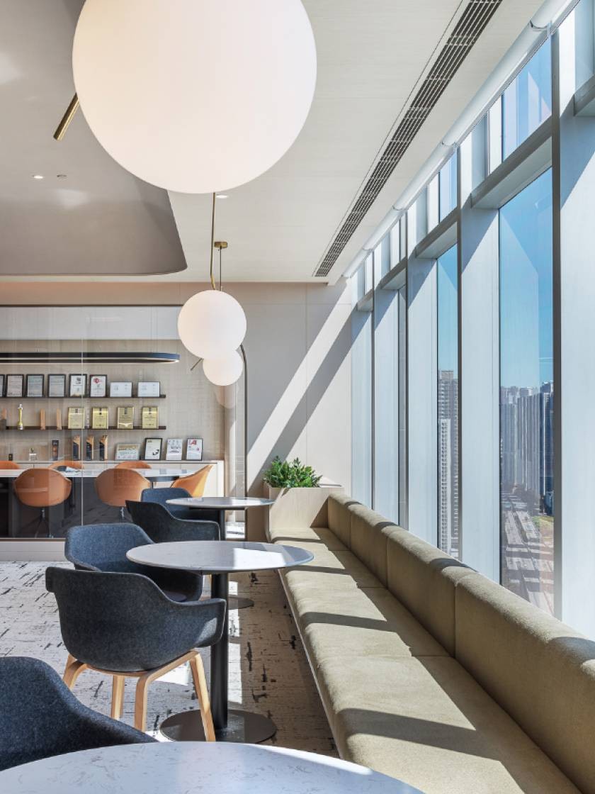
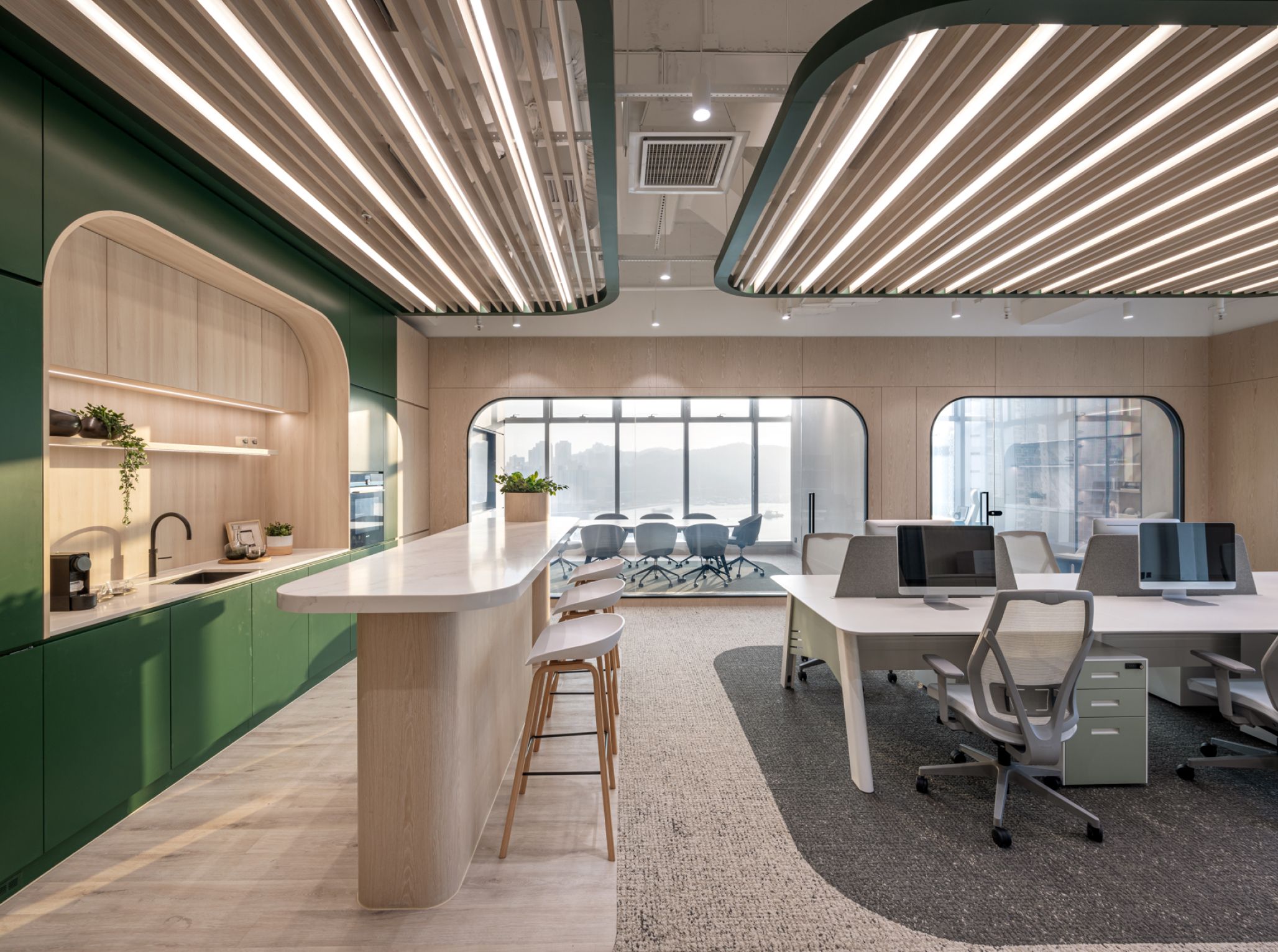
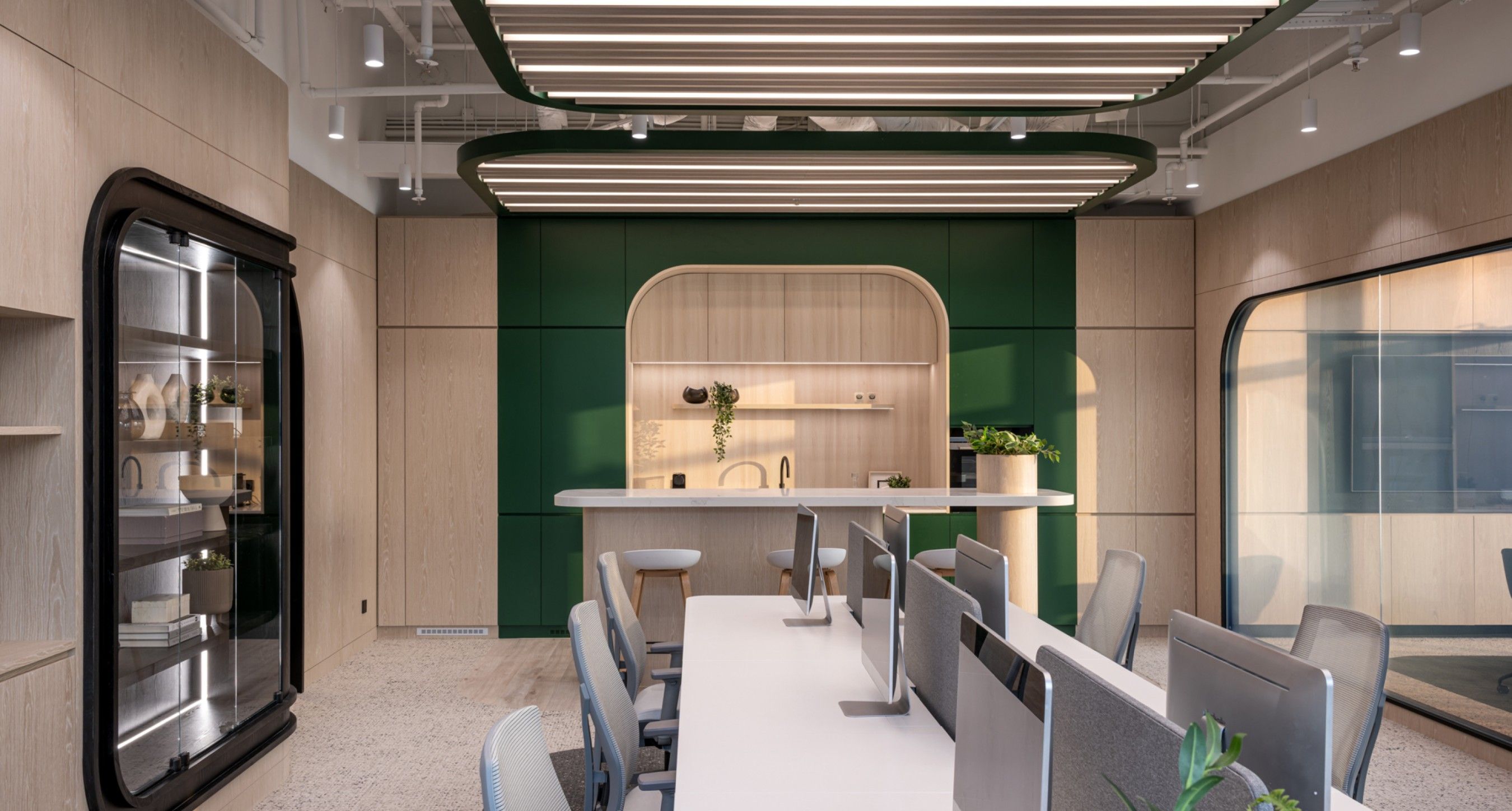
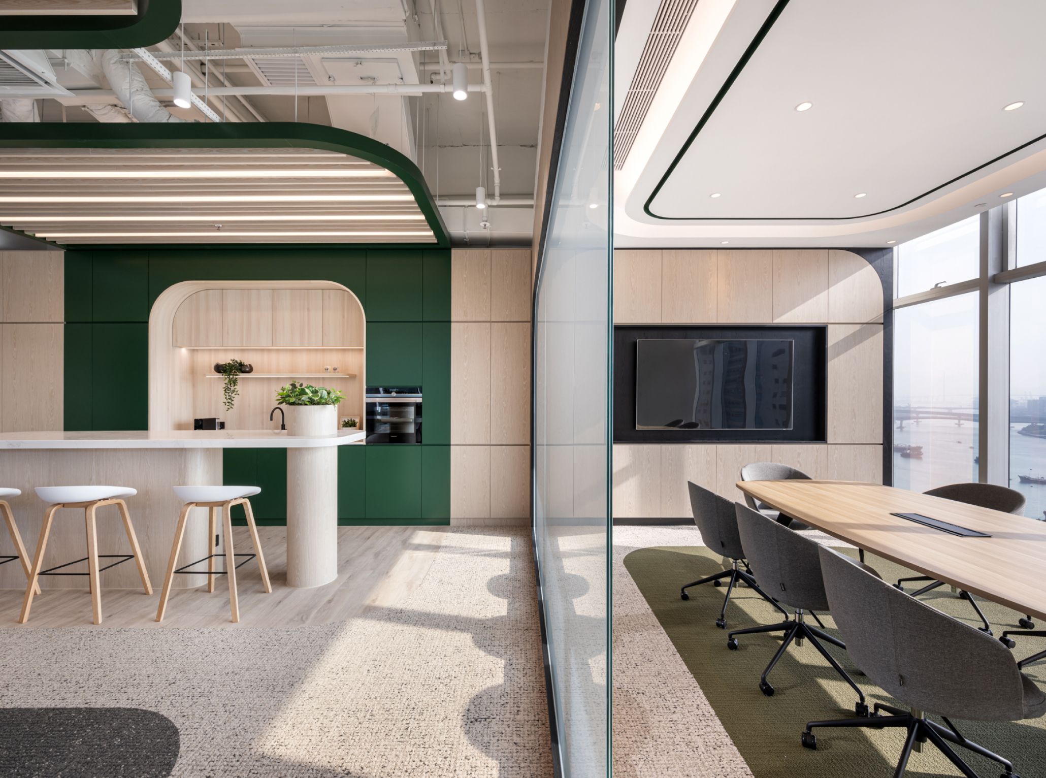
Within the office, the employee pantry is an essential part. This tastefully designed dining area stands out from typical setups, embracing an open design concept that provides employees with a relaxed experience. A mini bar counter is placed, allowing colleagues to enjoy lunch while engaging in casual conversations. The dining area incorporates a feature wall adorned with green accents and is complemented by the presence of plants. This creates a naturally comfortable ambience and also contributes to fostering a vibrant atmosphere in the office.
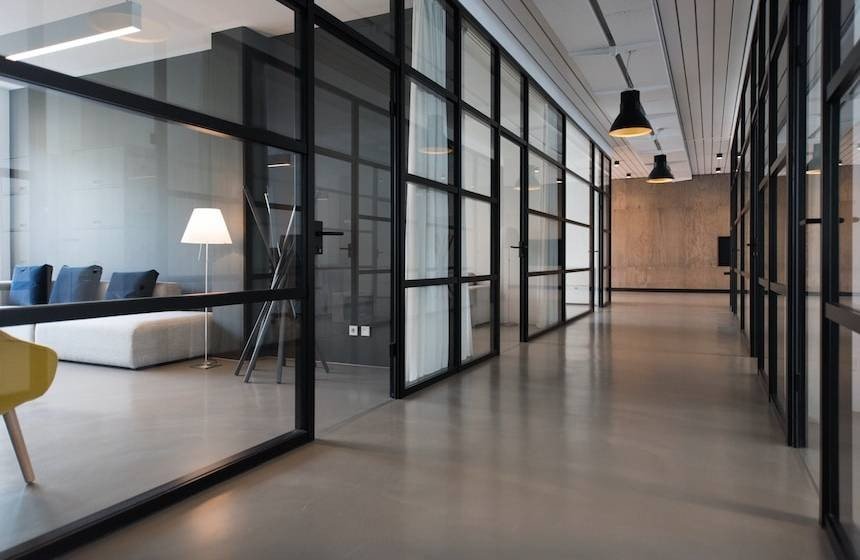
Unlike the traditional solid partitions commonly used in offices, we opted for semi-open feature glass as the central dividers. This design can effectively connect the indoor and outdoor spaces seamlessly and also creates a sense of transparency. The feature glass has a frosted function that can be activated when needed to provide a certain level of privacy. Conversely, when not in use, the glass can be restored to a transparent state, allowing natural light to permeate the space and maintain a sense of continuity between the interior and exterior, enabling a harmonious blending of the indoor and outdoor environments.
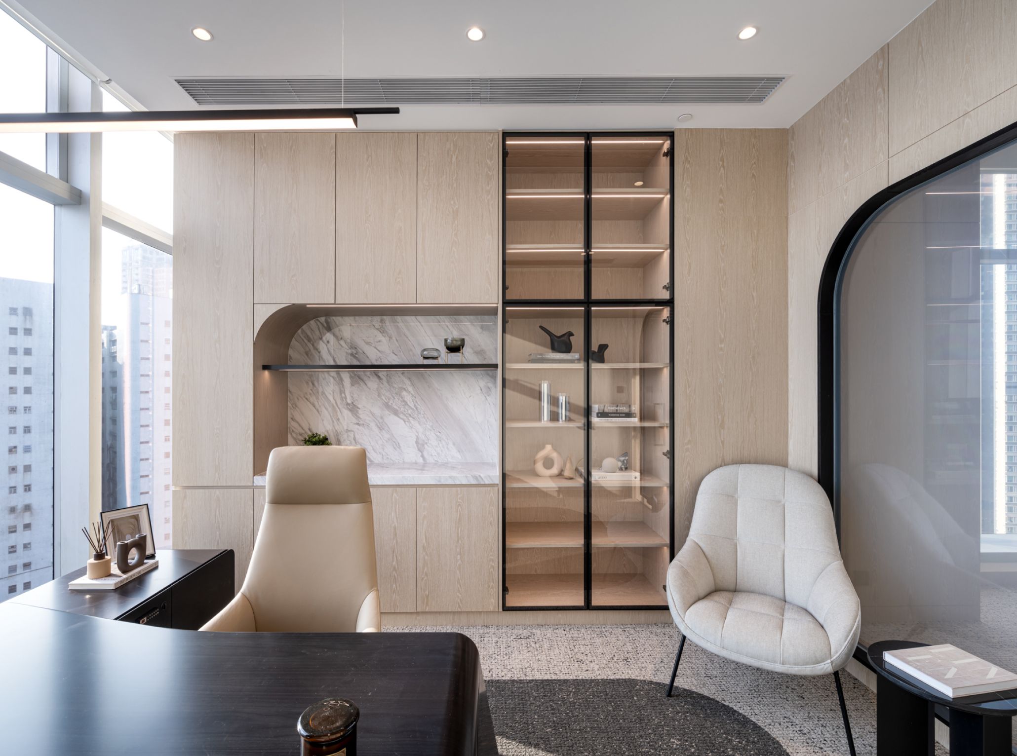
We positioned the meeting room and executive offices near the windows, employing a minimalist light wood design to create a relaxed yet focused working environment. To enhance the overall space with a touch of modernity, we incorporated black frames and accents of marble. The black frames can provide a sense of delicacy and attention to detail, creating a distinct contrast with the light wood, making the space more dynamic and engaging. On the other hand, the marble accents inject a sense of nobility, elevating the taste and texture of the executive offices. In the glass display cabinets of the executive offices, we utilized linear lighting effects to highlight the items on display, this also adds a touch of sophistication.

