A Design Concept of a “Open-extending” Luxury Home Layout
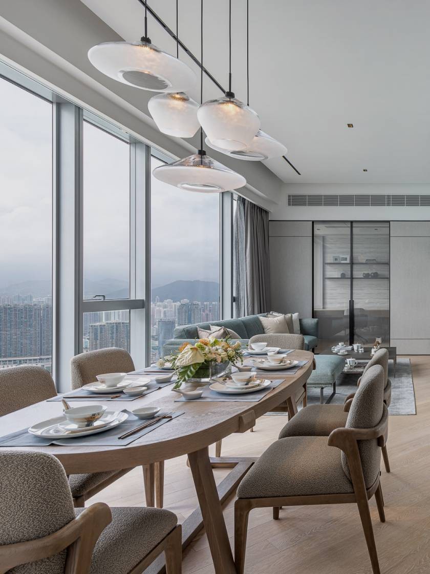
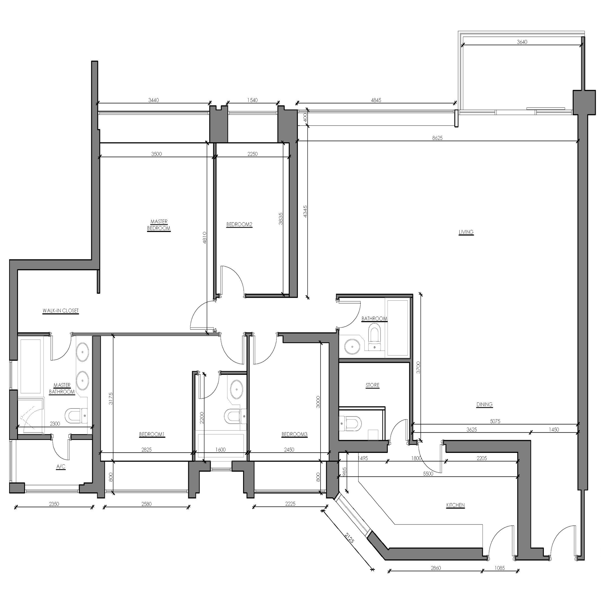
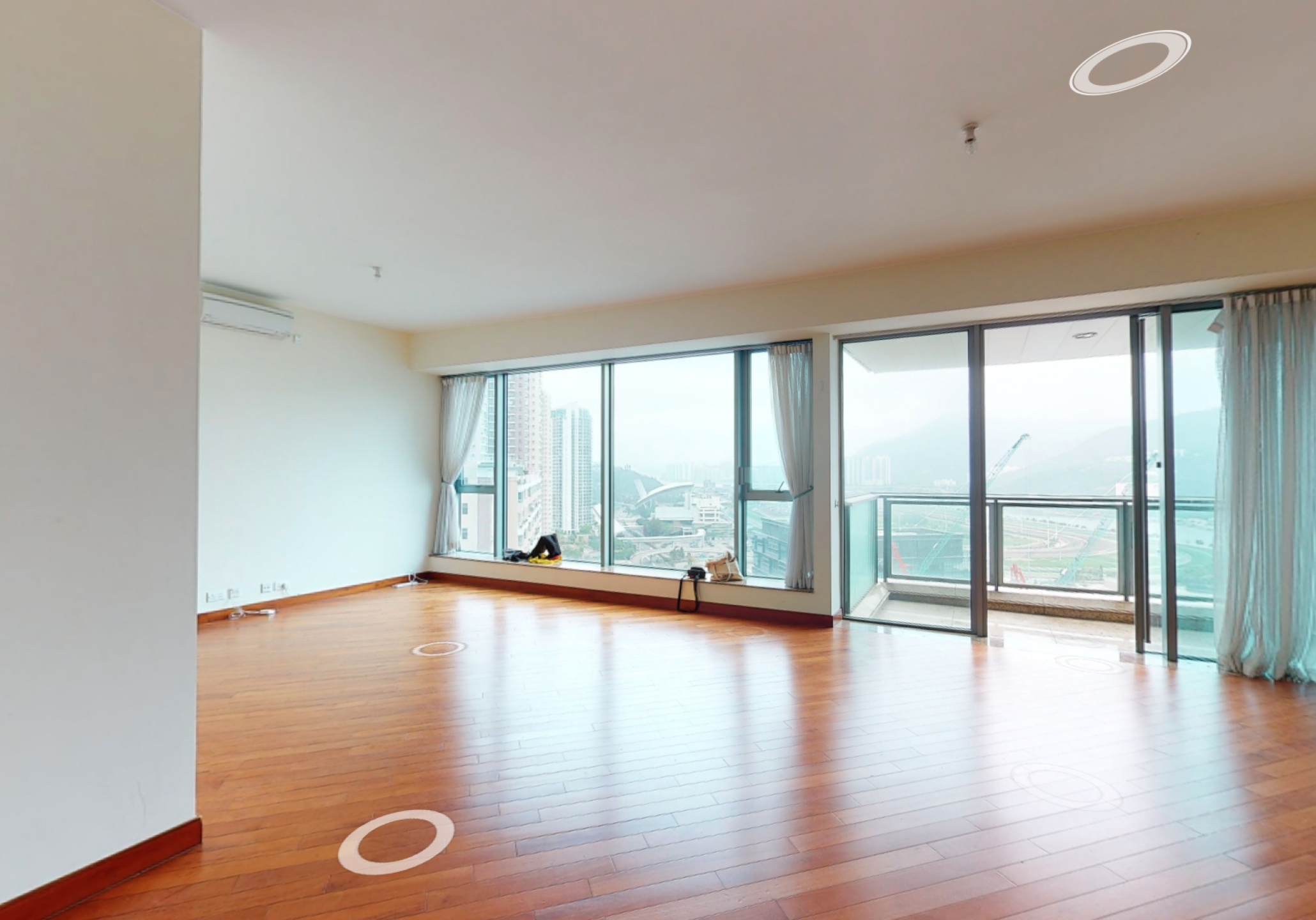
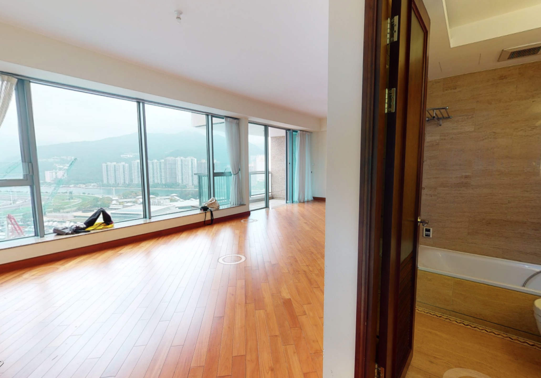
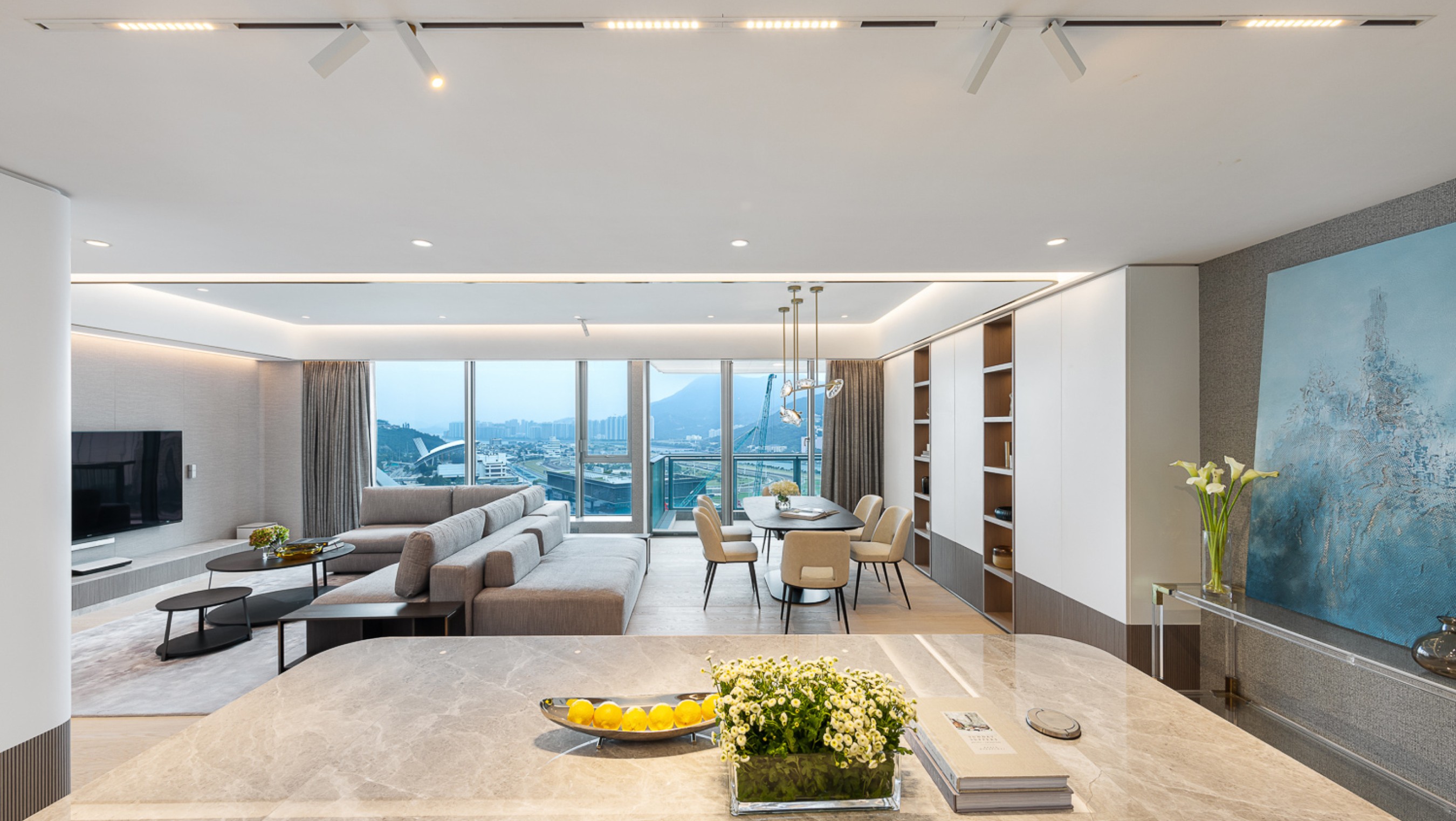
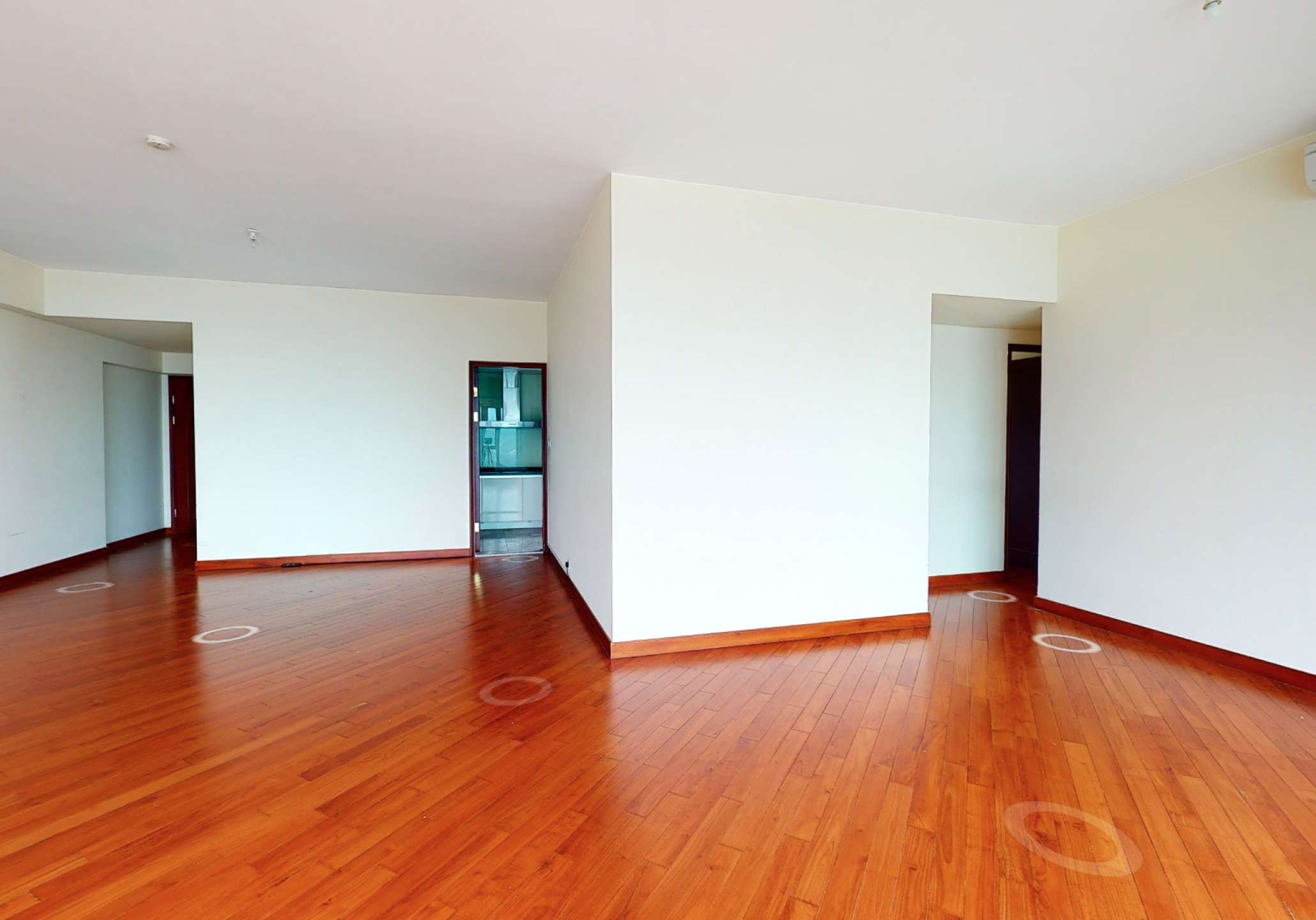
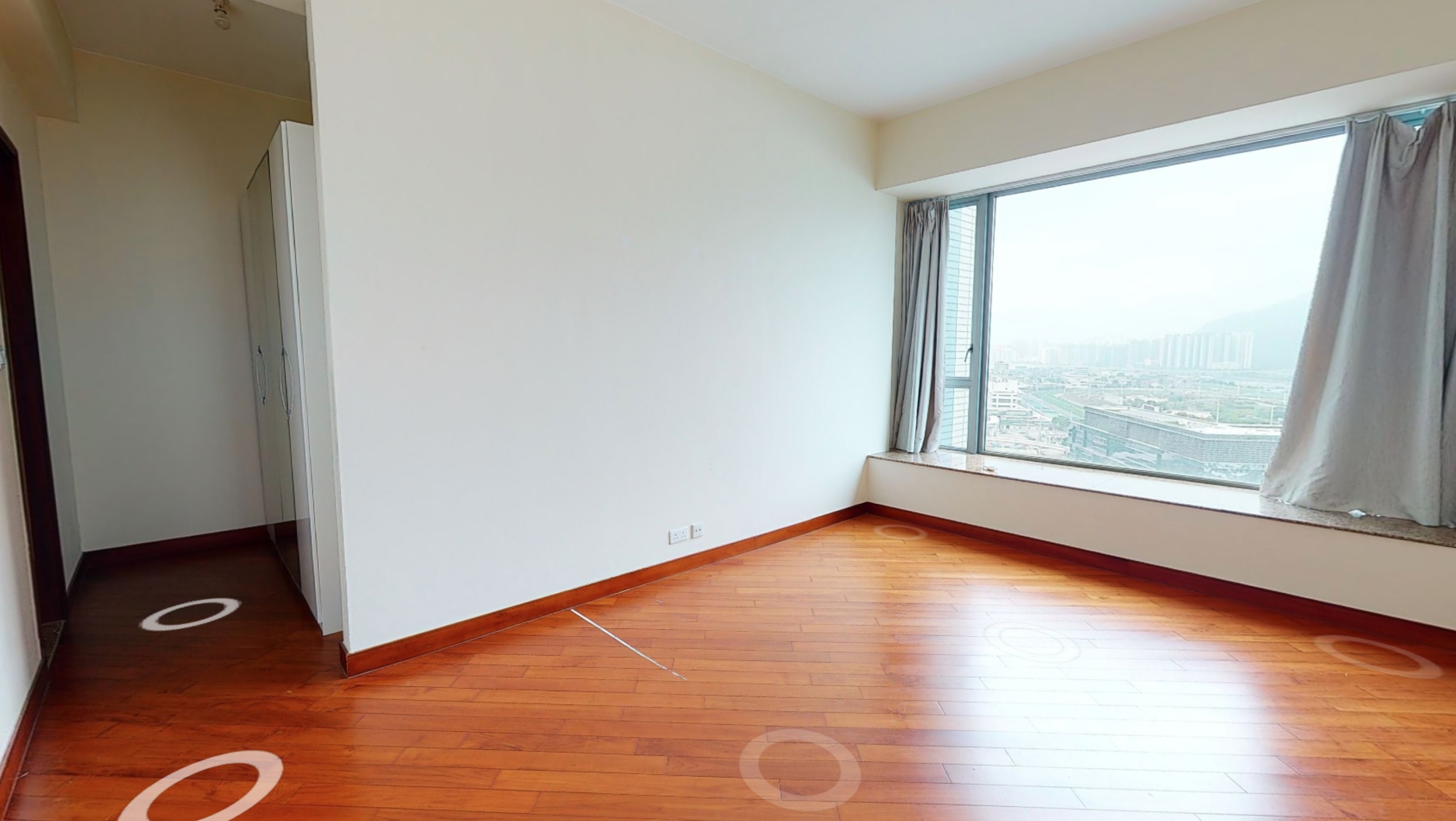
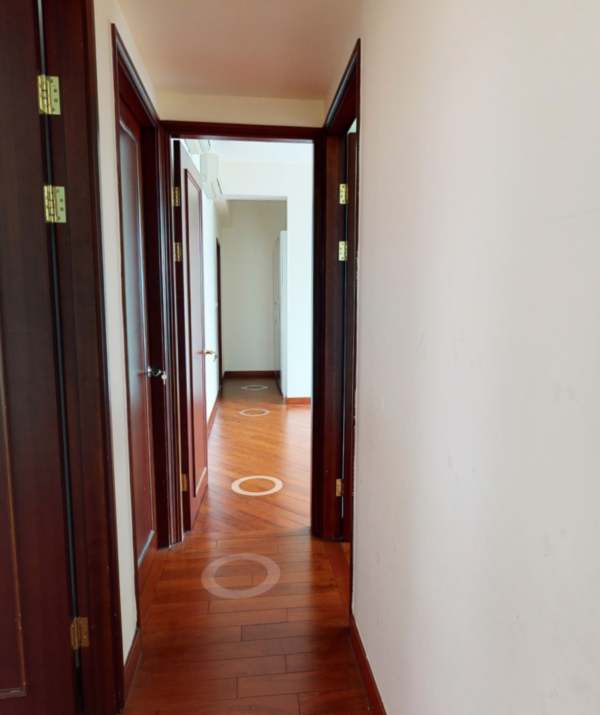
Compared to the typical mountain and sea views from luxury homes, The Palazzo in Fo Tan offers a spacious area of nearly 1,800 square feet. This residence features a wall of large floor-to-ceiling windows that showcase the panoramic view of the Sha Tin Racecourse, and provide abundant natural light to create this ideal living space. However, the original layout, which leaned towards traditional and conservative styles, was not well-suited for a family of three, and a domestic helper. Therefore, Matthew applied the concepts of "extension" and "openness" as the design aesthetics and core, which adopts an earthy luxurious tone to complement the unit's scenery, emphasizing the combination of natural materials into the overall design.
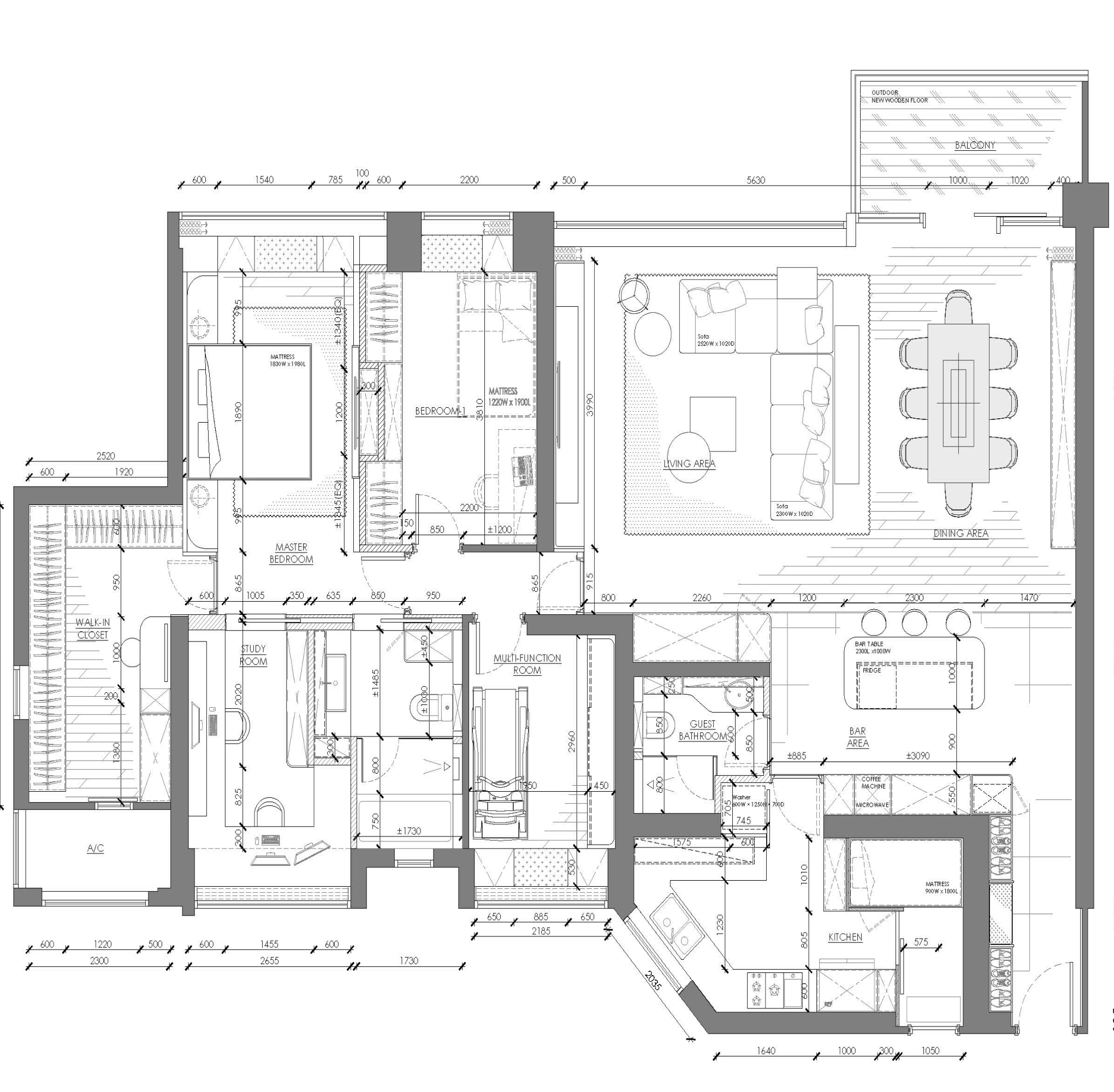
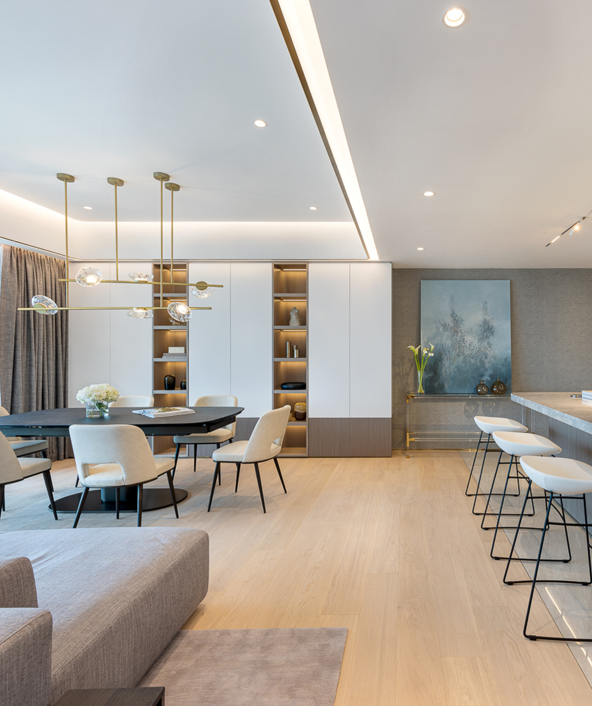
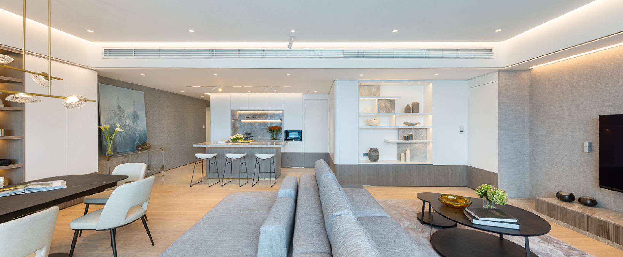
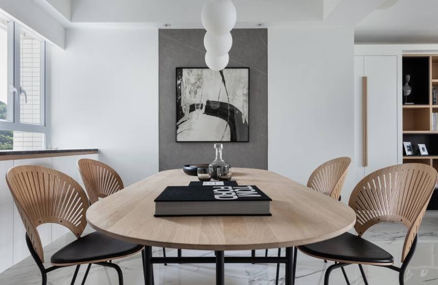
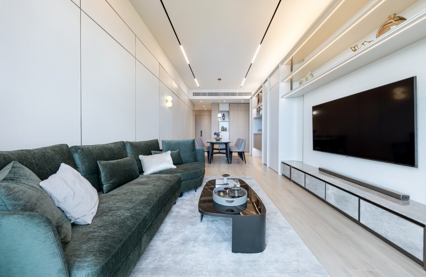
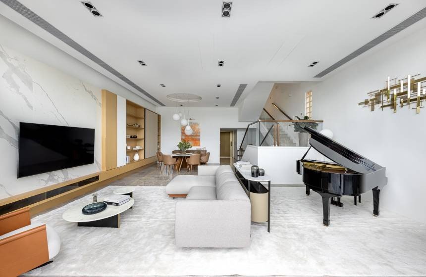
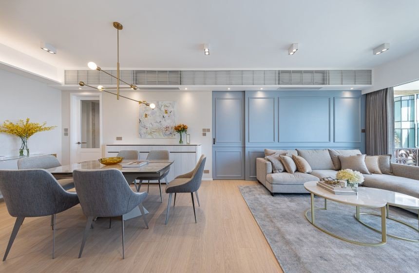
The living and dining room is the main area of the entire residence, with a rectangular layout that allows more decorative elements in the design, such as storage display cabinets, TV and feature walls etc. To accommodate the family's need for a space for children and their hospitable habits for home gatherings, a double-sided sofa was used in the furnishing design, providing a playing time for children and added flexibility when in use. As the use of lighting is essential in creating functional residential space, this home incorporates a smart living system featuring various types and functions of lighting, as well as motorized curtains and air conditioning. Often with stone tiles as the base for the design, wooden wall surfaces, and textured wallpapers to accentuate the lighting and create different vibes within the home.
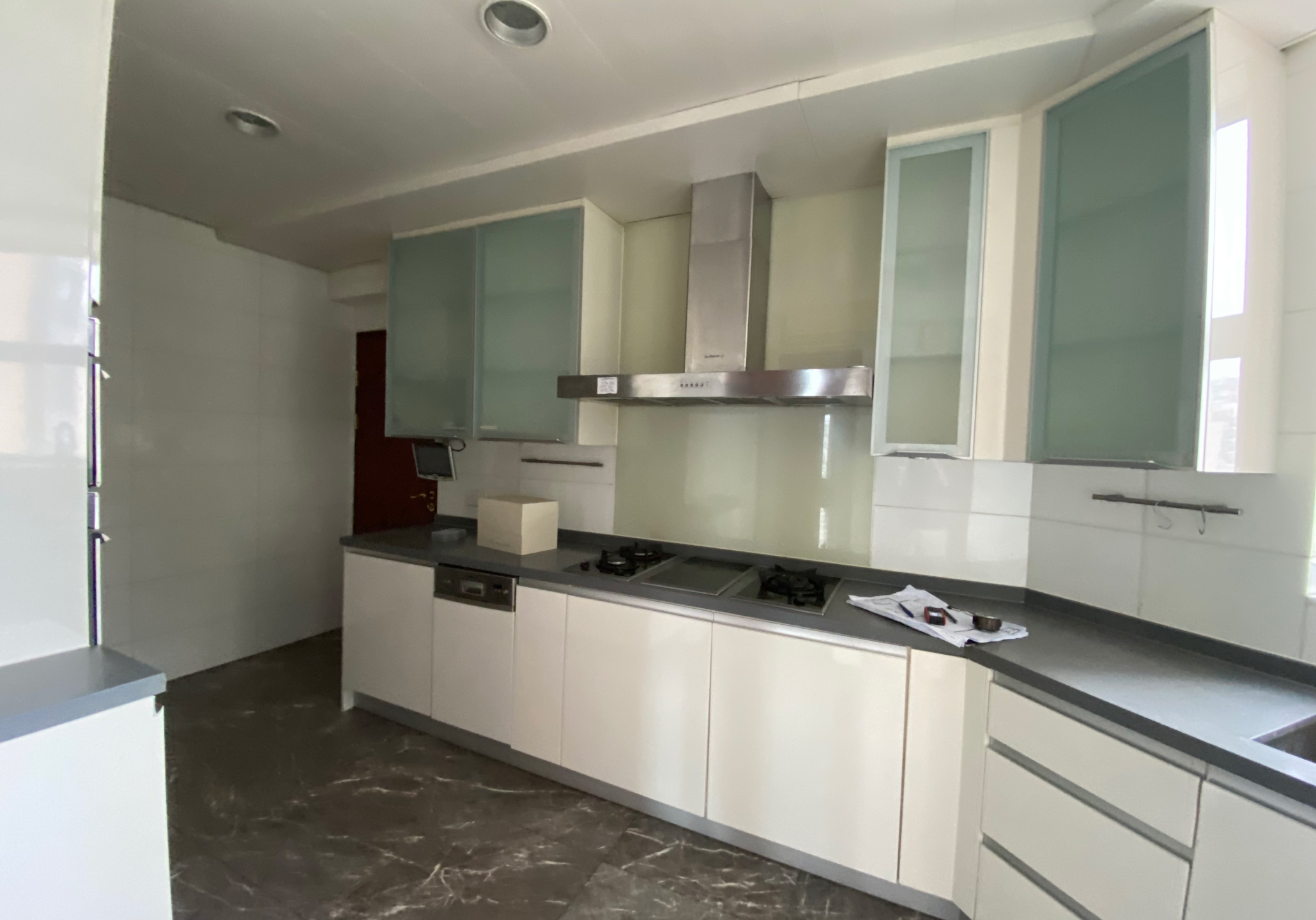
The original layout placed the maid's suite in the center of the living room, which greatly hindered the possibilities for an efficient space planning. Therefore, Matthew repositioned it inside the kitchen, freeing up space, while some areas of the kitchen were transformed into an open mini bar, allowing spaces for some kitchen utilities and functions, such as small appliances and storage, within the dining room. By designing a niche resembling a feature wall, with a gray marble surface complemented by ambient lighting and decorative items, this open design enhances the sense of visual space and achieves the idea of "openness".
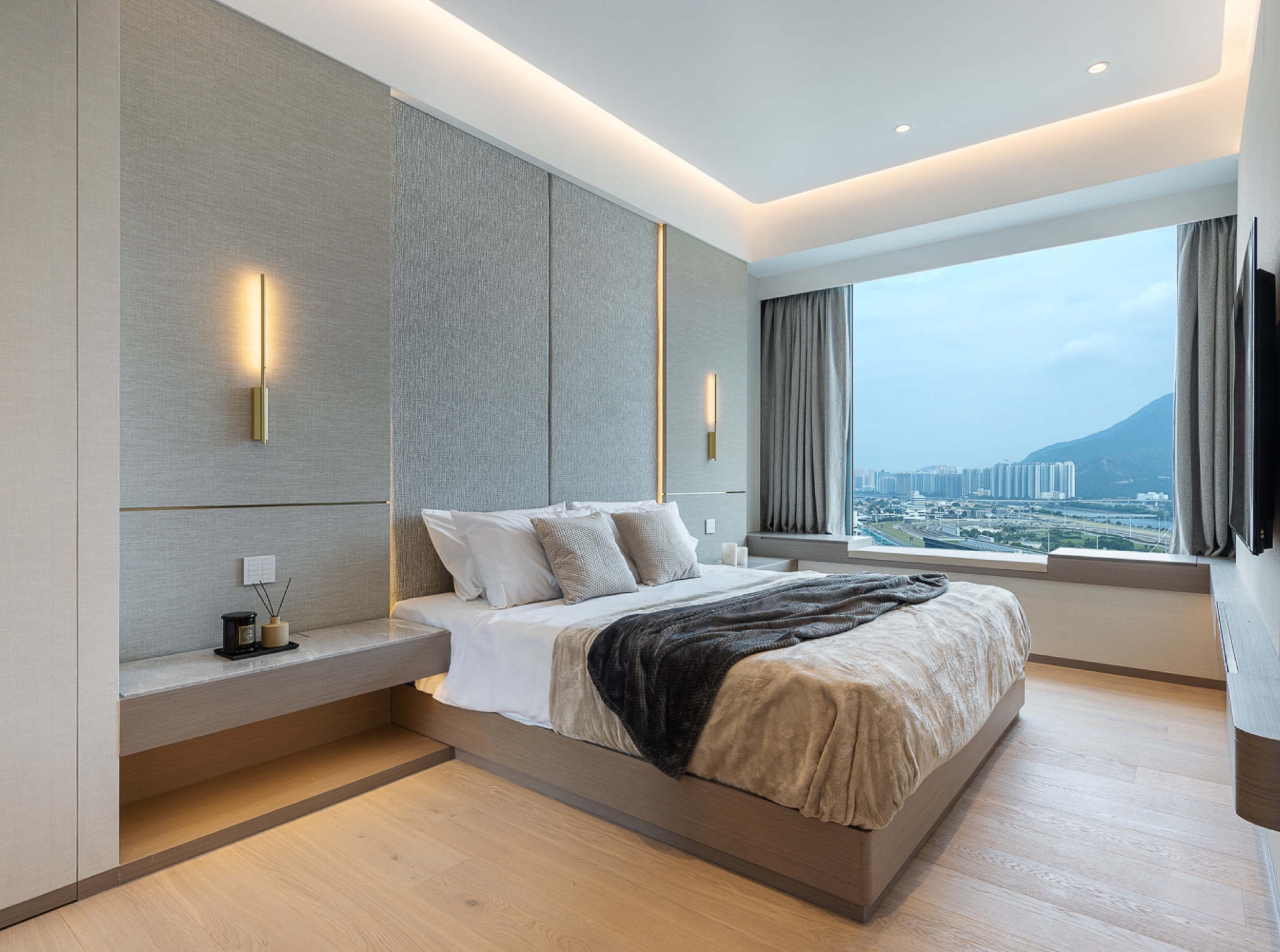
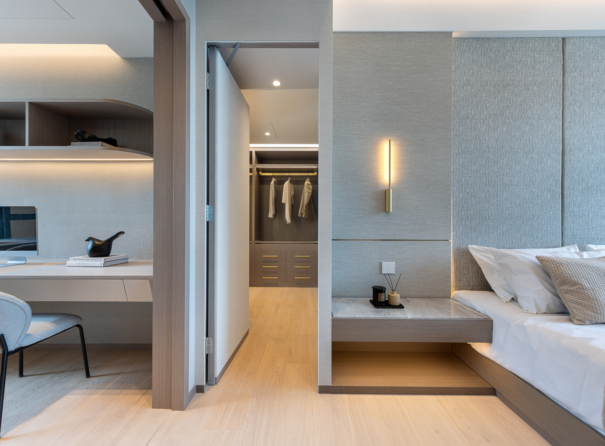
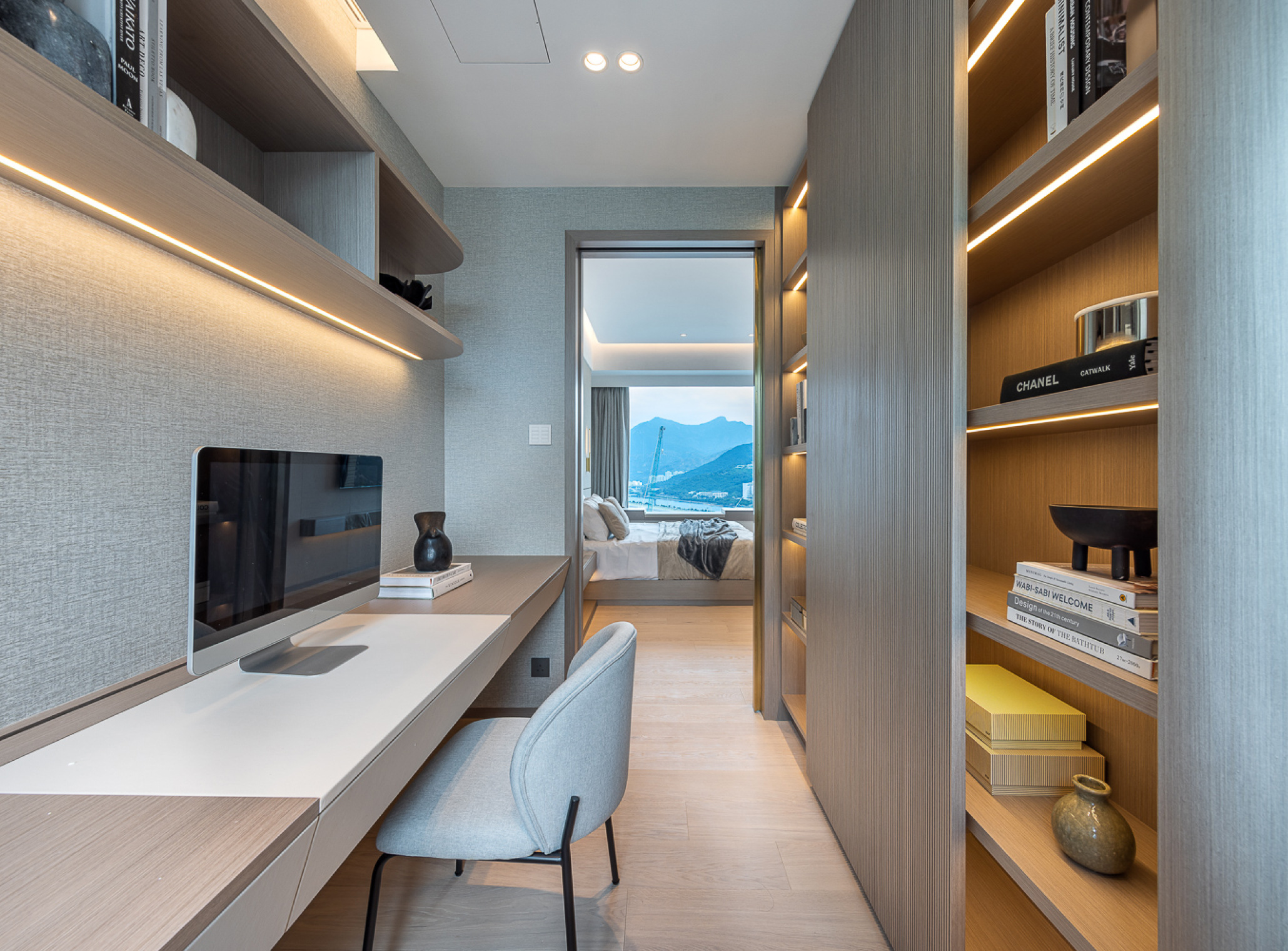
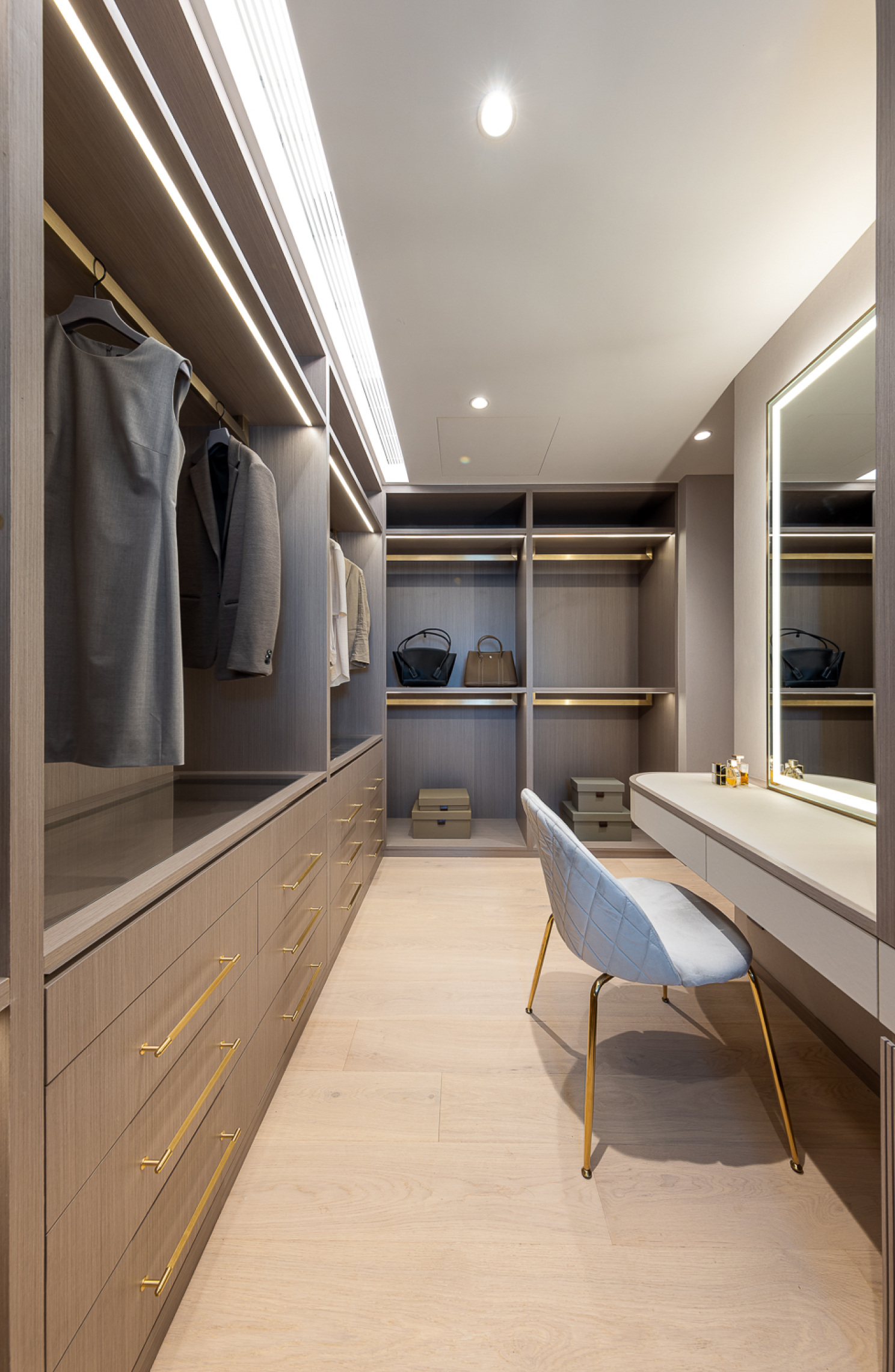
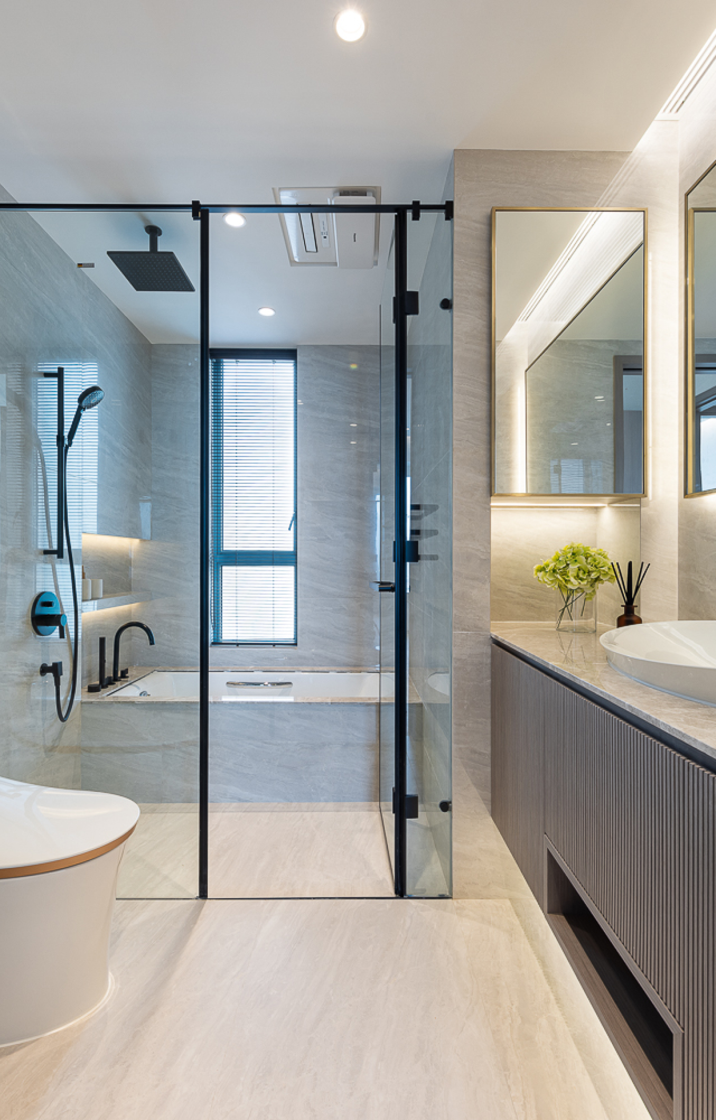
Moving to the bedroom area, as the owners desired a spacious master suite but didn't need so many separate rooms, Matthew reconfigured and combined the two original bedrooms and transformed them into a large master bedroom, also addressing the issue of the toilet directly facing the bedroom. One of the rooms became a private study room, while the other was converted into a small en-suite bathroom with a flowing curvy design. Both rooms feature distinctive glass sliding doors, enhancing natural light and echoing the concept of "extension" in the design. The original master bathroom was transformed into an expanded walk-in closet and the overall color scheme of the bedroom adopts a light and luxurious feeling, an understated shade of pale grey, high-end stone materials and special wallpaper on the feature headboard wall, creating a hotel-like relaxing atmosphere.
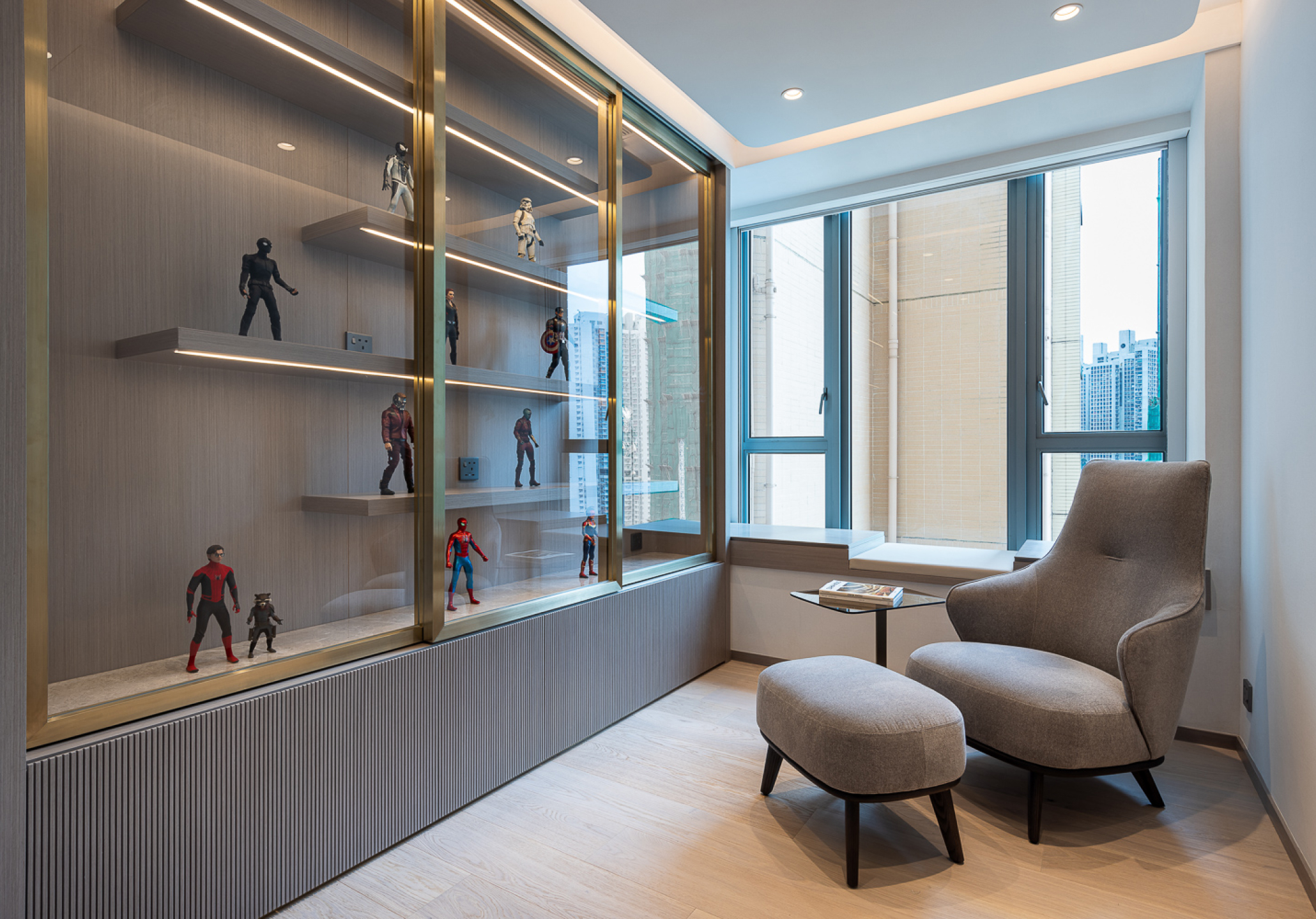
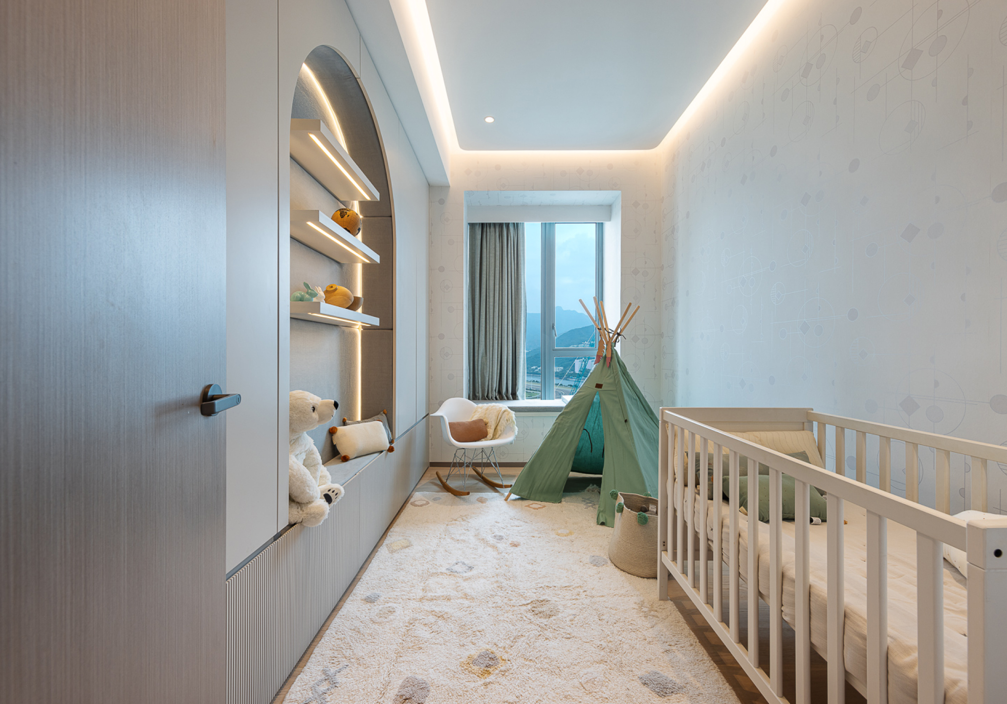
In addition to the master bedroom, the other vacant room is also utilized for its functionality. One of the rooms is transformed into a versatile model storage room, perfectly fulfilling the long-held dream of the male owner. A top-display glass storage cabinet showcases beloved model collections, accompanied by a comfortable armchair and a coffee table, creating an exquisite yet serene private space where can relax and enjoy reading. On the opposite side is the child's bedroom, considering the child's continuous growth, the design incorporates flexible furnishings to accommodate future additions following the growth of children, the style harmonizes with the theme of the dining room, featuring a distinctive wall niche that includes lighting features, consistent materials and wallpaper combinations.

